What Is Mobile SEO?
Mobile SEO (search engine optimization) is the process of optimizing your website to rank higher in mobile search results and enhance the user experience for mobile users.
It shares many best practices with desktop SEO and is an essential component of an overall SEO strategy.
The Importance of Mobile SEO
Mobile SEO is important because Google uses mobile-first indexing (with few exceptions), meaning the mobile version of your site is used for search rankings.
Users also prefer mobile devices over desktop devices for search.
According to our analysis, there were 313% more mobile search visits than desktop search visits in 2023.
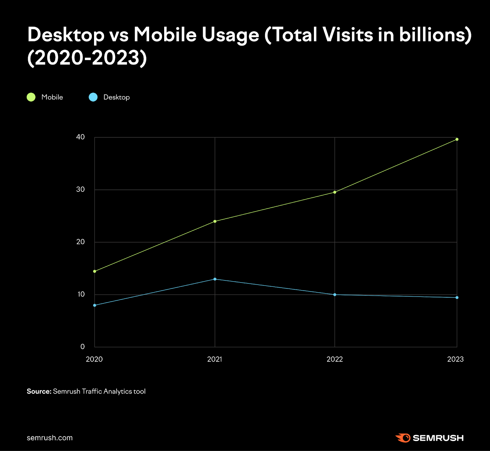
![A graph compares desktop vs mobile search usage from 2020 to 2023. Mobile is much more popular.](https://static.semrush.com/blog/uploads/media/63/03/63030c11f9f3974bd3722b8cec1503cf/72cb0266119b4eac3ddabc68df9afeaa/AD_4nXetGkMiLpDijft47ywdFf_6Wyzin619uNChMa8Ag-0wLHsXLcAUGjwQUu2B9Kp8De7g2trgVKbhMReBC_voXa26q03Wpl1C1p804URhQ1Qqx3UCnF8LxaSvG83SbSm5iGd7ZPw92Q.png)
And 90% of consumers use smartphones for product research while shopping in a store at least some of the time.
All this means ignoring mobile SEO can mean missed opportunities—even if your business has ample foot traffic.
Preferred Way to Configure Your Website for Mobile: Responsive Design
Google recommends responsive design to configure your website for mobile because it’s easy to implement and maintain.
Here’s how it works:
Responsive design serves the same page to both mobile and desktop users.
The server sends the same HTML code every time, and CSS adjusts how the page renders based on the device.
Like this:
![Responsive design is how your website reformats to fit different screen sizes](https://static.semrush.com/blog/uploads/media/d4/c2/d4c244a3b1d0985218cd3407016f0a80/45a17db3033f8520742f61db78f8d289/AD_4nXd3zlqDNl1KJnb1QPf7b16amZ50FsOL0r8MeV3TLmQR1c1BETJufw7EoZVb9pcCwxXroCP3GuQahHAllSc61CFLxz3-CJKijLW7qC7RcR4qy19_Eae1YoU2iyH7luefxhj-X8lw.png)
Responsive design is ideal for SEO because it:
- Uses a single URL, allowing easy sharing and linking without a separate “mobile” URL
- Reduces common mobile site mistakes
- Requires less maintenance compared to other methods
- Eliminates the need for redirection, speeding up load times
- Saves resources when Google crawls your site, as Googlebot only crawls the page once
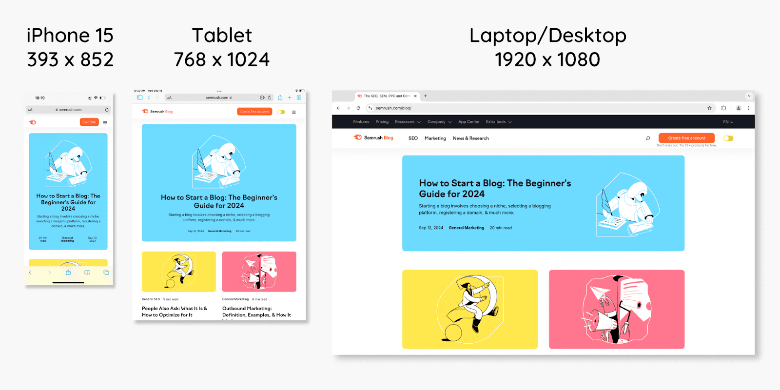
Here’s what it looks like on a real page:
![an illustration shows how a webpage reformats to fit mobile, tablet, and desktop](https://static.semrush.com/blog/uploads/media/c6/0a/c60adc50d2a5e46ed70da64ccdcc79e3/bb7e6ffae740b255d68e2f64c3f8bbb7/AD_4nXe1RxNMSim7L-kBABnOFzIWbHBELnQXOUOBvVpJjdzsKCUj19hB3dqMKWdMKqSh24kh9rgdpDnljT-bFrOoXBbWynd9Ieuw5TmR5ddXr0XdSri9GvXATizURxq1nmcfbeCy3Q9Zxw.png)
With responsive design, there’s only one responsive page for each piece of content.
This approach prevents duplicate content and slow redirects. It also simplifies the user experience across various device sizes.
Alternate Ways to Configure Your Website for Mobile
Besides responsive design, you can use dynamic serving or separate URLs to make a site mobile-friendly.
Dynamic Serving
Dynamic serving delivers different HTML code depending on the user’s device, but the URL remains the same.
Here’s an example:
![dynamic serving is when different code is applied to desktop vs mobile](https://static.semrush.com/blog/uploads/media/1b/5f/1b5fe3e803557ad563bcbdb9eb86a6c8/212b0c2824ce01d57e2ee599de8ab889/AD_4nXfS5ZfYoSjiXy0pHH_QaWm0HHf5F7iYYW4i2UTKpy02fvXACBvM0qUv1hdM4c4dYPMoPgAZm5FEXj4zjrC1DE-RVbjOgdxYVdB_Z53aodaRhaAnjHiFk_9eI6yxXNt-XZz_sF5vKg.png)
A potential issue with dynamic serving is that the server might send the wrong version of a page to certain devices.
For example, a smartphone user might see the desktop version. Which can negatively impact the user experience.
Separate URLs
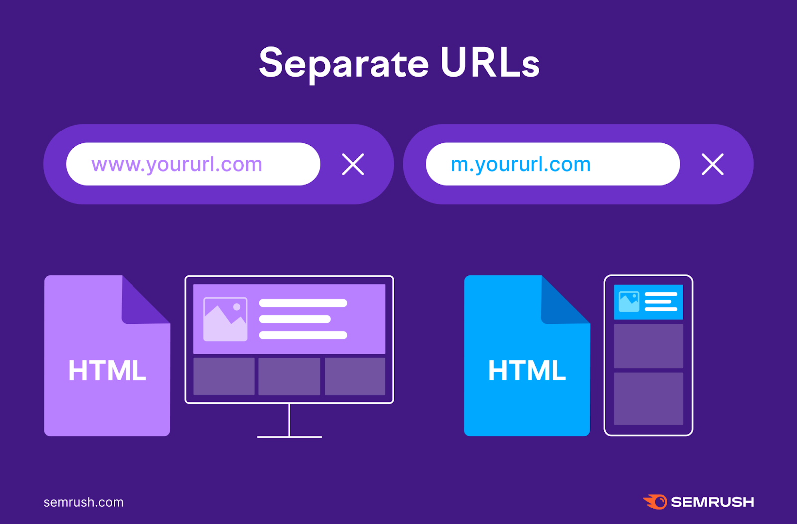
Using separate URLs gives you one desktop URL and one mobile URL (often using “m” or “mobile”).
When a user visits the site, the server detects the device type and directs them to either the mobile or desktop version.
![separate URLs can serve desktop and mobile](https://static.semrush.com/blog/uploads/media/5a/12/5a1224ae4411973de3093636c572e815/4f1664f3a11abd8da0163732982cf494/AD_4nXdZkXQ62UoKDAaRvMyE2mLayTFUb2BGmOhsJppoAxYmzb-iYgQdGULfMeA6uClNqCVCNT1NKIzHDcCjtubI4O7Ps33h9Mp49kaGmSbyOHf7Naqle10djZs3WEMHRxbrtY802RlPTQ.png)
This solution can be time-consuming to manage.
Because there are two versions of each page, you need to add either rel="canonical" tags or rel="alternate" tags to the HTML code. To inform Google which is the primary version of each page.
- On mobile pages: Set a rel="canonical" tag pointing to the desktop version
- On desktop pages: Set a rel="alternate" tag pointing to the mobile version
If you don’t set these tags correctly, Google may consider the desktop and mobile pages as duplicate content. Which can be confusing for trying to rank the correct page.
And your Google rankings could suffer.
How to Check if Your Site Is Optimized for Mobile
After ensuring there’s a mobile version of your site, use Semrush's Site Audit tool to check its user-friendliness.
The tool checks your site for over 140 technical issues, including many related to mobile SEO.
Go to the “Issues” report to view a full list of errors, warnings, and notices.
Click “Why and how to fix it” for advice on any issue. Or follow the blue links to see affected pages.
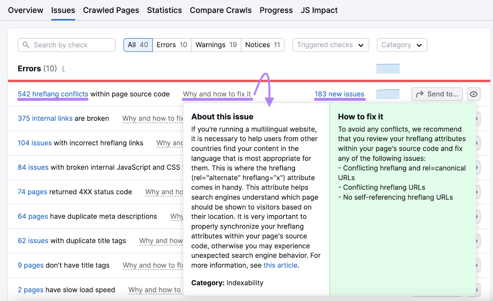
![“Why and how to fix it” pop-up window in Site Audit](https://static.semrush.com/blog/uploads/media/0e/d9/0ed9a217683ce22d908c4e549422f03f/1d517e08dfb9872d5b7059d5a725323b/AD_4nXd6A16XeF0FoguSdkI_cAnXaYOrZvHplekrtbQnPBJzfHDHJRRmFKdKWKfdbsIYPkuYygGXO4V-cC2HB6dXxue1tWbHljpBDcVAdprMrYXmX7A9cxWN9t6HYcpyY0m8zcaRzX7CMw.png)
Many of these issues affect SEO on all device types.
But you can search for “mobile” to focus on mobile-specific issues, such as those concerning Accelerated Mobile Pages (AMP) or viewport meta tags.
![Results for "mobile" under "Issues" tab in Site Audit](https://static.semrush.com/blog/uploads/media/02/a1/02a15f36a7a1c702f31316ed40ac4432/c6aa9e99933a097f9bcc106e8a7e8e58/AD_4nXdQ_hrZsk478uPH1KImN2gdZfhAEfWbjB7To0MB4z8K8n1jzIKSAo6J4Ax0DNxXO1FEh-CUTFkhIqnVfGvMCrAHTiy-glrGK8ASjqV38GOrI2JOh3ThYq1P_iD-gcPBsSI9E1ZMJA.png)
After making improvements to your mobile SEO, rerun your audit to ensure the issues have been resolved.
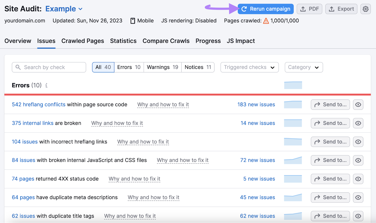
!["Rerurn campaign" button highlighted in the upper right corner](https://static.semrush.com/blog/uploads/media/8f/0f/8f0f8de54a6a3eed78095e958ee5c2e4/1a2e6419451a6a2a621c9f6c6e00dc81/AD_4nXdGjFdqzThuBliW7V_WgNQn43WSy0t9JhXpIJ4NvxASj-h-9gZ6H5_GhyvBMz-Aye41vDmNxXJmFps0xzmDa3RI2NFFl0Gd3ldosClodJki1i92QJwoXzk_ittYUIsLQm9__jAl0g.png)
8 Mobile SEO Tips & Best Practices
Now that we’ve covered the basics, let's discuss how to perform mobile search optimization.
Here are eight essential tips and best practices for mobile SEO:
1. Create Mobile-Friendly Content
Mobile-friendly content is easy to read and navigate on small screens.
Optimize your content for mobile by using short paragraphs, brief introductions, and ample white space. Also, remove any intrusive pop-ups from your site.
Use Short Paragraphs
Short paragraphs are easier to digest visually and because they usually contain a single idea.
While there’s no specific number of sentences per paragraph, consider breaking up paragraphs longer than five lines on mobile devices.
Splitting longer sentences into shorter ones also helps mobile users skim the content more easily.
Here’s an example of hard-to-skim versus easy-to-skim paragraphs on mobile:
![easy to skim paragraphs include paragraph breaks](https://static.semrush.com/blog/uploads/media/df/61/df61f150f7a78eda7f24a368297860d1/b2e523e9e142a79a11275aa8641c9421/AD_4nXc7h7JMD9CTAz6_08LllVAmI51wc-Gv-br9VamuVQfMNr_XMNCDGAmk2xqITWgGl1AxGdhfv3hmAbSbz58ldkUZqCZ81CfpJ_eyCYFEm-xpttq7lW-1xlorHMDb-APR50INOAOgHQ.png)
You can further enhance readability by incorporating elements like bulleted or numbered lists, tables, images, and videos.
Keep Introductions Short
Since mobile devices have limited screen space, a short introduction allows you to hook users early and gets to the main point quickly.
Long introductions risk losing users’ attention, prompting them to return to search results for faster answers.
If the article focuses on a question-based keyword, answer the question at the very beginning.
For example, if someone searches “what does a dermatologist do,” they should find the answer in the first sentence of the corresponding section.
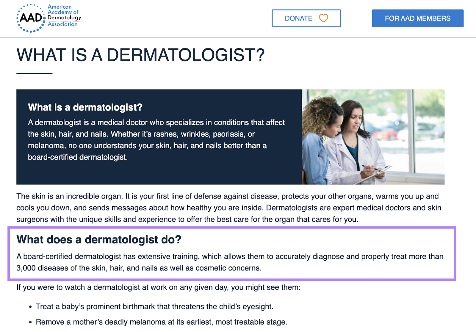
![The article answers the question in a single sentence.](https://static.semrush.com/blog/uploads/media/a0/0e/a00e374fb6c13bfc57863c4c0ff63ecc/11d304128a9c888d4eda0dc9087194dc/AD_4nXdtOYIqsWoHUbecONg2VFIXxmWA2SAGevefUz_oU6GxNikJIsqUGHG1pxbx-irGpb9HH-o3GQConyqWQ4DrjPdX5_Dw6BdYpGAbuu5ViUoIm3Yh_TzMh_SW2KCMTtHCQZBizn2Enw.png)
Use White Space Effectively
White space (the blank space between text blocks, images, and margins) is crucial in web design because it improves readability.
Plus, it can enhance comprehension by up to 20%.
Consider the difference between these two examples:
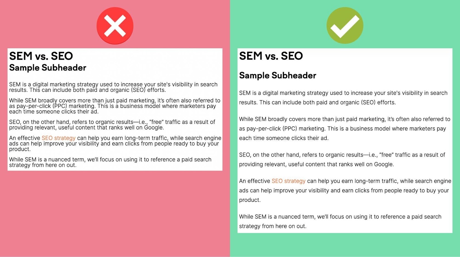
![the line height in an article is better with some white space in between lines.](https://static.semrush.com/blog/uploads/media/0f/48/0f48685bfe7260c16611234b1513b434/a97b69af4ef4846ec903e4be166e3cb7/AD_4nXeSpasXYAZCqAqzGxVOJ_k0kFJSwSm5VfKS6x4Mk3r9iUHl0_-B6JwPnmbXv2KTszvxNN4Orc4XyAEa-JNFQfKlErXNWnD41S729E2kHgkoePWbcrTPcYe-f-IHMFY5tX2lri8zOA.jpeg)
Avoid Intrusive Popups
Google penalizes “intrusive pop-ups” that cover the main content as soon as the page loads, specifically intrusive interstitial pop-ups.
Here are examples of what not to do from Google:

![These intrusive pop ups cover the text partially or in whole.](https://static.semrush.com/blog/uploads/media/76/bd/76bdaea4fa47b9ed037bd2960c968073/7bf2cd8874c5b4fd68fec0f367618dde/AD_4nXcO0F6Mns3sCcDIy9NATK-uMjW1PZJS3BT6nFCnL6THUQ8Gdfo9skMUeNaRvCrilu_rmOj33t8BNkmY1kzVwAr0bRrAQnq8aed1VnD8T2YvIkNW_sJGPURbLuLVWaGYkFxqsEDOqA.png)
In these examples, the pop-up obstructs the main content.
It’s OK to use pop-ups to ask users to accept cookies or verify a user’s age. You can even include a traditional ad—so long as it uses a reasonable amount of screen space.
Like this:
![the right way to use pop-ups include not taking up a lot of screen space and providing a clear exit button](https://static.semrush.com/blog/uploads/media/01/5a/015a22ebd7adf63ecfe5b4aef4ba9477/9fa78fc40db28345195655ee71985cf1/AD_4nXdVw2mRg3Md3D3YNw0PsFp72Of7Nt2YEVc13dhdclezD-b5mTbF3CelurxQXPrlJFp0RvTI0Oy7soZ-m24wPIAp41dKGa0t0v5dSt29OnggnUAd1Z5tUSLasWTH-H4dSlg0n6_Syg.png)
If you choose to use pop-ups, ensure they serve a clear purpose and don’t hide your page’s content behind ads or other promotional messages.
2. Use Structured Data on Your Mobile Website
Using structured data (markup that conveys information about your content) helps Google understand your content more easily.
Specifically, schema markup is the code that represents this data in a format that search engines can understand.
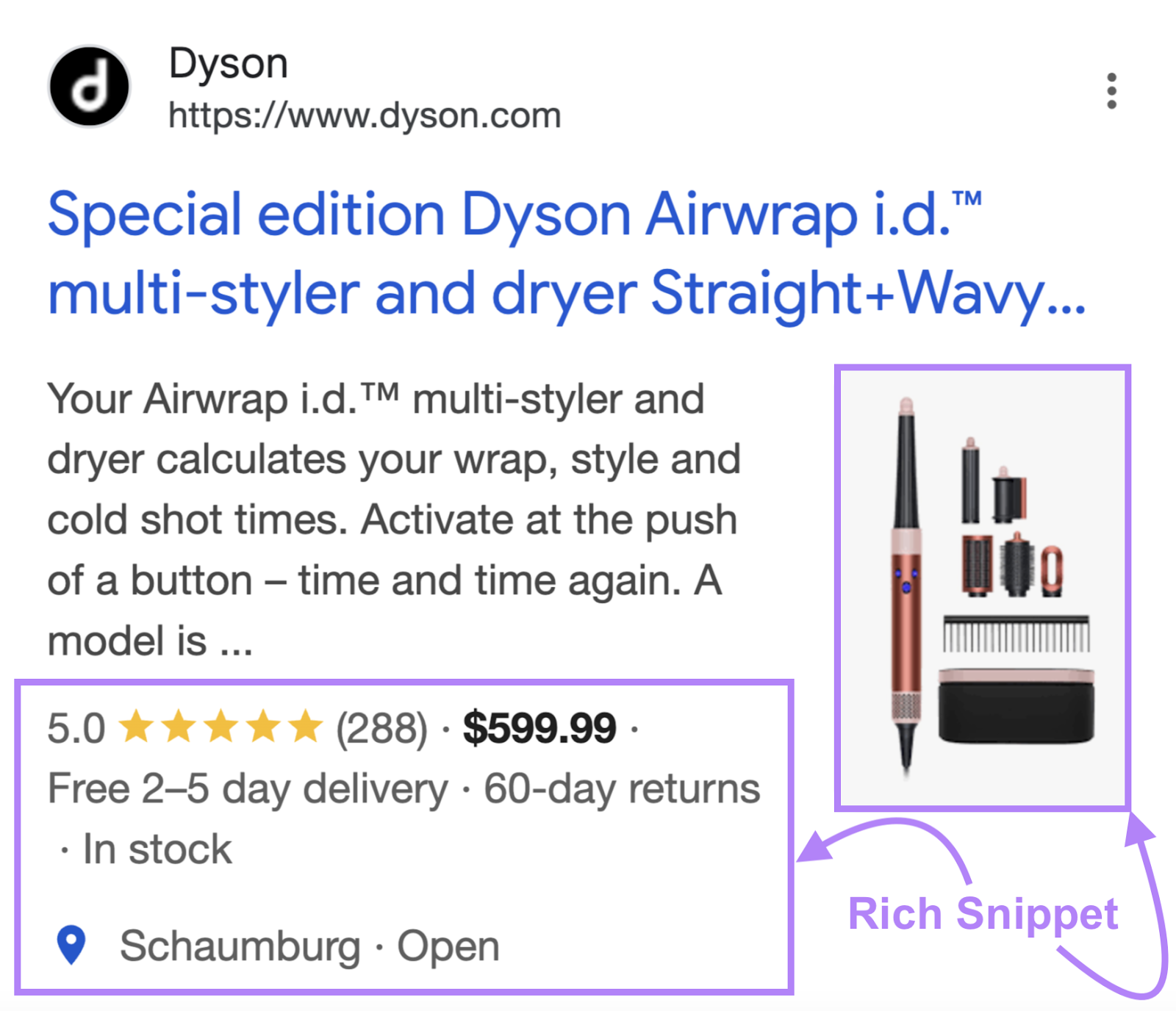
Using schema markup can make your content eligible to display elements like recipe stars or reviews directly to your results in the SERPs. This transforms your normal SERP snippets into rich snippets.
Rich snippets make your webpages stand out even more in mobile SERPs.
Here’s an example of a rich snippet containing the product’s rating, availability, and price:
![product image, star rating, price, delivery information, and availability is highlighted](https://static.semrush.com/blog/uploads/media/23/18/2318230f72354f6a37408648d90ce3c3/9a1acf378e03136187fdc8602ff47a81/AD_4nXdYpiqTRFxyZtDz4WWTyf0L0q_WSG8yd3WR3afYDhJ2OUymd9qwDDQXKl8tJ2Wj3ChVJsFvdu2WWzx5Kd-pYzgfhVhRlWon_ebn5iAwvVo3LLecaPduCJ1ddn12CygHbmtO76Q2UQ.png)
3. Target Voice Search-Friendly Keywords
Voice search-friendly keywords are crucial for mobile SEO because most voice searches happen on mobile devices.
People using voice assistants to search typically speak more casually, so optimize your content for conversational or semantic search.
To start, find question-based long-tail keywords.
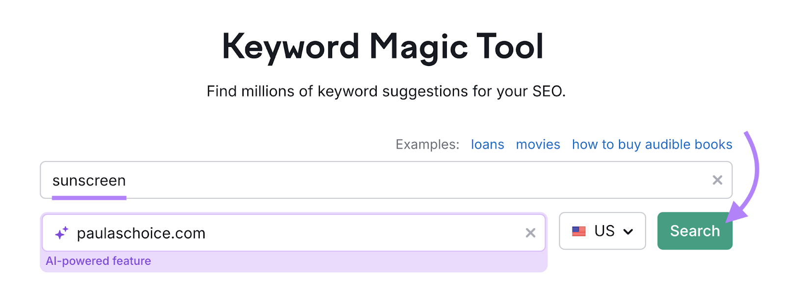
Go to the Keyword Magic Tool and search for one of your target keywords.
And enter your website URL so the tool’s AI functionality can generate personalized insights for your domain.
![keyword and domain are entered into the tool](https://static.semrush.com/blog/uploads/media/a5/a0/a5a091baa5e6db860999c00f22b02b56/53b40e4ae6ea97db7e3ce6f3085460b9/AD_4nXeRdxD1dCxyIEHR-FkFqjPGEYQpODeUhrAWYkvXmP5Ip6u3QxHBvCOaaKCDR0xDJfDvqPLDaCBi1tjhLx6RaV5f8_Ein2vnrj6gIPYH-taK-QoLr-fQUdXl_Ad70d4wV2V-qhmalw.png)
Then, filter your list of keywords by “Questions.”
![questions filter is highlighted](https://static.semrush.com/blog/uploads/media/c6/f5/c6f574e2b70c17aefcf078672acd9361/fde79d6bc64115eddc25c6dd71b6c3e0/AD_4nXch6FvJqx8RJqlbD1zctTYEU3kq3A8YSJ2DLC0oKHkQMMaQ_yAPH-Nm81bsOcmbu_r8rZCyjTS4bydE5y4_lw-ig3C9U5OwP3oOkHxyGmM5QlDobbaErt9DgmDltlZ_iArwfus1ZQ.png)
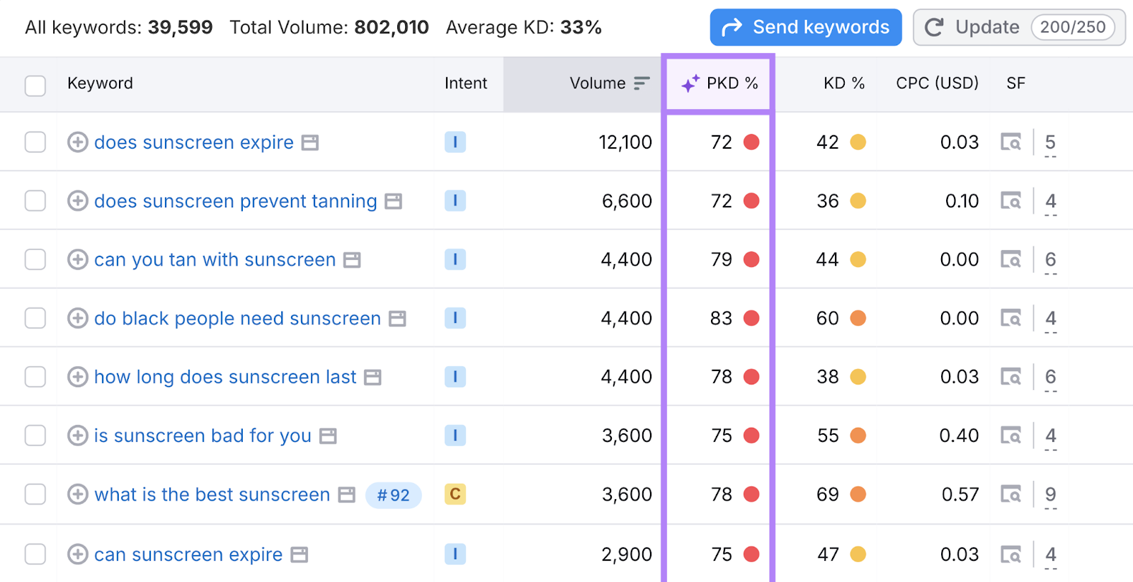
You’ll see a list of questions that people commonly search for.
The purple columns display AI insights. In this case, your Personal Keyword Difficulty (PKD %) score.
![Personal keyword difficulty column is highlighted](https://static.semrush.com/blog/uploads/media/22/30/2230836763d2d5811b6ebb99851c8f09/34f334846dfa20cbb4b1fa65cafd9dd3/AD_4nXd5XIb6xyFBIJ-t_6m46DmzcVT7M4H4dW636yYo6mbq3apfc5FQqgZq6HxoS4agfK74ACLhEFl15mXhuFIV5dCPB03QTxzzWdgd01ge-udixlcyLhJzj_JY4KacD9PCbyN-d6VaWw.png)
The AI insights help you decide whether a keyword is worth pursuing.
For example, if a keyword has a high PKD % and you have a small or newer site, that term isn’t an ideal choice. Because your website has a minimal chance of achieving high rankings.
Instead, choose terms with a PKD % ranging from “Very easy” to “Possible.”
4. Analyze and Optimize Mobile Site Speed for Better UX
Google uses page experience as a ranking factor, which includes how quickly your page loads on mobile devices.
Google recommends that mobile sites load in under one second.
Use Google’s PageSpeed Insights to check your site’s mobile load speed and identify issues that could impact your mobile SEO.
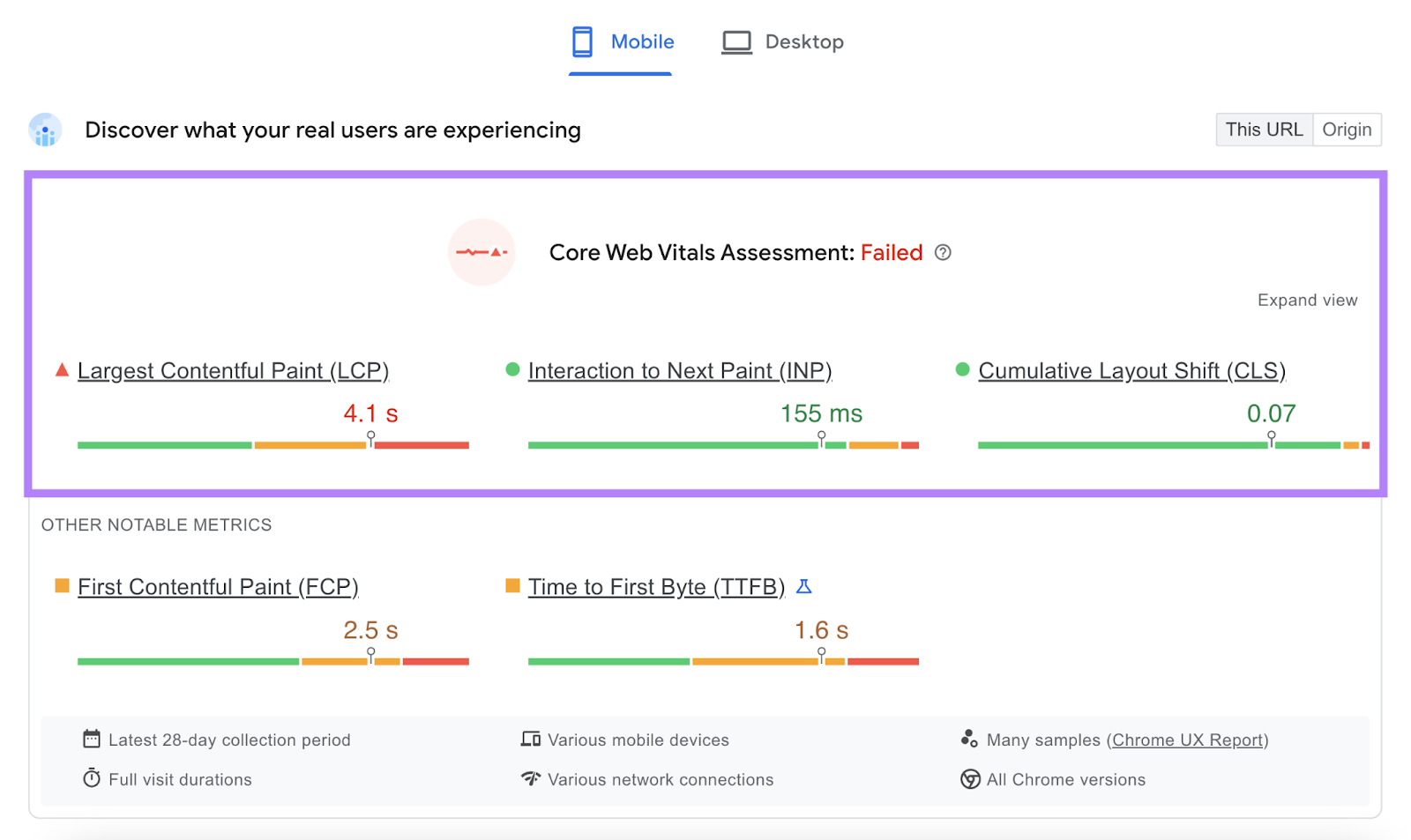
PageSpeed Insights assesses your Core Web Vitals—a set of metrics that assess page experience.
The Core Web Vitals are:
- Largest Contentful Paint (LCP): The time it takes for the main content to load
- Interaction to Next Paint (INP):How quickly your site responds to user interactions
- Cumulative Layout Shift (CLS): How much your webpage shifts as content loads
To use PageSpeed Insights, enter your URL into the tool to get a full report.
![pagespeed insights tool has url entered](https://static.semrush.com/blog/uploads/media/dc/80/dc8098ac96b06fdbe9b96c1080d7c6ad/b5879f8b7c61e2632f6539e557ebce3d/AD_4nXeTZ_b9PnfoCVdNfdYtXgmM2w6TNoH_RY8ausBMPCatb9O5YKyTpNp1LZUuXYXqF4E6iItj4BUTcjlwugFU5Jvbq_W5_SlcA93Ulp2ey8vnsyz2Wvl1hxqGofgj0m9HwOmCKYK1.jpeg)
Your report will look like this:
![core web vitals assessment shows metric like LCP, INP, and CLS](https://static.semrush.com/blog/uploads/media/f4/09/f409e8827967195e0649d87b227265b5/3671843d046d8361168a47d0fe0e95fb/AD_4nXeo_ul3sQ4Ff9CJZyY1EyMJ4OzAglh9vvXfWv9c5BTSa-N1QcMjnt2b40qXJ9qwhZO6XU0UN5yl54wbIztRjYeV8KnxXeLQGxCcOu2Zcel6gamUb9g-H0botzYBejaLU1nvntv5ew.png)
The tool also provides a Diagnostics report that lists existing errors.
![diagnostics report](https://static.semrush.com/blog/uploads/media/81/ff/81ff4da7a543948ed5e378a58049ea5d/6e2a90f2c3c827c605fa948f7744826f/AD_4nXcLI5BFbVCbySs9SxIoKZ1y_4RWKP8cblMk1168i77LHuvKauZP5HYnj-3wSPLa8VqVS9T3uU0Mnmf8lTiCauTSqbd2QwtEAHpIcZSbbImvKwtx0OapvZYponyrbfgjzPUnrl1F.jpeg)
And includes suggestions for increasing page speed.
![opportunities report](https://static.semrush.com/blog/uploads/media/6b/4c/6b4c49c49251e908f3e50967b95b6960/387a0347bf1aebbe20863719663294e3/AD_4nXef3H-s8uKAAEbv9Ja_gpxK7mXLO01M11SOz714oJxwoBB-B8WQkKHOsHspGuBnR7svsqSM9fgK3J8LE5svOPuPoub5it1FGUz0eGrqZ_9riiGbUKYPDy_jlWYdiH6DcLgkVLs6.jpeg)
Improve your page speed to enhance user experience and show Google that you’re quickly meeting searchers’ needs.
5. Optimize Title Tags & Meta Descriptions for Mobile SERPs
Optimizing title tags and meta descriptions can improve the click-through-rate (CTR) of your page.
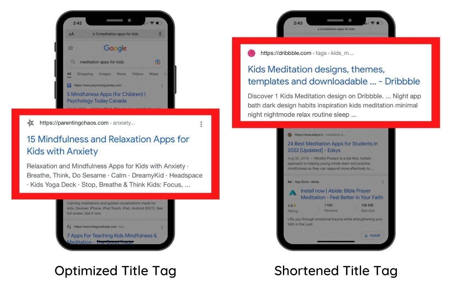
To optimize title tags for mobile search, keep them between 50 and 60 characters.
![mobile title tags show the difference between an optimized title and a truncated title](https://static.semrush.com/blog/uploads/media/19/1a/191a830c9453c04b7306bec4118ec8c4/f56466de88321c9d8c043a5650ef0c50/AD_4nXdXobqPYQolr97kcIETO6fhD4QSxVpqBdt-RuIFCEQfvCRVdVYO8e-mjSZwDDAg8z4M2dTCj5LJeFUWxu8zG4XEemAzaUwqzP1GhmUjEKgtE4ibvnpmu89xk3K8zvjfZz47HL7umQ.jpeg)
Google shortens or rewrites 99.9% of titles over 70 characters long. Titles within the recommended length are less likely to get shortened or rewritten.
Additional title tag tips include:
- Targeting one primary keyword
- Avoiding keyword stuffing
- Making each page’s title unique
- Front-loading important information
For meta descriptions, keep them under 105 characters.
Longer descriptions may be too long for mobile, and Google might cut them off or rewrite them.
Additional meta description tips for mobile include:
- Summarizing your page’s content
- Using unique descriptions for every page
- Including your primary keyword
- Adding a call to action or a value proposition to encourage clicks
6. Monitor Your Keyword Positions on Mobile
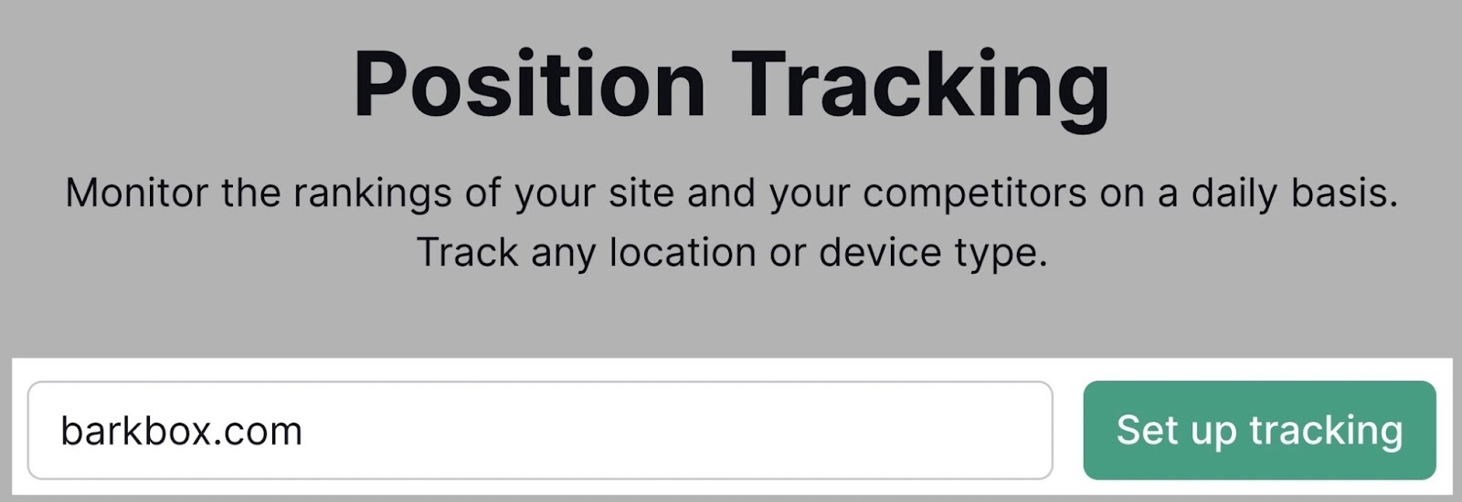
Track your mobile rankings by setting up a Position Tracking campaign.
![position tracking tool has domain entered](https://static.semrush.com/blog/uploads/media/90/aa/90aa753fde76a630a495588202c50861/9d8a03a6112b0f20fe4952d1667457bb/AD_4nXdu5IY2HttNRhXmPn3uNfK7IDN0ssVOziths2H0sK0Onb0_7f6dOXVoVFegui9pdVbET-7ELjxN6ZmDhdvUx8XRWDucIFj5YA6oNA8YWsSPsQBGUV4oDGoNVbrun9Gu4FyfBwR9ZA.jpeg)
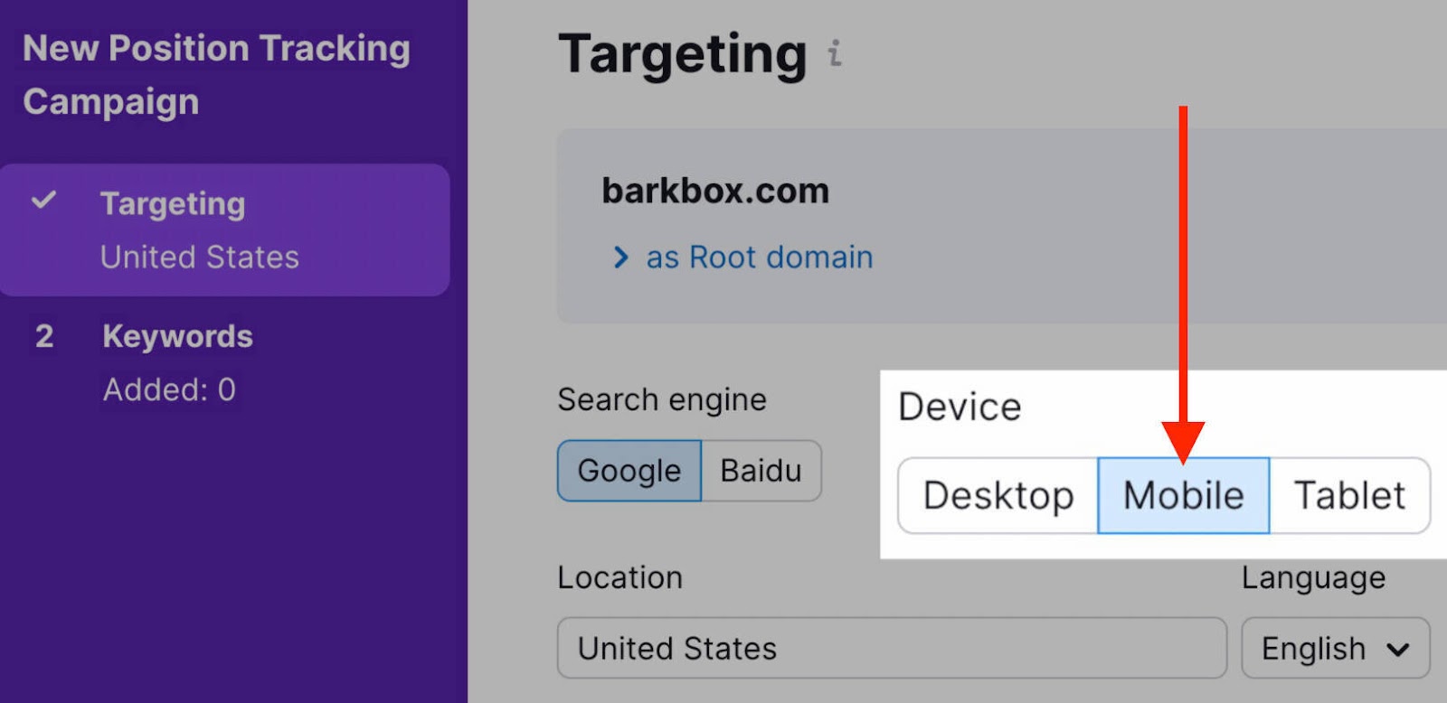
When creating your campaign, select “Mobile” under the device category.
![mobile targeting toggle is on](https://static.semrush.com/blog/uploads/media/62/b2/62b27bf6761b014390c8efb91f5e03a1/7284ec2cf9bf187b1d1dc325d314c93d/AD_4nXdOKGVBcyU3Ra1AiThzwMomSd1zB987T-tWazQwrXX5cloI2MPmgYatIK4neVZ6eGlAggFtMZTdYeWNvHQ7ujNPv_kRDY6psaaLVkcziXA-BwBftqKbWNC2zqsJaMxdhcynJ4Ww.jpeg)
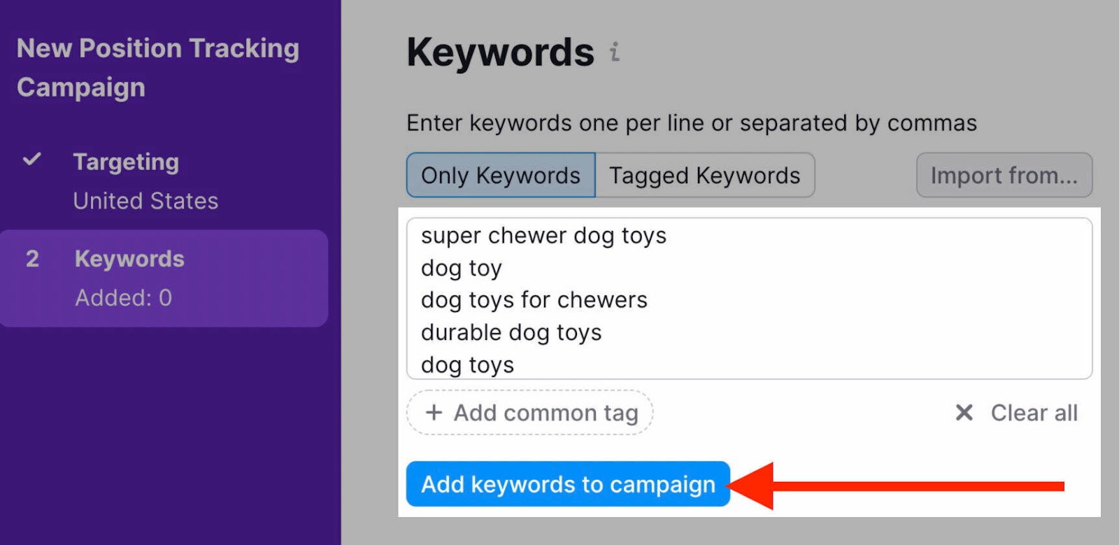
Enter the keywords you want to monitor. Then click “Add keywords to campaign.”
![keywords are entered to track](https://static.semrush.com/blog/uploads/media/ff/19/ff19c927fa55a892b68944980d4d75e7/ef0ca9a085bd32a7bc25b7cff71ea61a/AD_4nXfz8UavCzhjVQjSwu3JyQ0Su34tmRQFtbfOmNFt2meXPoMYj47Ak4Wlm2oWQ8dvZYlKn_UvnhkgqfTJkCynOumkRoKW_PYJIvAucpcW8FDRkOAemRgHxPP3bM3DsPz2Ql3FssE0rw.jpeg)
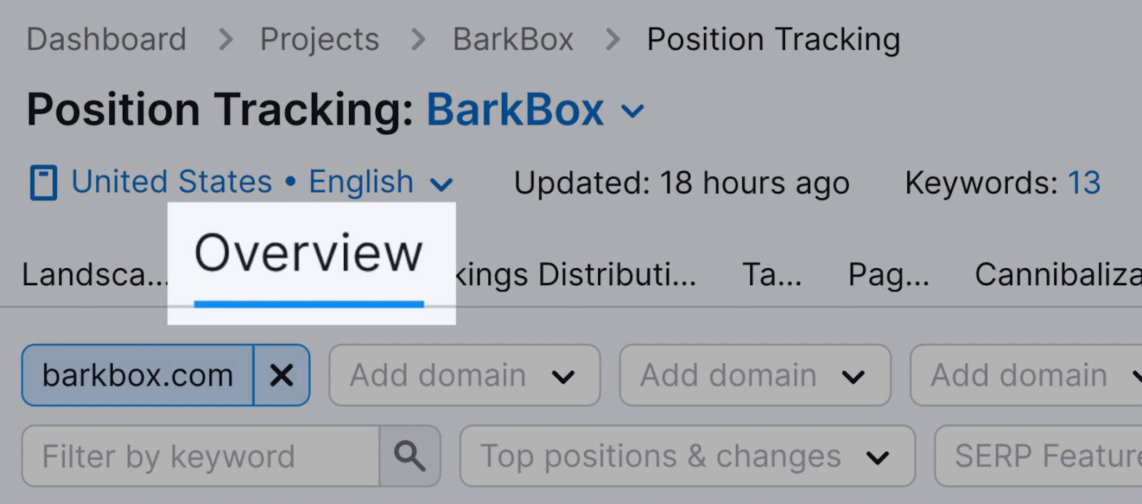
Once setup is complete, go to the “Overview” tab.
![overview tab is highlighted](https://static.semrush.com/blog/uploads/media/44/0c/440caaee23fb8d6599881779774a5e4f/a51471a59fe0e4348be8268fa8a612bc/AD_4nXcqME4Ior5uYkjY7hkAsNZgKY4TDsNSPTgpaTPaX16QC380N50UOny9Q5RlprWJAOvoUcwc4meQHfwsZPJmaK7fA-eVLlYgv0pfvNR_J7MWFMwvhm8RELD-M22v3jXTrgXlCjG96g.jpeg)
Scroll down to see an overview of rankings for the keywords you chose:
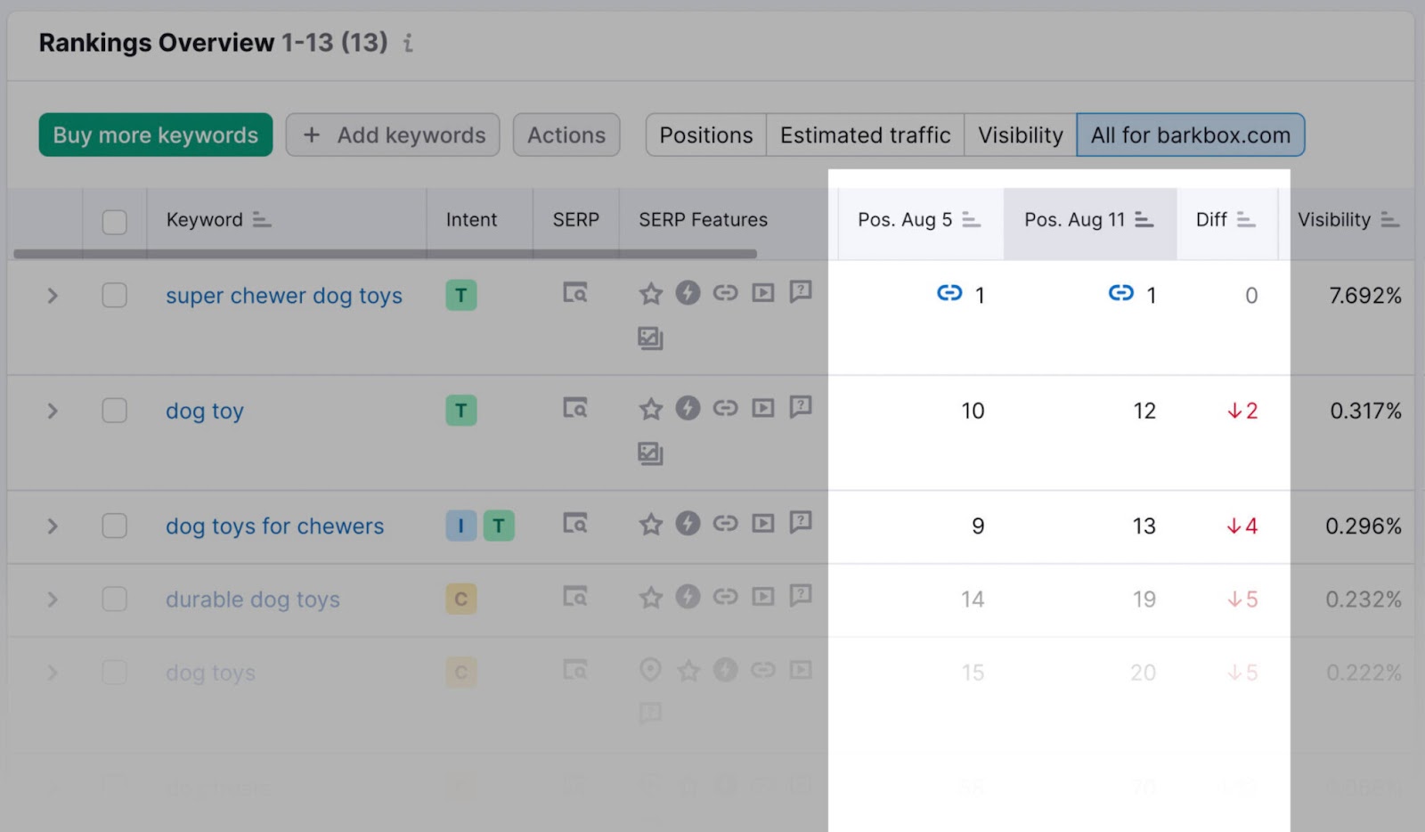
![rankings overview shows keyword rankings for mobile](https://static.semrush.com/blog/uploads/media/b2/e0/b2e0cc7bc643e9c8da71c661b022a198/4de0173a35cfb1cfc2612055c58a99a7/AD_4nXdiCZ4GJXryNDWs7jWMh2EPB0Rt-KxYh9Fvz4fKHzJnY6AFNxmpyznJBPWjPl4NTdd9yIqfd47ZVTFRiWuwGFhKwYshFfhbcT7k-qbhIKouJABwZniixwU5hcvHFkVyan2C7abjaw.jpeg)
If you have a Semrush Business or Guru account, you can compare mobile and desktop traffic for your tracked keywords.
Visit the “Devices & Locations” tab.
Click “Add new target” and add the same keywords you added earlier.
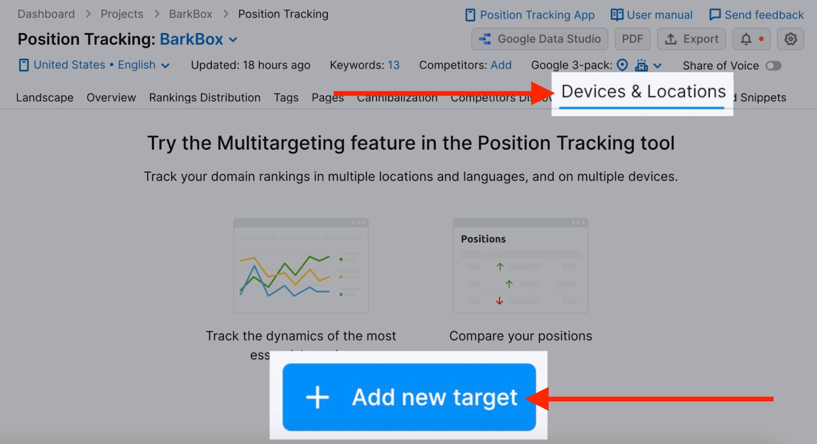
![devices and locations tab is highlighted](https://static.semrush.com/blog/uploads/media/a6/51/a651204f643c7e26337bcb581328fd61/b872afb47ebb256e5a8a4282a84c647f/AD_4nXcLb_yLnmqqvsbNeoHjaWTv7pGcQoxKFW5vXFapLzMSTul-NDRFVnGkScR_8SqElu6DAjd-5ykjLpFFSPpNN4kXq0eNCylWEImB_Oj6eY20VD4Un9wrFcN0E-4TmeKeLpRAUu1M2A.jpeg)
Select “Desktop” instead of “Mobile” this time.
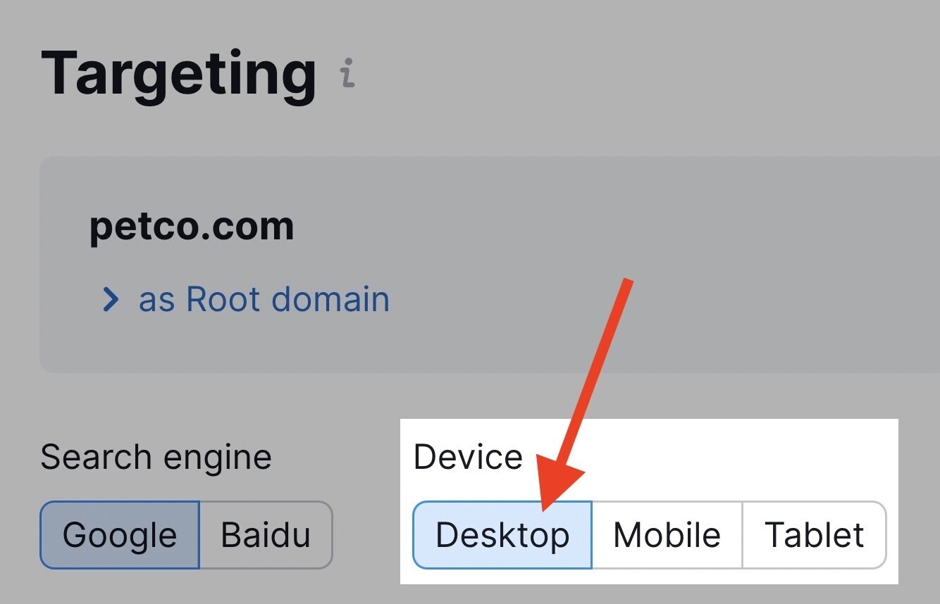
![desktop option is highlighted](https://static.semrush.com/blog/uploads/media/b5/cd/b5cd5716ed975a43ad1c82a7da4ffc75/43493affe488ff58cda942dde258c3fa/AD_4nXfhsIpHzZBhDwrIM0WwEyrksv6Qw-PRDCf5VDwDHNmhz0DRWnccW_C2D9Cl8t8mAQtqtLv1xl9clDqLHcJgR1XOt87KXbLAA8BpZlDnOHUUlVIqpEtFQnOOGZ016cpZc6BZ8dxqKg.jpeg)
Now, you can see the difference between desktop and mobile performance for your tracked keywords:
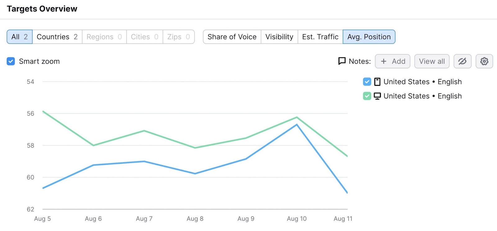
![targets overview shows mobile vs desktop performance](https://static.semrush.com/blog/uploads/media/3b/bd/3bbd92c79c952dd2cfe04b902997a888/3dee994eebc2fe8f2a8a8e5e393155d6/AD_4nXczrGc7PZC0FO1Y3so4xaz1S9-WOIW8IgkUcMiMXs3U5a6sKKLiOKsFyHfL3eb8Uam5QFNL2IUb9bokJIy82AqYL-bgbuA5ymFBSJAow7Xf0Re8s7Ej12MB-LUo-WyVELHBP7m0tw.jpeg)
To monitor your keywords effortlessly, click the bell icon at the top right corner to subscribe to weekly email updates from your Position Tracking campaign.
![position tracking notifications bell is highlighted](https://static.semrush.com/blog/uploads/media/5a/07/5a07910862f7449a2b24b2dc26758350/06ac77e88ca42791a7f596bcf8745ff6/AD_4nXc_LKNNSGsQJ9j9fpP8Pqf9XW2Xxj469Nlos1RDaXqYMivI2CRE0xGBEYZFT66J37Ay6CxDhOnH7ZOzdsmTw-Evh93g3ZbKftlpj3uCUH13KRV8WXaCQP6tb1FD12caEDmcmaCgeQ.png)
This way, you’ll be notified of any drops in your mobile rankings and can take action before they significantly affect your traffic.
7. Review Your Competitors’ Mobile SEO Performance
To review your competitors’ mobile SEO performance, use a competitor research tool like Semrush’s Organic Research.
This tool allows you to find your competitors’ keywords, discover new organic competitors, and observe domains’ position changes.
Start by entering the domain you want to analyze.
![organic research tool has domain entered](https://static.semrush.com/blog/uploads/media/2a/7f/2a7f11e15196e90f1dacbddbdf0d46ba/1673af91a36f82b4ce7efaa33009447c/AD_4nXd8SiBCNn4qIztmQ8hrsdap7QLIr40O4RnS4LDFNjb4x52NB-db98m-wAqs75VS9p9o0hvCXD1C4b_9cAwdwDMi2LMGHpWiJSEbVAYfQDXDotZ4j6CGTLArXolSEOUZHk3BZ6xAuw.jpeg)
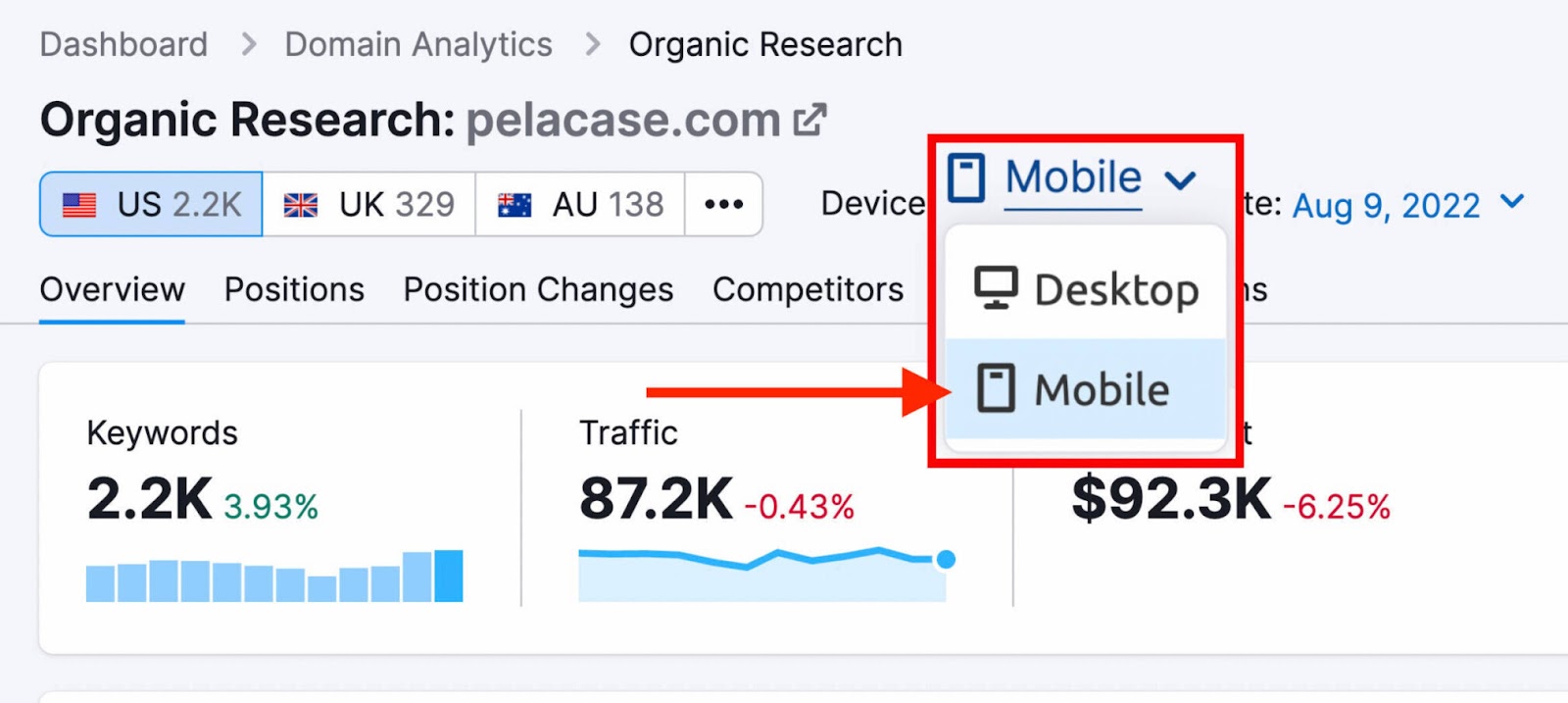
On the main overview page, toggle the device setting to “Mobile” to get mobile-specific data:
![mobile option is selected](https://static.semrush.com/blog/uploads/media/8f/86/8f86a02afd7625dbf8640e3aac2c5842/f6d56611eb2f0c4e70bf49edabc8bcce/AD_4nXcGiPos1RNah0pdlBcncdRnGjYAQ_d9pJPAiPAe9nOwHFIWCpu4C06x37-QJ60GZlwrwPvN9DSMDKYwSwg7X_EdmJfcOsQhgAYrsIiQJORaMlXmTApPURUPr_MshbrW5R5_XDXc-w.jpeg)
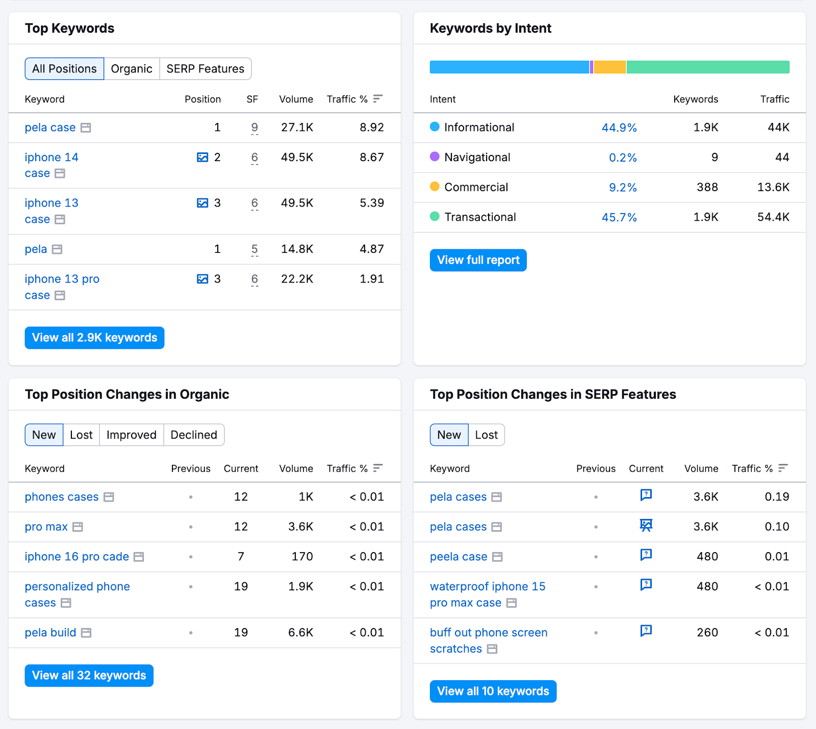
Scroll down to see your competitor’s top keywords and position changes. And click on the corresponding reports for more detailed information:
![the overview report shows top keywords, keywords by intent, top position changes in organic, and top position changes in serp features](https://static.semrush.com/blog/uploads/media/87/20/8720b98f8f1cb3f40c9ba78437de07ae/894e6b6ed01f969a73c16152d38a730f/AD_4nXdsTUHoFI9ODRwbxDfoIZVXDBfb0aDu_9x1cMgRlo0k9caUXTq0udnCXitokUo179BrZXbFuixq63NAZGG5ihgMFwfXdr4JlejrDAV63EvjIDDba3e5kJmOg76ak8yr2qaho6hd.png)
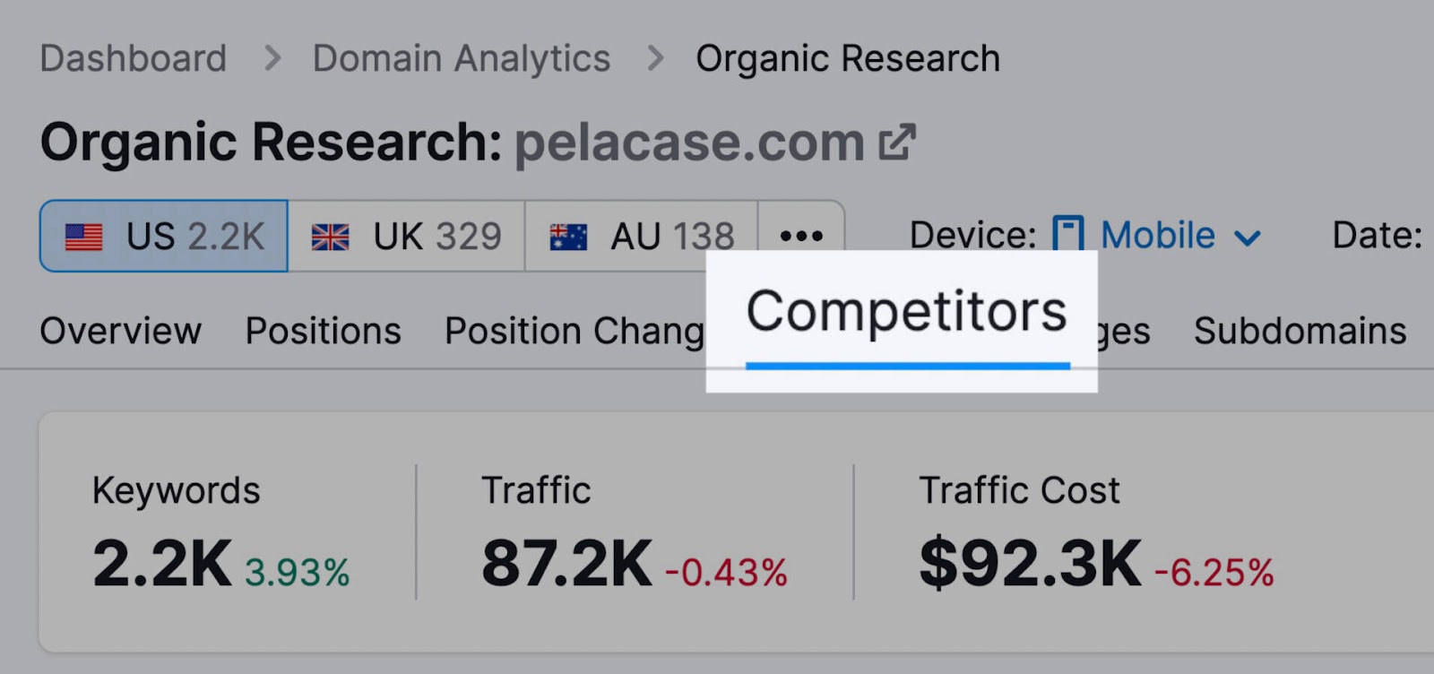
To find related competitors, click on the “Competitors” tab at the top of the screen.
![competitors tab is highlighted](https://static.semrush.com/blog/uploads/media/5e/0a/5e0a8f91fba322a0d67a527488dbef02/46fbd134463185d0e4d3faeff851f7cb/AD_4nXemlsoAD-pvFu_v9IqAQFRTs8k5i8cwLP8C25g-_0kTGTTsFAAnfemzNeMSVYkqnowWBfY-qWeFnuMtaRPgs6VLdw2j5bhKr5Gfzopk6w2GkzyIwd2TzDUtuZNFbYWbl03gCEAAaQ.jpeg)
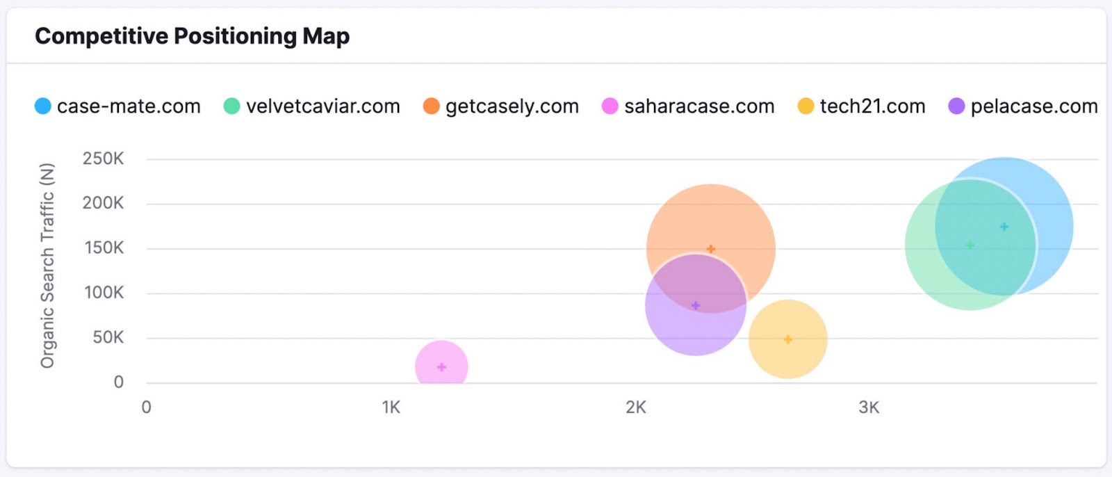
You’ll see a Competitive Positioning Map highlighting the top competitors, along with a graph that covers shared keywords, competition level, and more for all competing sites:
![competitive positioning map shows domains by organic search traffic](https://static.semrush.com/blog/uploads/media/a4/ab/a4abdf309396d10b8babefed6d27fd95/a19b066b86833cb8d4409aacace8248a/AD_4nXctUo7OhNWqCrWBkQ0pYhw7-GgNdcsQDWggxGAo00dcn6OQ34SkkePc96c6tvhAS2eCQJrvPY8eMlDc1UO67-PtVU7NoGss_vXovekEgeAbisSDZmJFCJQQmEv-QA7HUONfA9b7gg.jpeg)
Another way to find opportunities is with the Keyword Gap tool.
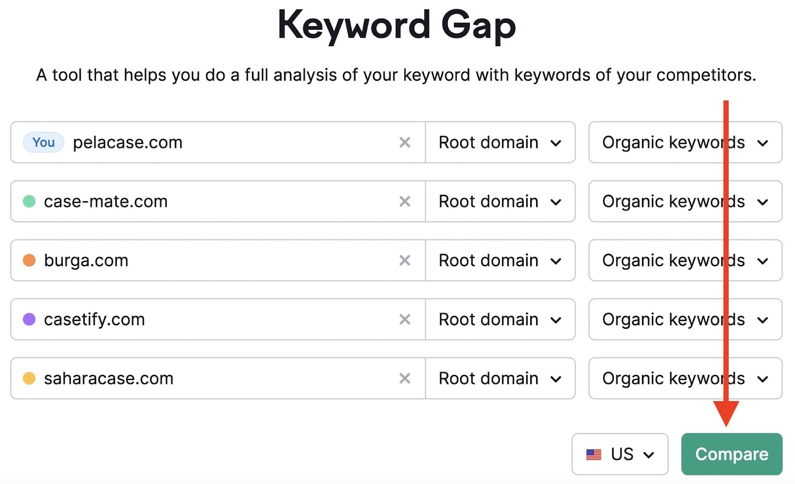
Go to the tool and enter your domain alongside the domains of up to four competitors. Then click “Compare.”
![domains entered into tool](https://static.semrush.com/blog/uploads/media/7a/90/7a9004954752f7c8572346d3f684acd8/4367aecdf12eeae56fb5f3057f3e9419/AD_4nXcTqZdJfHjmyeZNNUjvpsgk698uzKBzVsDGGUpHvl6EmP4UrvWbSnYuMRMYybHRV84DigpLi1VYdw0Xkp6aPJYSNw8-phoZXEzRAZCf-RTvHGRnoYAQJKS7vkYGOcdou2oHIOFi.jpeg)
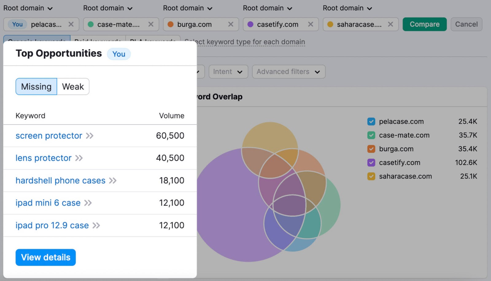
You’ll get a report containing a list of keywords that your competitors rank for (but you don’t).
![top opportunities widget is highlighted](https://static.semrush.com/blog/uploads/media/1e/b3/1eb367537f8a87cf639b02bd709083ec/4d8b629eabb4cea5766156893e6db899/AD_4nXdOTC6qDQXzqi-LYuKc85bAgOn4NFCyOs63Cc1C69AzaHxGVWgC6O4qETYUgmcIx4yeKIP0KefVO8MDYFOMUuOgyRVL0N5AN6VU-wL3_c52-RibuZetipCfrL3qNGya9IOvEqOLlQ.jpeg)
Below that, you’ll also see a table with more keywords including data on how you and your competitors rank for each keyword.
![more keyword details lists keywords and competitor rankings for each](https://static.semrush.com/blog/uploads/media/d7/04/d7042d82a16fef68742afd46e8bbe3e6/2f0787b8214e77ca1ee81a3020855c54/AD_4nXe2Z2dDJk0_iufDdqVcf1TOxkIz_dAz0f2tjkFeEW_gQtc7DDhUdhmIs3TN3_9orSWDWcWxlPT-EoA29e4mDXnm7tJKQgri3vSIVXx00eKcRl74BG-eAxdfn3B9L9U3yJnW_ozO8Q.jpeg)
Analyze your competitors to find keyword opportunities you might have missed.
8. Compare Desktop vs. Mobile Site SEO Performance
Use Google Analytics to compare how your pages perform on desktop vs. mobile devices.
Start by logging in to your Google Analytics account.
Go to “Reports” > “Acquisition” > “Traffic Acquisition” using the left-hand navigation bar.
![navigate to traffic acquisition report](https://static.semrush.com/blog/uploads/media/5a/1d/5a1de4fe9974a474a20563426e53a3f0/c8ae2f00c4d5befb6582038e21a10ebb/AD_4nXfqLbVlgrSLYDEs7BQ-uNO2rChHB3aawBTmO0fYkA09wjhoKaBycKnwLANgsCXi20NH0t53I1VuwLHdncGIakNbiU3cPzKyO3e7o05Ub0HVI1URP6kLKfsZIzl5EvhzcJs1vnPNCQ.png)
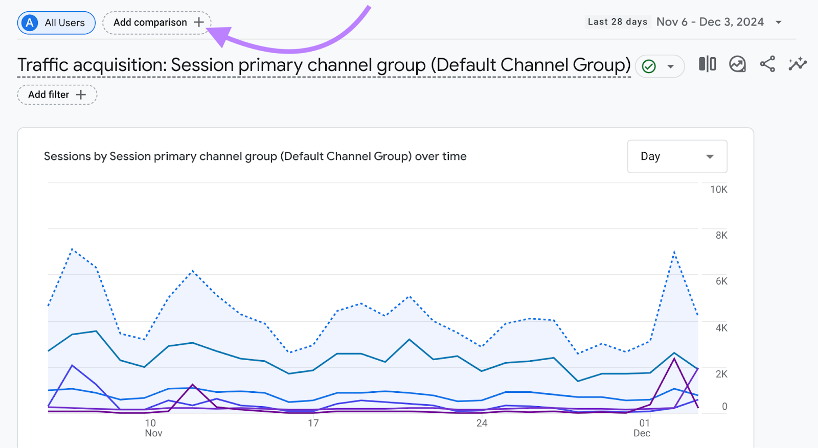
Then, click “Add comparison +” at the top of the page.
![add comparison button is highlighted](https://static.semrush.com/blog/uploads/media/09/59/095991e176c6c569b1ce77c24cccd188/4a9f74672658faae3bff96528fdd2989/AD_4nXcAM_TNqwqm9ixjtvlacpr7O6MVNMNdqFWnXty6itOYoDG7lfDFOmqoBXr8x32VC5rpXhVCfhnxdeURBzh00lfsO2ShjYbx4Xv-nXF0nIdtUjH331uUhLw95f6gddl19T5WuMNdJQ.png)
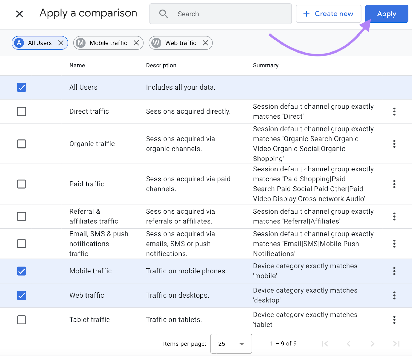
Then, select “Mobile traffic” and “Web traffic.” “Tablet traffic” is also available.
![mobile traffic and web traffic options are selected](https://static.semrush.com/blog/uploads/media/af/2c/af2ce52fe6265f4e8028b442a11cae5a/ed9f03f9f3ca1b490d0b594ddde43f5c/AD_4nXc-0jXD1vjimf-P38Bs0ONoenFdAiQBTii6l9lBY6ZzjfJIFqO_XvaXMlkejGtkGomoXenxD8UfZxhUX4qXjfyFGkeRbojY8hdZOOzNG0Exlptke37qcyjN10-08qzC_hT9dC3GFQ.png)
Now you’ll see a graph comparing mobile and desktop traffic over your chosen period.
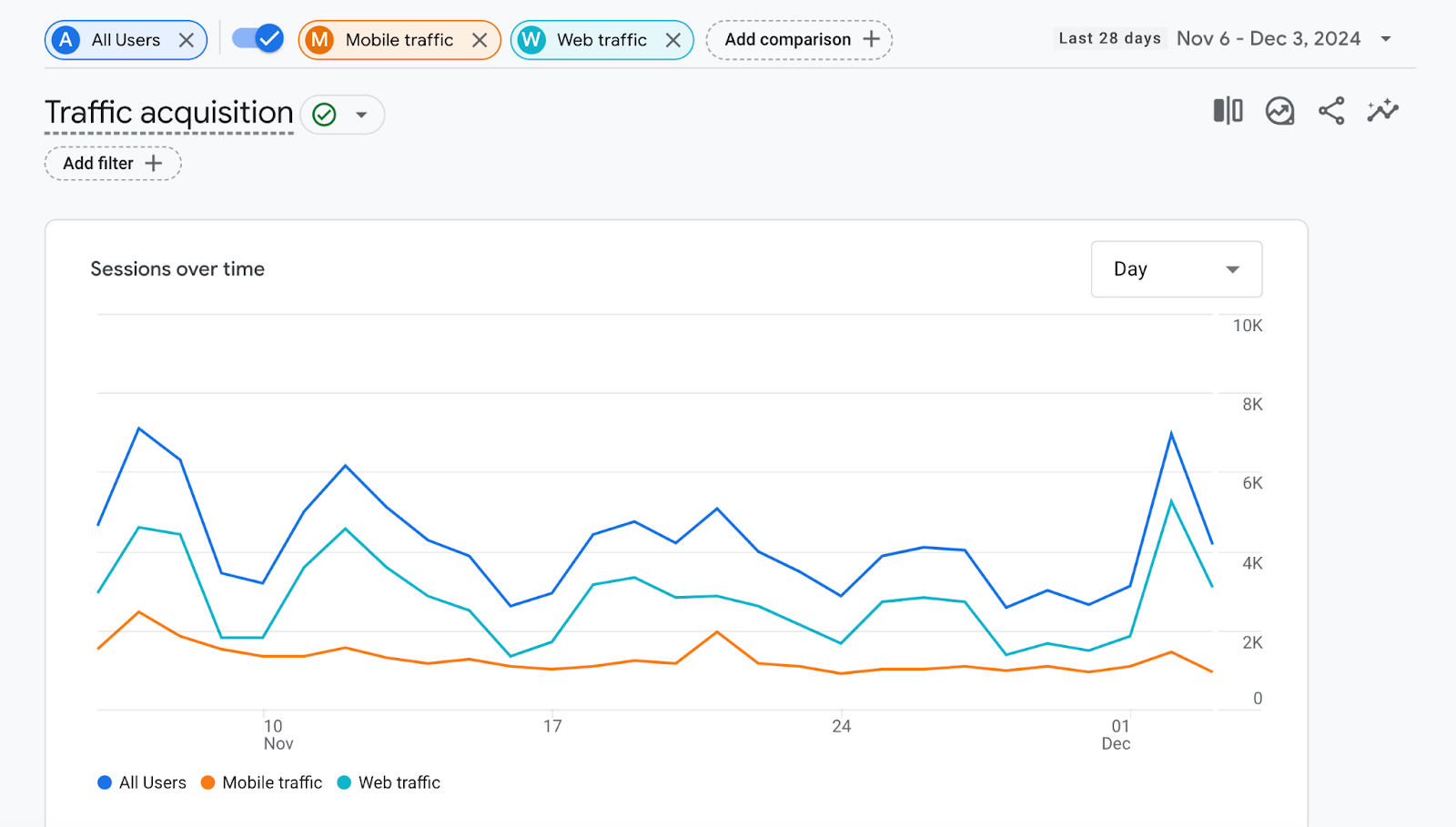
![chart compares mobile and web traffic over time](https://static.semrush.com/blog/uploads/media/48/c0/48c07aca12ad8eb33aeada4b4e466edc/d38be1ce32e24eaf07927fe85c8e2aa8/AD_4nXegwoYiaaiw4nzTGE5iqJkJLzBmefRR1YH7ZnnXvrW2vYC7WCGQxx5b3xu3RyRwlqmqdp-6fJw0Hwq9gfBTaAeY0sETqO4HF1o3nFZ5uot4FJLcLFRKs--hHKP5G6mvjSVMAKoIUQ.png)
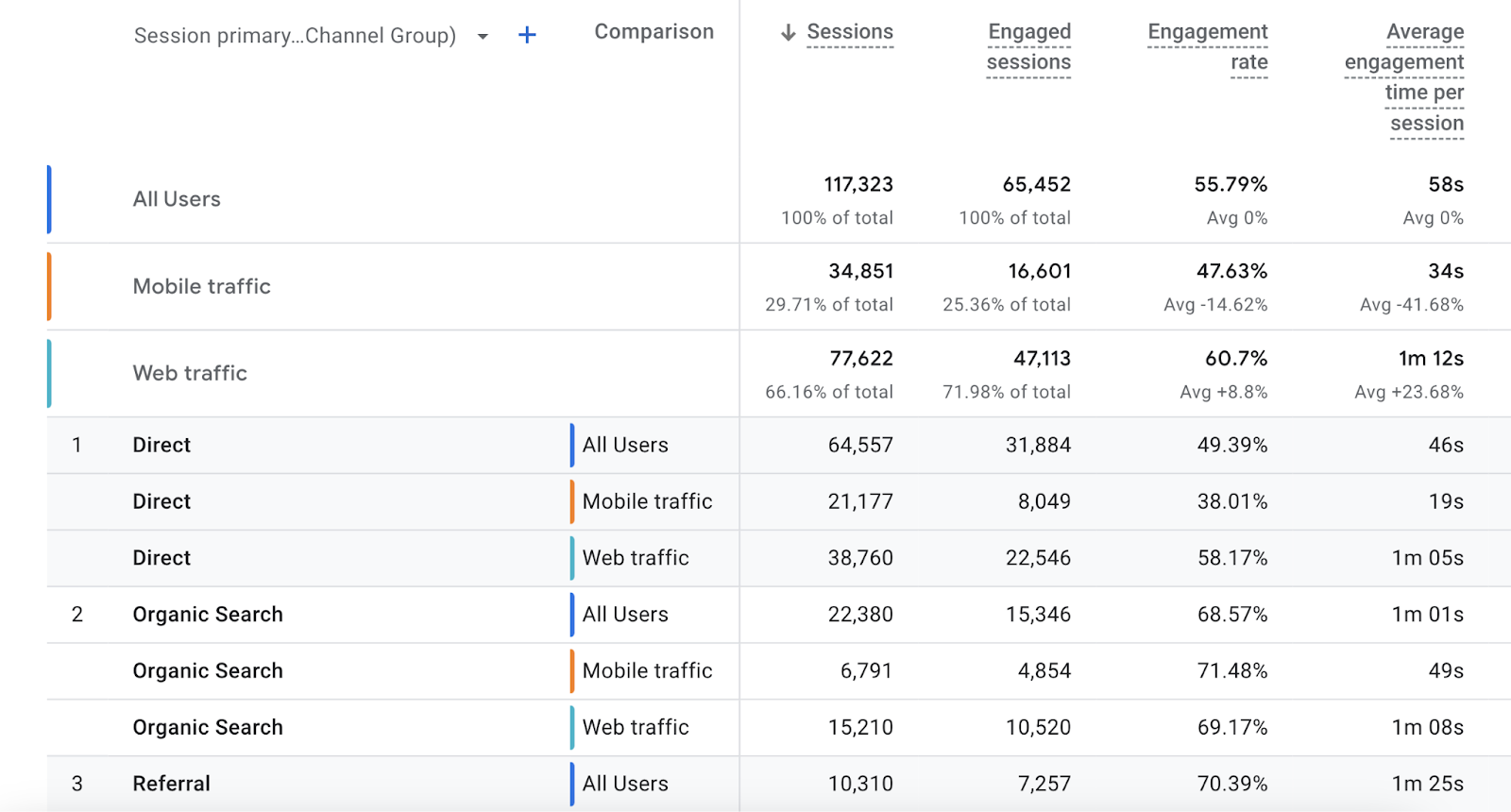
Scroll down to see a detailed breakdown of traffic acquisition by channels such as organic search or direct.
![table provides further detail by channel](https://static.semrush.com/blog/uploads/media/02/71/02716727466b1111c504e7eb416c9b17/25e531f66e61f9cdbe7df53c85347842/AD_4nXcLhT0KfsJK7-a7iEZi7eJZ9oQegy9DKA9AC63KOkpXv4zx_qGutUfU5Bqbi9zOEQK1or4Czn9ZCMI4LScWKW1fVZacp5H4Fre1OxvJQhv7Fg3Ba6Kt-UoJcHGe-9_jNb3-mAaI-Q.png)
This report provides valuable insights.
For example, it helps you monitor the results of your mobile SEO strategy and verify that your efforts are leading to organic traffic growth.
Supercharge Your Mobile SEO
More users are choosing mobile devices over desktop devices, so it’s crucial to ensure your site is mobile-friendly.
Now that you understand mobile search engine optimization, apply these best practices to your own site.
To test any of the Semrush tools mentioned above, sign up for a free trial today.