A great website is an effective way to showcase your software and build trust with your visitors.
What makes for a great website?
We’re about to uncover what sets the best SaaS websites like Slack, Shopify, and Stripe apart.
But first, let’s jump in with some quick background.
What Is a SaaS Website?
A SaaS website is any website for a company selling software that customers pay a subscription fee to access.
These SaaS companies can be business-to-business (B2B) organizations, business-to-consumer (B2C) brands, or even both. And their software can be related to many fields—like project management, accounting, design, and more.
And the best SaaS sites clearly show what the software does, are easy to navigate, and look professional.
What Makes a SaaS Website Great?
Here are some specific elements that make a SaaS website stand out from the rest:
- Using clear messaging: The language on the website should clearly convey what the software does and why it's useful to the company’s target audience
- Having appealing design and navigation: Good aesthetics and intuitive navigation provide a good user experience that makes it easy for visitors to quickly find what they need
- Including social proof: Sharing logos from existing customers, impactful reviews, and real-world success stories establishes trust and credibility
- Featuring transparent pricing: Making pricing options clear helps users quickly figure out if the solution is within their budget
- Publishing helpful content: Sharing blog posts, guides, and other informative content that’s written with search engines in mind can increase organic (unpaid) traffic
- Offering multiple contact options: Letting customers know all the ways they can reach you and at what times can build trust and reduce potential frustration
- Highlighting integrations: Maintaining an integrations page helps users understand how the tool could fit in with their existing solutions and workflows
- Offering a free trial or demo: Giving users an opportunity to experience the product first-hand helps them decide if it’s a fit for their needs
26 Best SaaS Websites (B2C & B2B)
Now, let’s dive into the best SaaS websites to inspire your own web design, messaging, and other choices.
1. Ramp
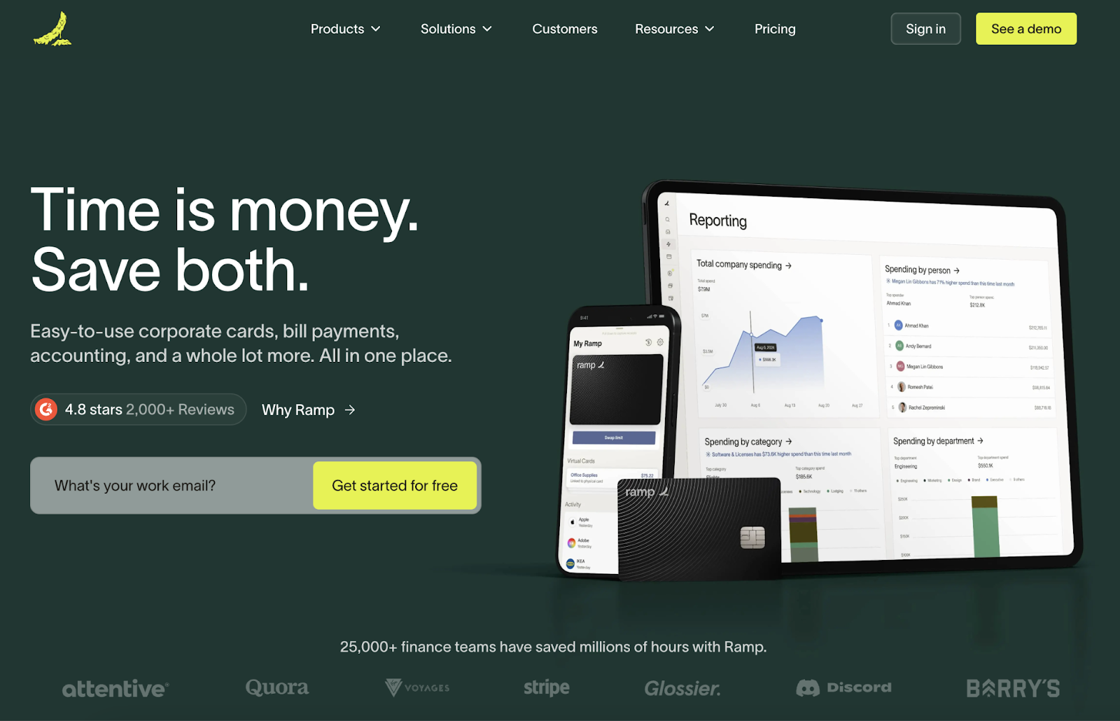
Ramp is a financial management platform for businesses, and their website stands out by emphasizing their clear value proposition.
The homepage greets visitors with a punchy headline: "Time is money. Save both." This is quickly reinforced by social proof in the form of a 4.8-star rating from over 2,000 reviews.
They use a bold color palette that contrasts dark green with white text and neon green buttons, making the text easy to read. And according to color theory, green can signify wealth.
Key Takeaway
Use striking colors and a powerful, benefit-focused headline to grab attention.
2. Slack
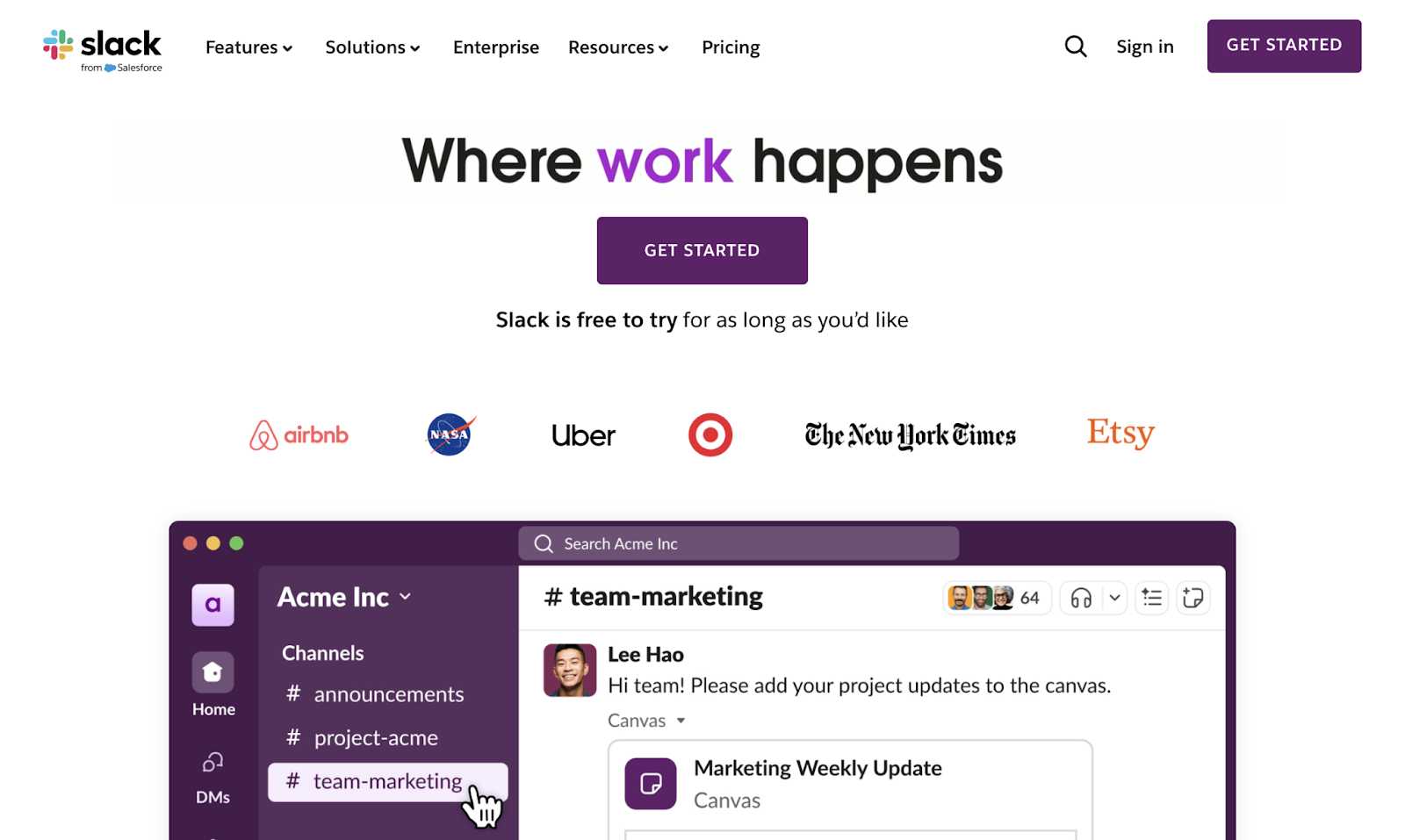
Slack is a communication platform for teams, and their website is one of the best B2B SaaS websites due to its simplicity.
The clean site focuses on the essential information. For example, the homepage includes product visuals, client logos, and a prominent “Get Started” button.
The colors are also typical for Slack’s brand. As soon as you see the dark purple, you know it’s Slack (assuming you’ve used the platform before). Which establishes familiarity.
Finally, the line, “Slack is free to try for as long as you’d like,” makes it easy for new users to give it a shot without any pressure.
Key Takeaway
SaaS websites don’t need to be complicated, so keep it simple.
When users understand what your tool does, they're more likely to take desired actions—whether that's signing up for a trial, requesting a demo, or scheduling a consultation. In short, clear communication can improve your conversion rate.
3. HubSpot
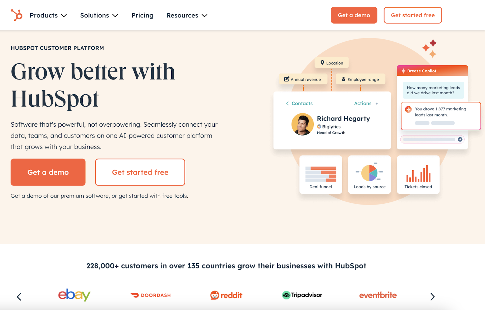
HubSpot’s site uses a warm color scheme and clear messaging to highlight their suite of tools for marketing, sales, and customer service.
Above the fold on the homepage, you can see a simplified preview of the software’s interface and logos of well-known clients like eBay and DoorDash.
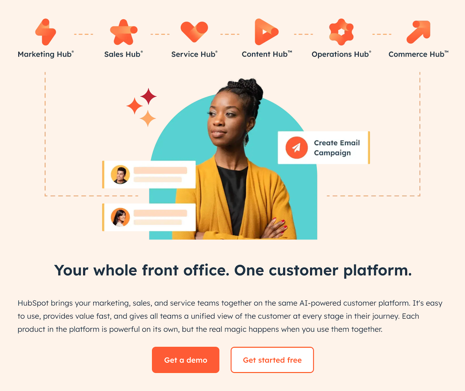
As you scroll down, the page highlights how HubSpot’s different solutions complement one another.
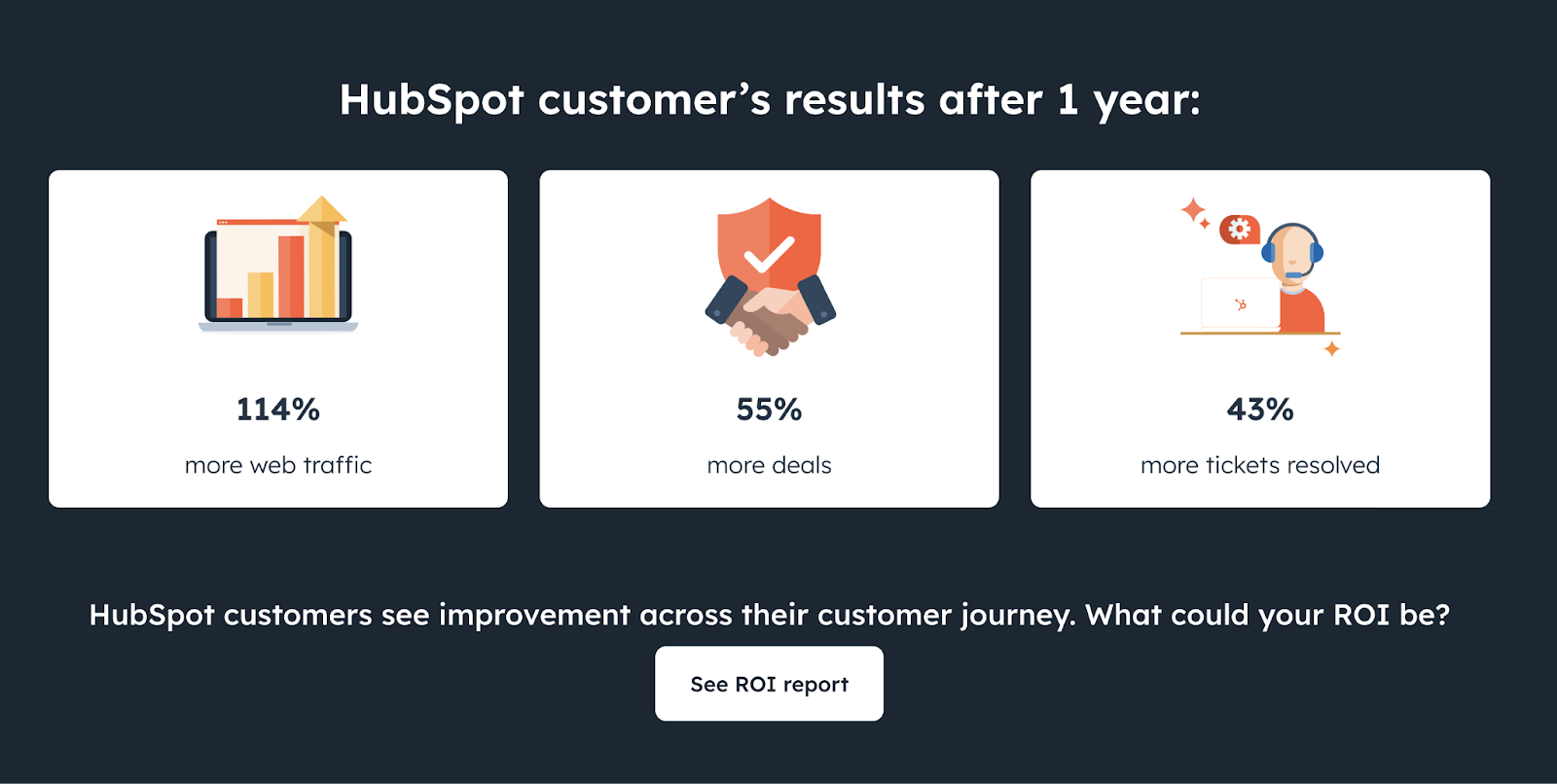
And HubSpot uses icons and numbers to share customers’ results.
Key Takeaway
If you're selling multiple products or features that work together, show how they fit as a complete package. And back it up with case studies and real results to prove your product works.
4. Typeform
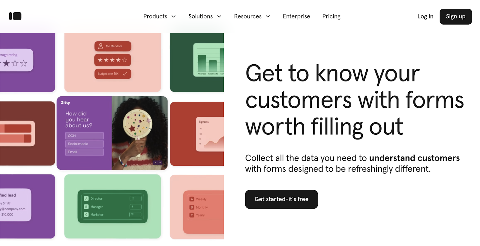
Typeform’s homepage showcases their product (a platform for creating surveys, polls, and other forms) with a colorful, animated design.
The headline ("Get to know your customers with forms worth filling out”) hints at the fact that many users don’t like filling out forms. This is a pain point for marketers who rely on forms for gathering customer information.
They do a great job of letting visitors know these aren't the bulky, overwhelmingly long forms people are used to. The subheading drives home how Typeform’s forms are “refreshingly different."
Key Takeaway
Put yourself in your customers’ shoes. Consider what they’re trying to achieve and how your tool actually helps them.
5. Monday
Monday is a work management platform with a streamlined website design.
The homepage leads with a simple headline: "Your go-to work platform." And the main focus is on the "Get Started" button.
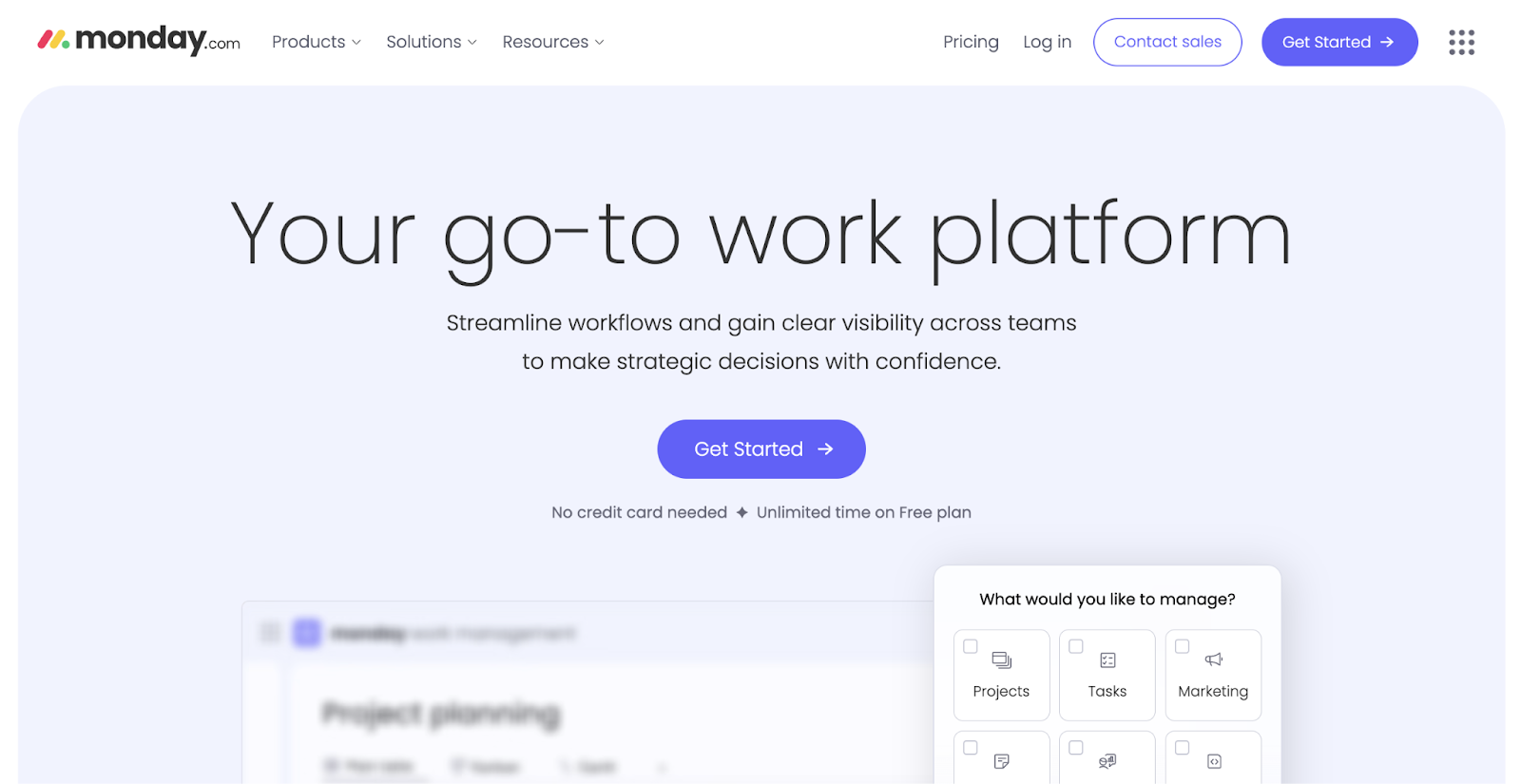
Their navigation features just a few essential tabs, keeping users focused on learning about the software without distractions.
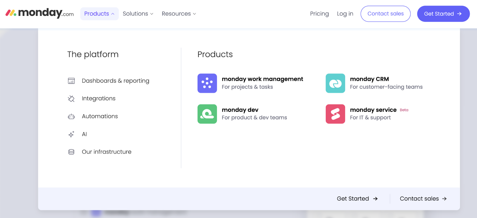
The main menu itself makes it easy to find key product information.
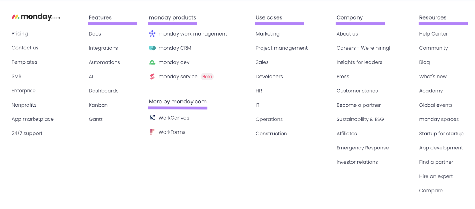
And Monday’s footer includes columns for each main section—like features, products, use cases, company information, and resources.
Key Takeaway
A thoughtful website layout with minimal navigation and organized footer sections helps guide users to important information.
This streamlined approach keeps visitors focused on exploring the product rather than getting lost on a complicated website. Which enhances the user experience.
6. Shopify
Shopify is an ecommerce platform that connects with website visitors through aspirational messaging and human-centered design.
The homepage leads with a rotating headline: "Be the Next [Aspirational Role]." And the role changes from "entrepreneur" to "founder" to "innovator" and on—to reach different audiences.
The tagline, "Dream big, build fast, and grow far on Shopify," speaks directly to motivated entrepreneurs and brands.
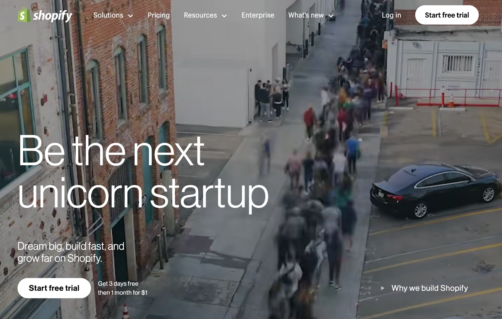
Throughout the page, Shopify features video stories of real founders who built successful businesses using their platform, showing visitors what's possible rather than just telling them.
Key Takeaway
By featuring real people and their success stories, Shopify creates an emotional connection with visitors. This human-first approach helps potential customers envision their own success on the platform.
7. Hotjar
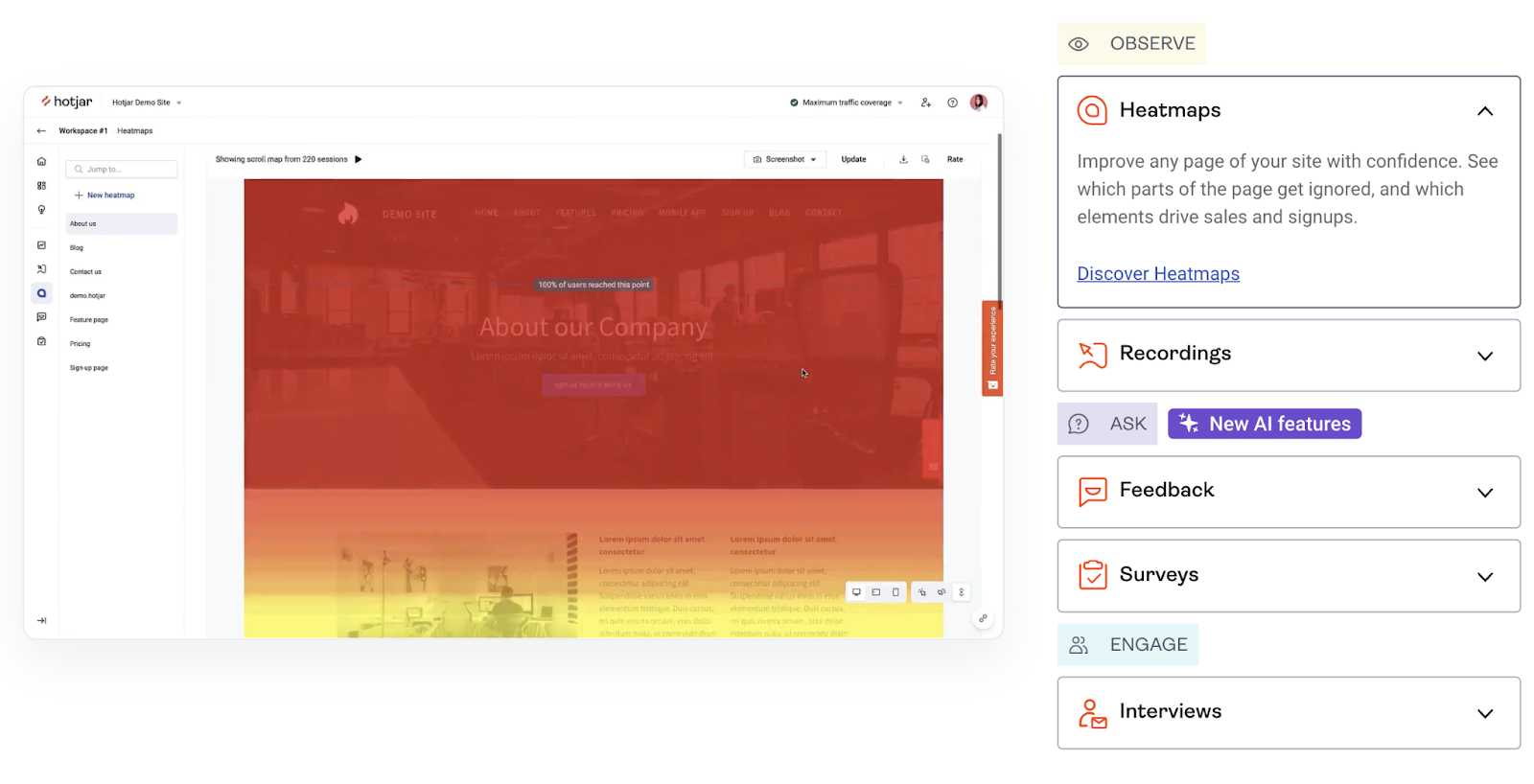
Hotjar helps companies understand how users interact with their websites, and Hotjar’s own site brings these insights to life through interactive previews.
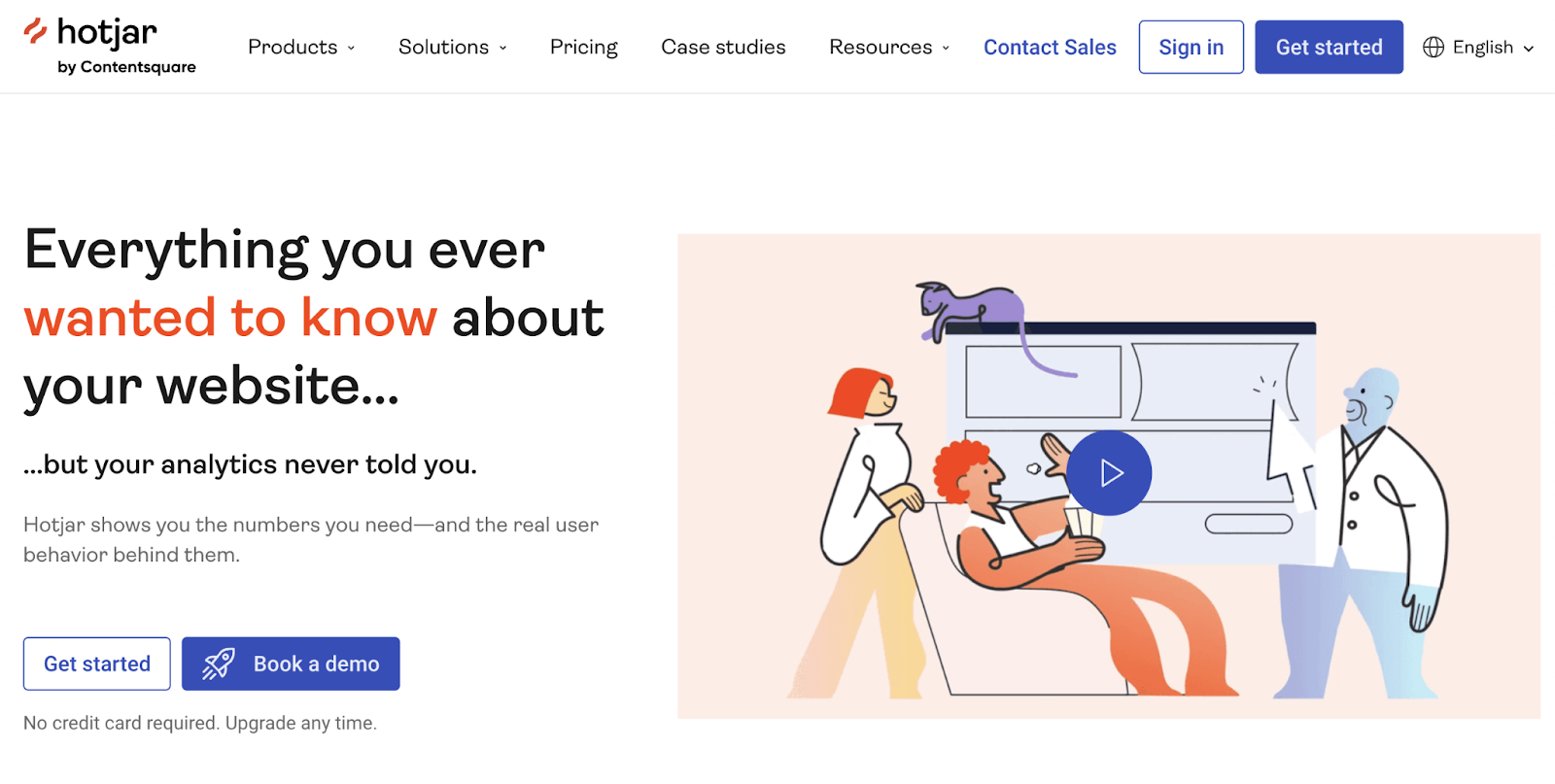
The homepage pairs friendly, cartoon-style imagery—which softens the technical nature of analytics—with clear messaging about data insights for website owners and marketers.
The main headline reads, "Everything you ever wanted to know about your website…” And that’s followed by the subheading, “...but your analytics never told you."
This explains what the tool does while sparking curiosity.
There are also interactive previews that show how different tools work.
Key Takeaway
By demonstrating their tool in action on an uncluttered page, Hotjar keeps visitors focused on what matters most—understanding how the product works and what it can do for them.
8. Calendly
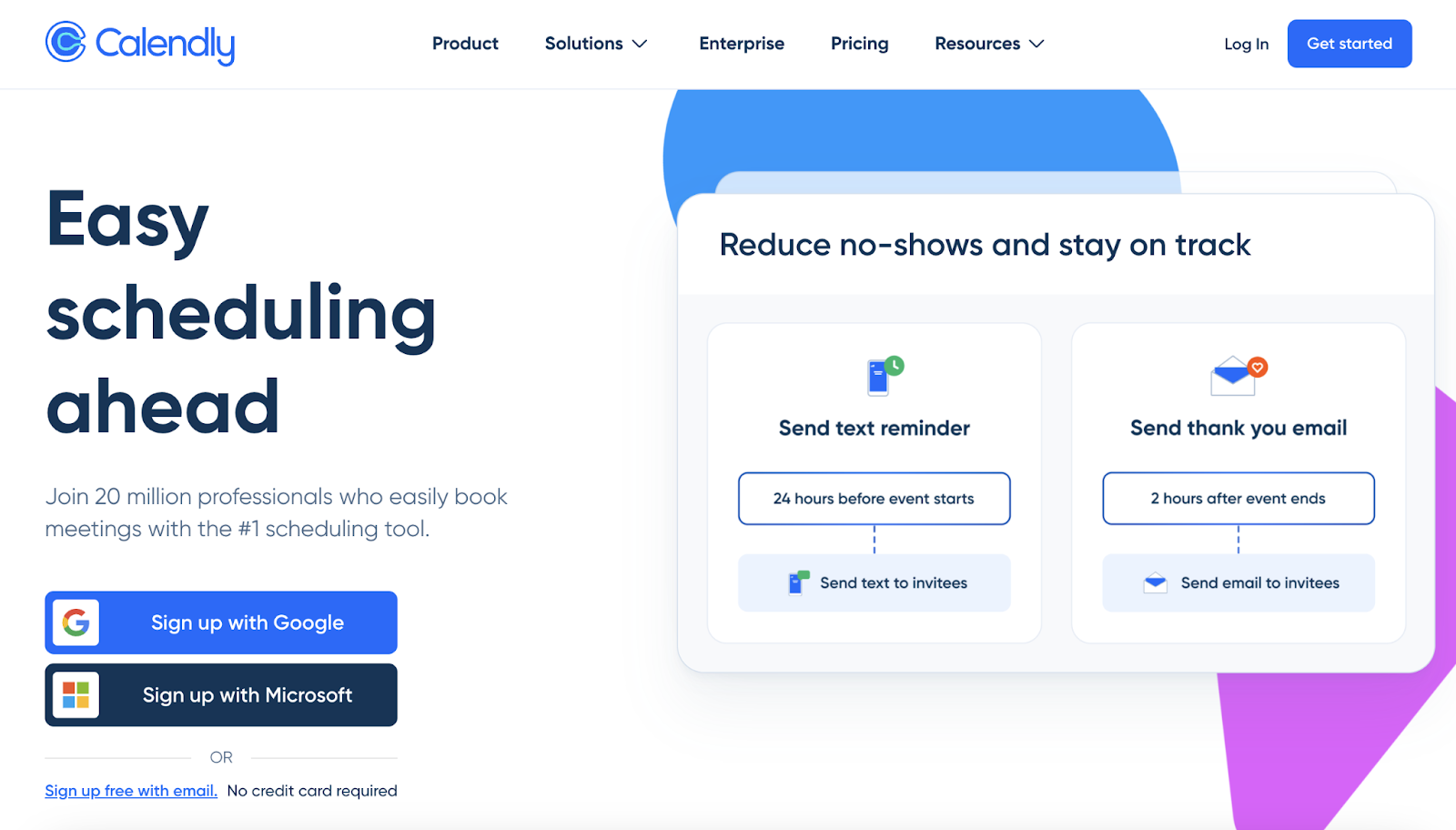
Calendly is a tool that simplifies scheduling meetings and calls, and their homepage focuses on how widely used their solution is and the ways it benefits users.
It promises “easy scheduling ahead” and tells users that 20 million people already use the software.
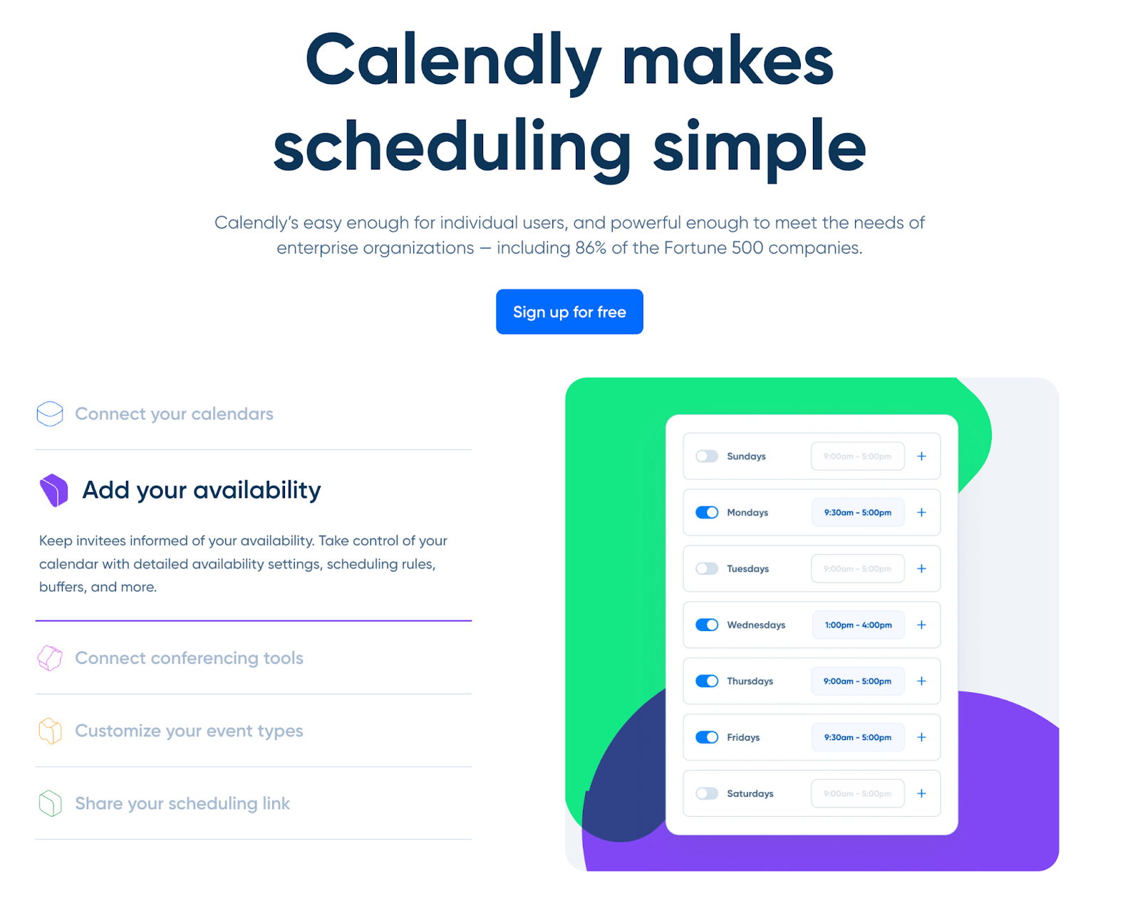
If you scroll down, it dives into the ways the tool benefits users rather than simply listing features.
There’s also more social proof in the form of customer logos and a number of linked case studies.
Key Takeaway
Tailor your messaging to what your target audience cares about—this makes your value proposition more relevant and compelling.
9. Zapier
Zapier’s website includes messaging and visuals that make automation—the company’s focus—easy to understand.
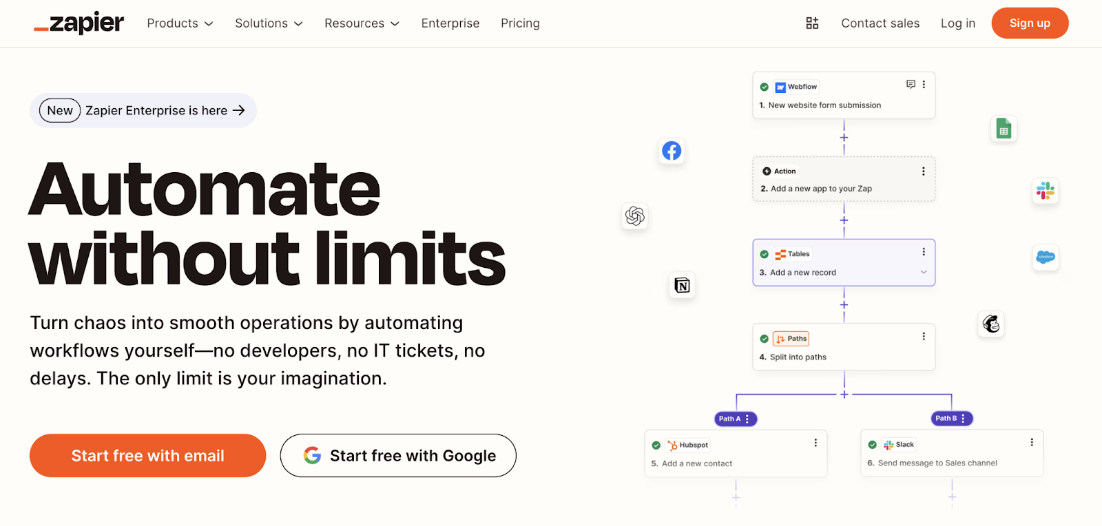
The homepage grabs attention with a catchy headline: "Automate without limits." Then, reinforces its message with a subheading that explains how easy it is to get started, even without developers or IT support.
And Zapier lets you get started for free. Plus, visitors don’t even have to enter their email—they can log in with Google.
Key Takeaway
Even if your product is technical, you can still make it easy for visitors to grasp. Just focus on the impact it has on users' lives and work.
10. Stripe
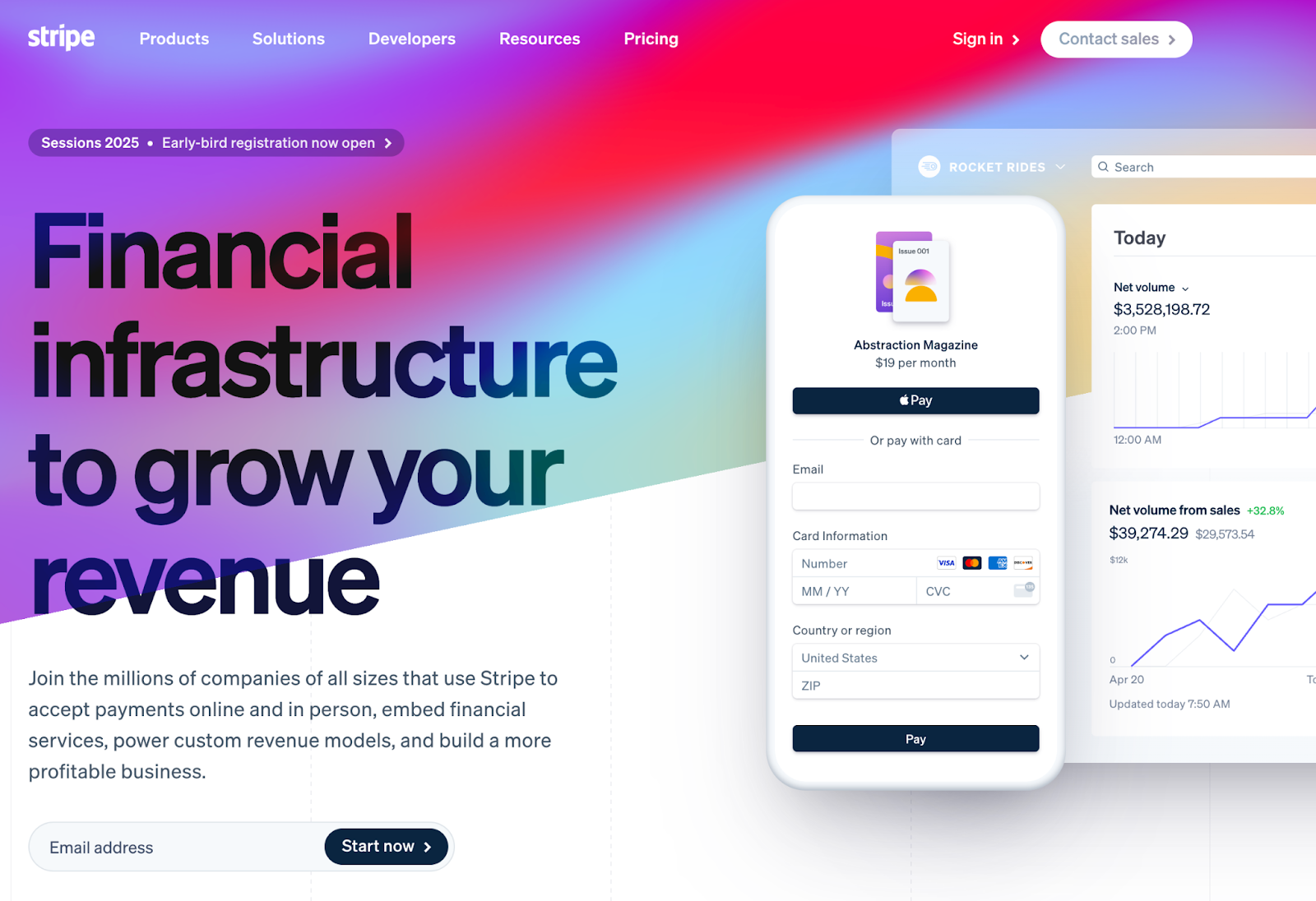
Stripe is a payment platform with a colorful, attention-grabbing web design that makes a traditionally serious topic—finance—seem exciting.
The homepage changes colors and goes through nearly the whole rainbow for a playful effect. And the product visual demonstrates how the tool is mobile-friendly.
The copy zooms in on the benefits for the user—growing revenue and profitability. And also builds trust by highlighting how “millions of companies of all sizes use Stripe.”
Key Takeaway
Use a striking visual design to engage users and grab attention. This can help you stand out—especially in a conservative industry.
11. Notion
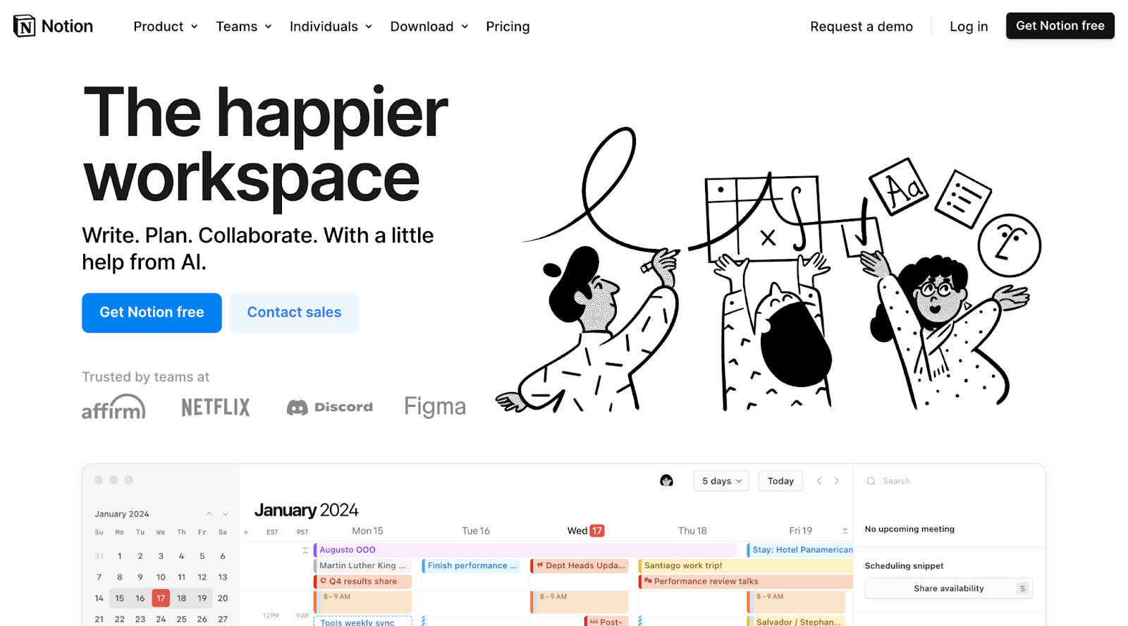
Notion is a collaboration platform with tools for note-taking and project management, and their homepage uses fun imagery and punchy, conversational copy.
The messaging makes it clear what you can do with the platform. And that it consolidates everything in one place.
Custom illustrations highlight the collaborative nature of the platform. And the rotating product screenshots gives users a preview of the interface and its key features.
Lastly, logos of well-known customers like Netflix and Discord build credibility.
Key Takeaway
Even for technical products, you can highlight key features and benefits in a playful way to make it feel approachable.
12. Figma
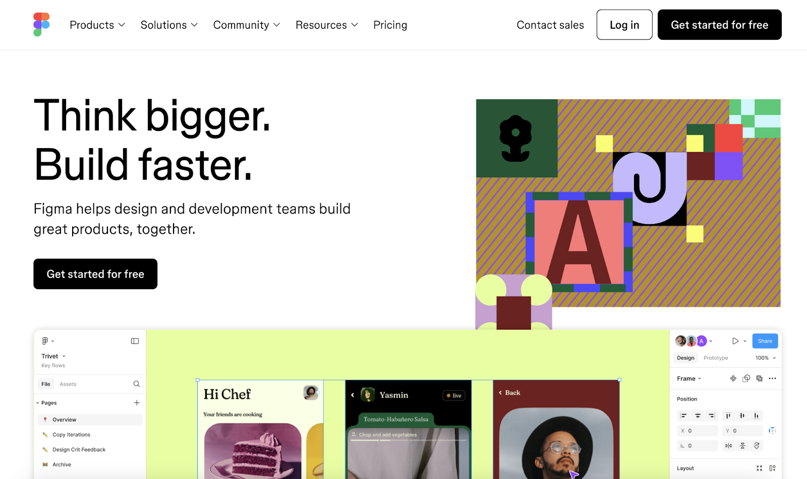
Figma has one of the best-designed SaaS websites that uses bold colors and typography to appeal to creative professionals and teams—exactly the people this collaborative design tool wants to reach.
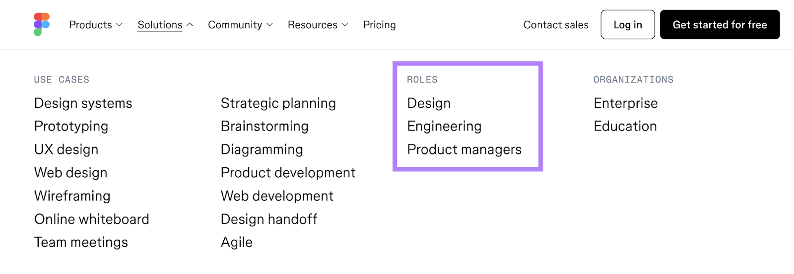
As you can see in the drop-down under “Solutions,” Figma has created content targeted to their main audiences: designers, engineers/developers, and product managers.
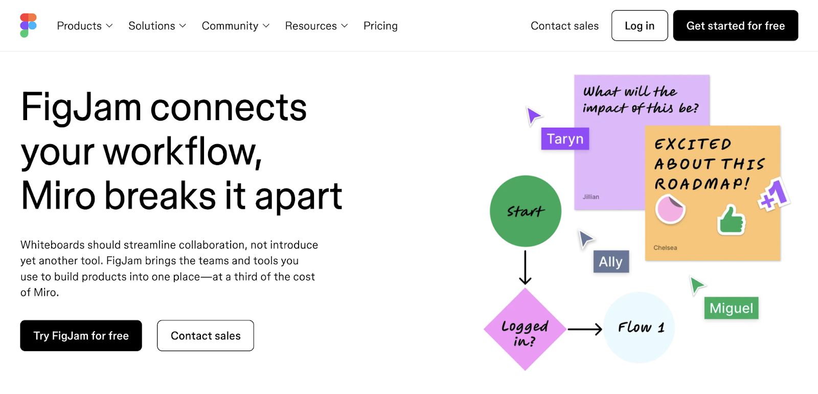
In the footer, Figma has a “Compare” section that allows visitors to access pages breaking down how Figma is different from their competitors.
Key Takeaway
Create audience-specific content and product comparisons to demonstrate your software's value.
13. Xero
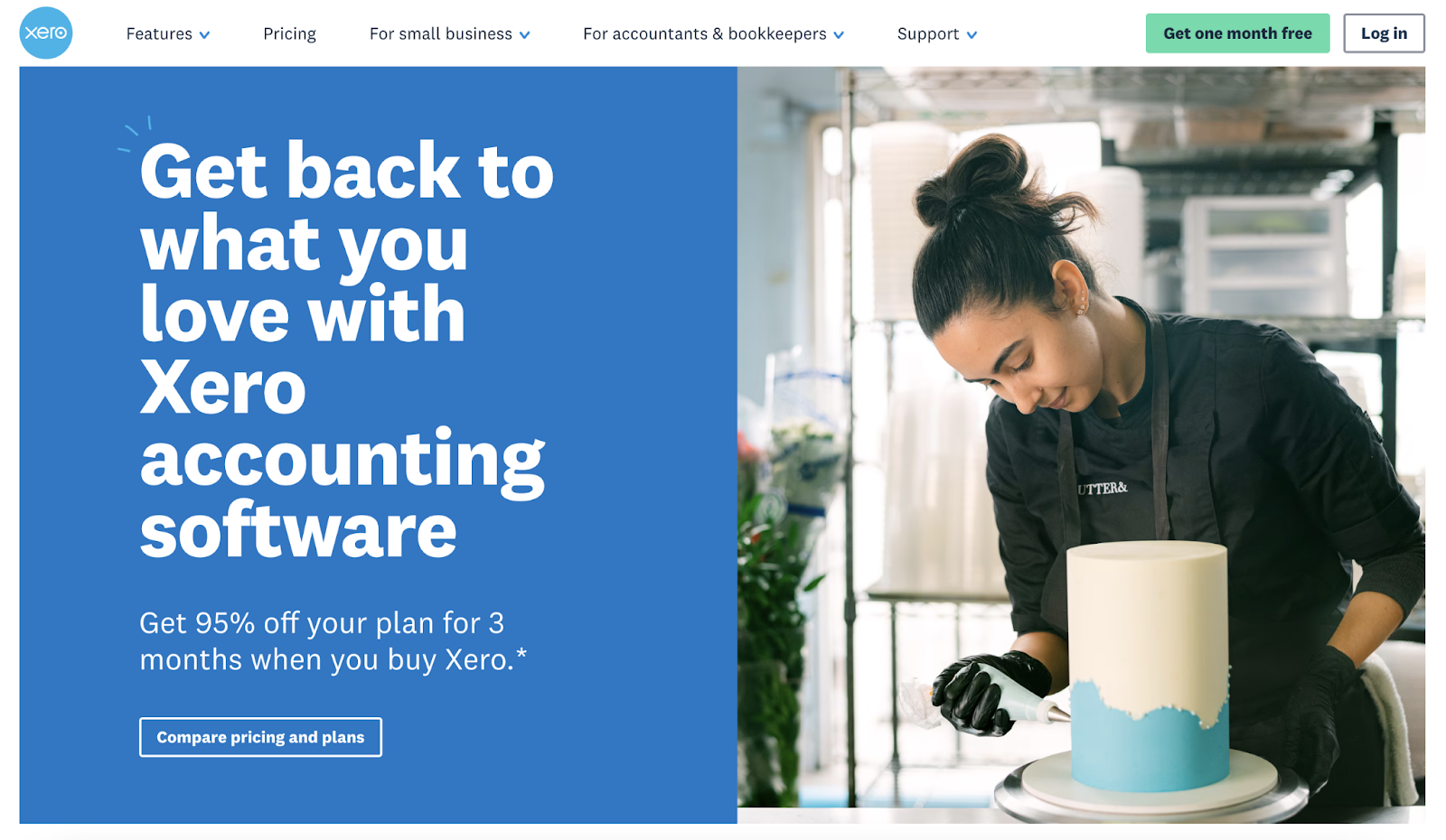
Xero provides accounting software for small- and medium-sized businesses, and their website is optimized for people and search engines.
The homepage headline both speaks to what their audience cares about ("Get back to what you love”) and incorporates relevant SEO keywords (“accounting software”).
The term “accounting software” is searched for over 18,000 times per month on Google in the U.S., according to Semrush’s Keyword Overview tool.
And Organic Research shows that Xero ranks in the top 10 results for various queries related to that keyword, including appearing in position 1 for “accounting software company.”
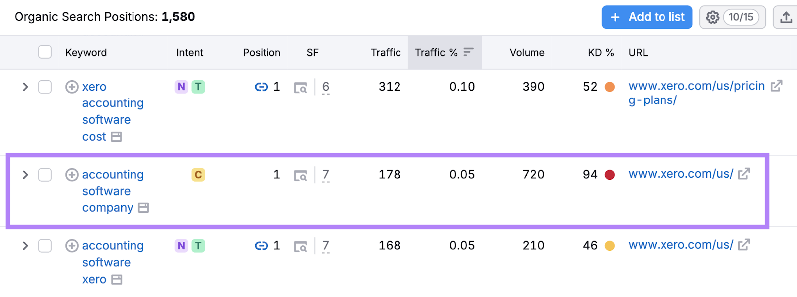
This makes it easier for potential customers to find them on Google and other search engines.
Key Takeaway
Use SEO-friendly headlines that include keywords you want to rank for. This can help improve your visibility in search results and attract more potential customers.
To find relevant keywords for your business, use the Keyword Magic Tool. Just enter a broad starting keyword related to your niche to find tons of terms and see useful metrics for each.
14. Trello
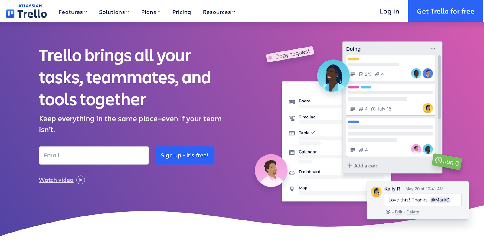
Trello helps teams manage projects, and their website combines an uplifting purple and blue design with inspiring messaging that makes project management feel less daunting.
The homepage headline immediately highlights Trello's value proposition—bringing “tasks, teammates, and tools together.”
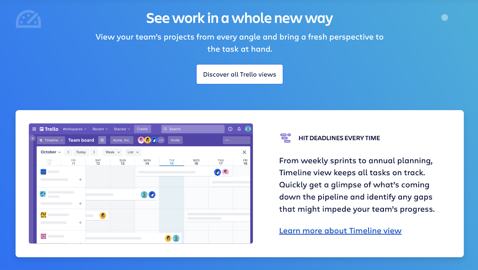
Throughout the site, Trello focuses on user benefits rather than just listing features.
For example, they explain how their timeline view is beneficial for meeting deadlines. This helps users understand why that feature matters.
Key Takeaway
Using encouraging language and showcasing benefits helps visitors feel confident that they’ll be able to use the solution effectively.
15. Apollo
Apollo is a sales intelligence and engagement platform that speaks directly to sales professionals who want proven results.
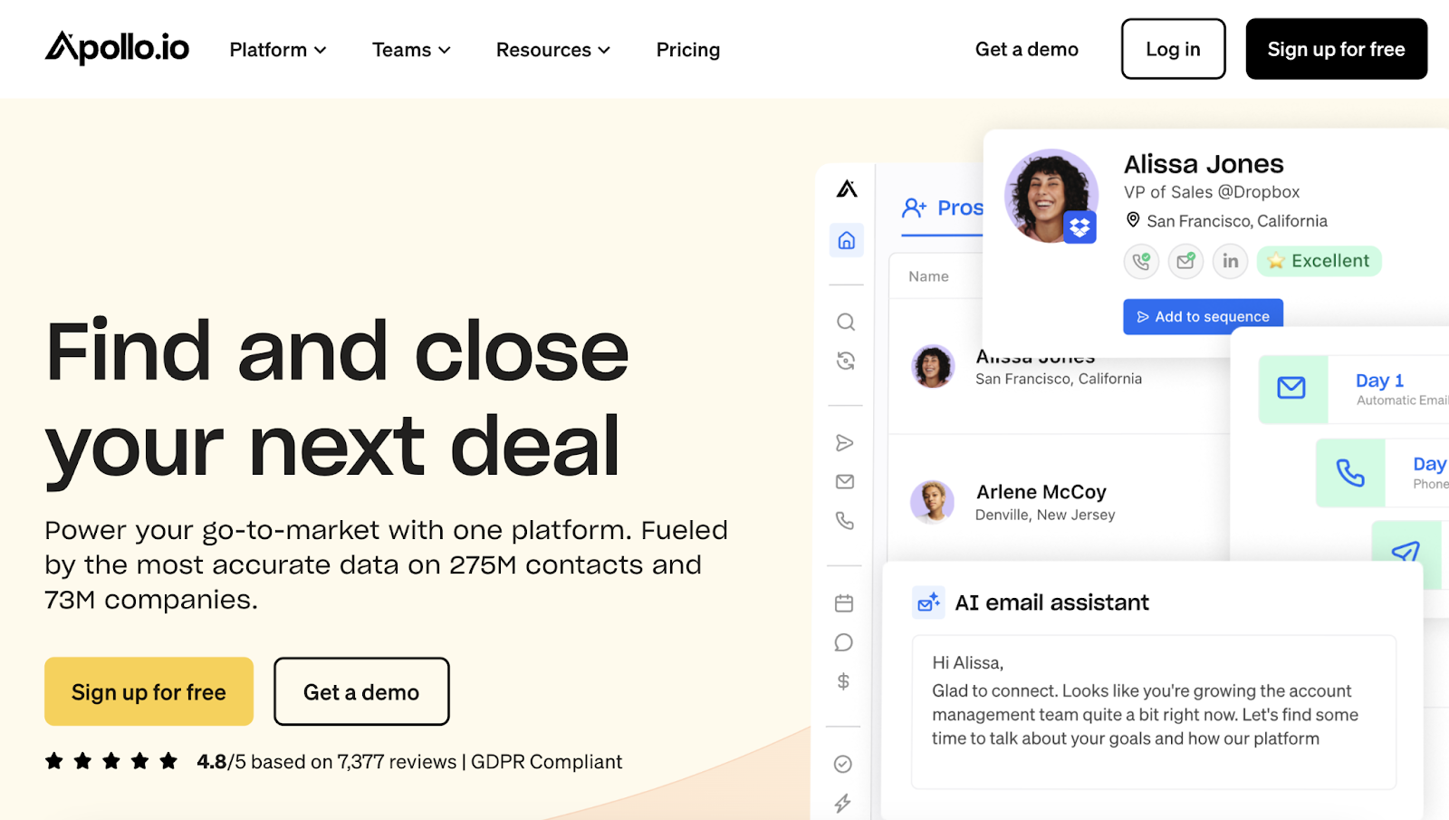
The homepage leads with impressive numbers—showcasing their database of 275 million contacts and 73 million companies.
The headline cuts straight to the outcome: "Find and close your next deal." They reinforce this promise throughout the page with specific customer metrics.
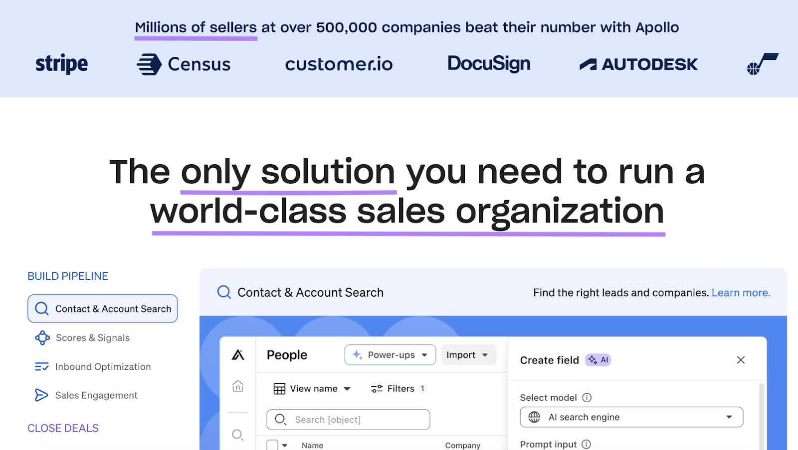
If you scroll down, you can see the focus on sales professionals throughout the homepage. Even the logo bar makes it clear who their tool is for: “Millions of sellers”—not just “millions of companies.”
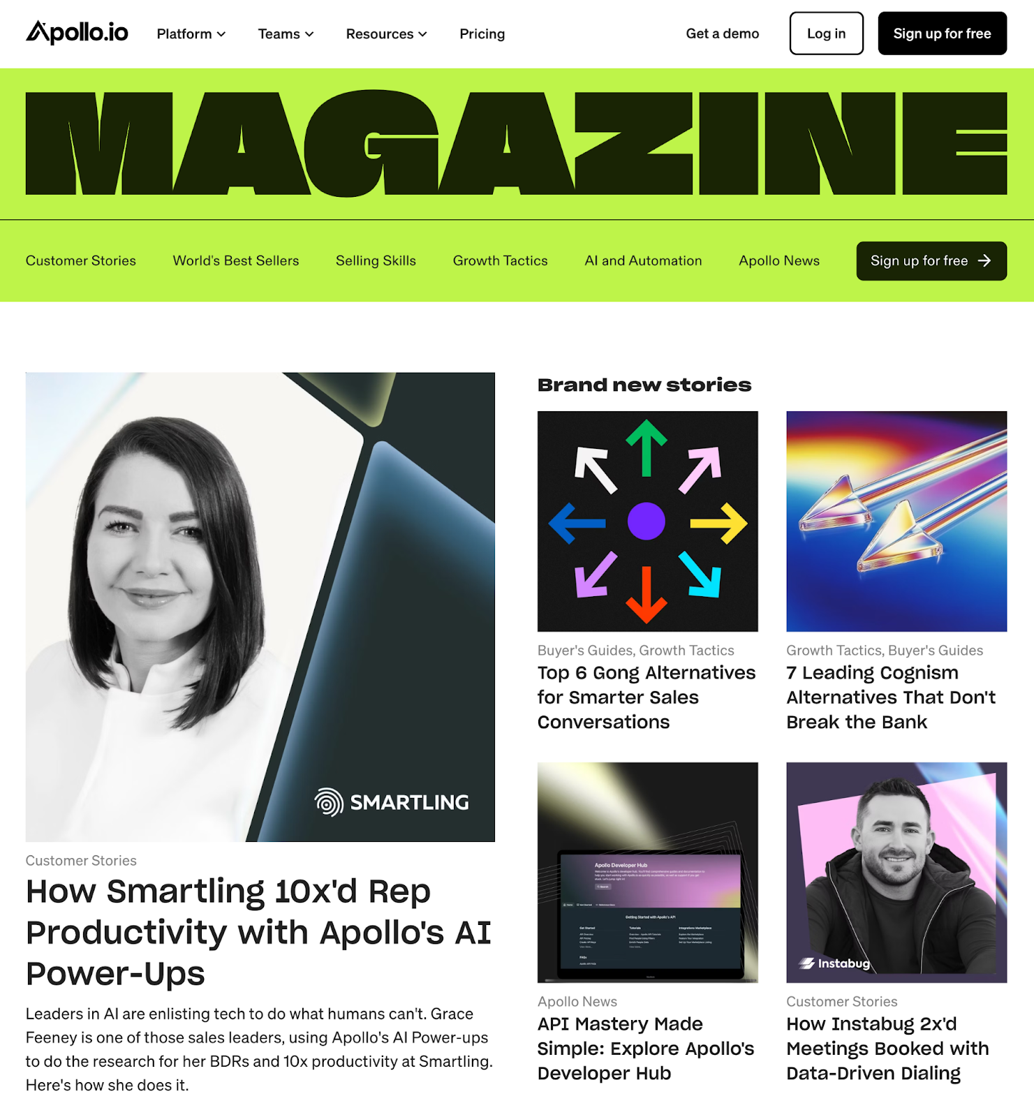
A standout part of Apollo's website is their online magazine, which uses striking neon visuals and custom illustrations. And content that tackles urgent challenges their audience faces as well as company-specific updates.
Apollo also has resources like guides, masterclasses, webinars, and more. And much of the content is about helping their target audience improve their sales skills and drive revenue.
Key Takeaway
Tailor your website's copy to your audience’s specific needs. Then, create content on topics that are interesting and relevant for them.
Not sure what to write about?
Semrush’s Topic Research tool gives you numerous ideas in seconds.
Just type in your initial idea—like “negotiating deals”—to get related suggestions, such as “active listening,” “body language,” and “negotiation strategy.”
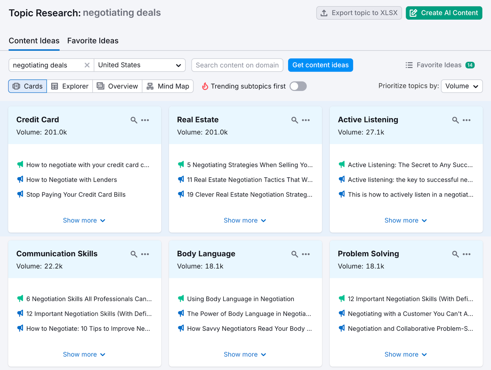
Save your favorite ideas and create content around them.
16. Basecamp
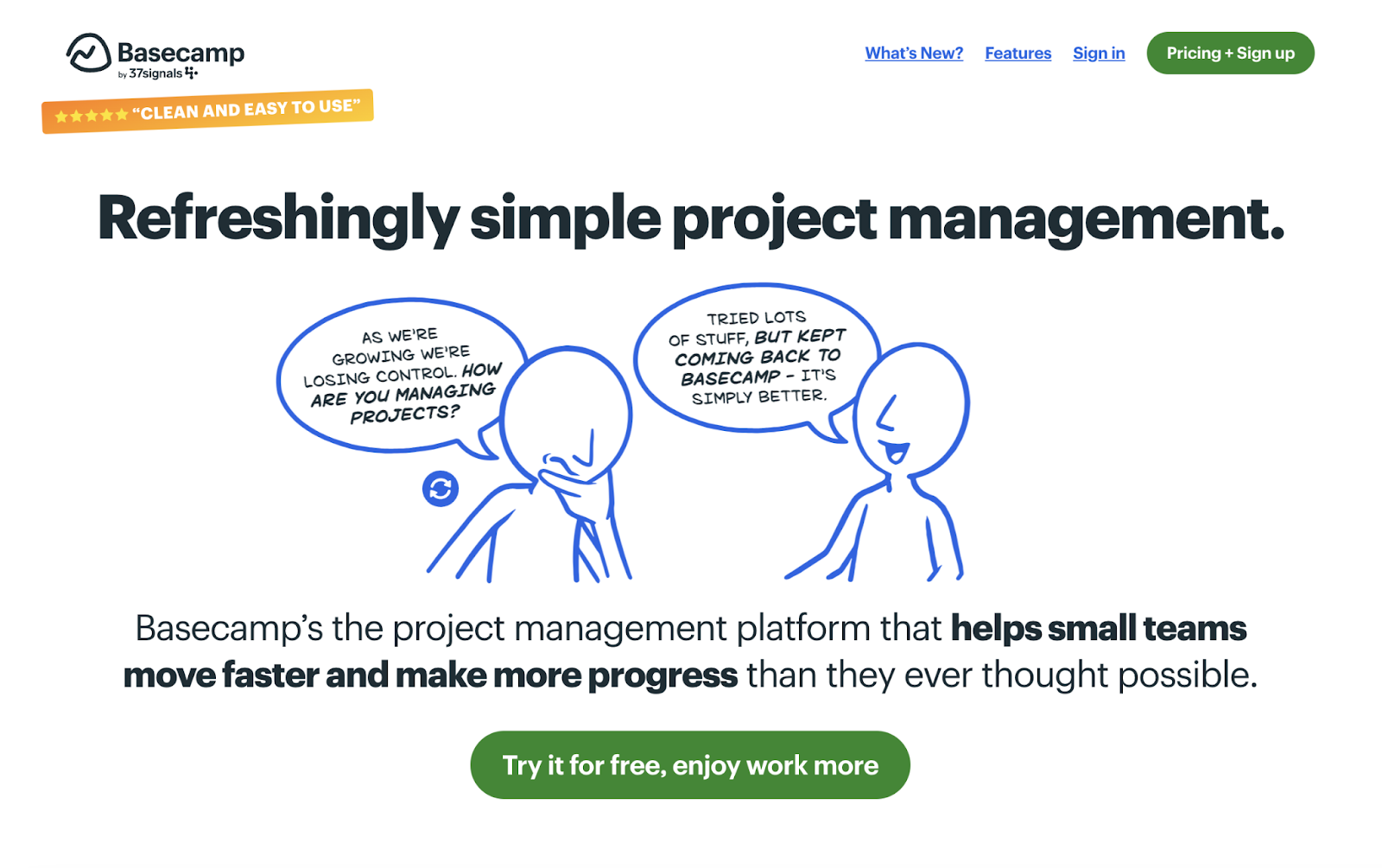
Basecamp is a project management tool with a website that breaks from the typical corporate aesthetic with stick figure drawings and humorous conversation bubbles.
The overall vibe makes the project management platform feel more human and less intimidating. And the conversational tone of voice (e.g., “Lots of Stuff”) makes sure their messaging is easy to understand.
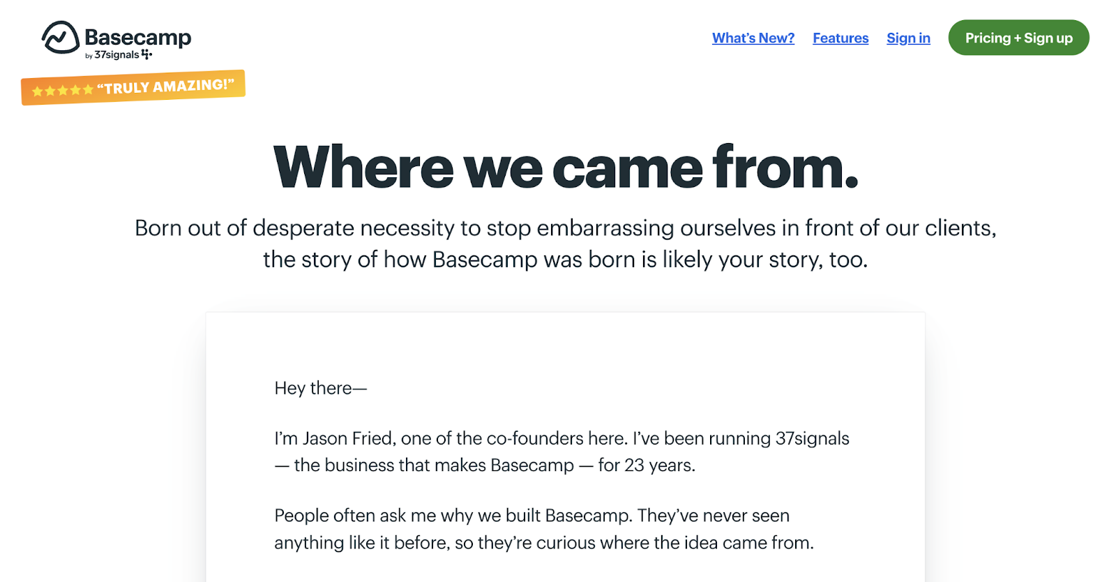
Basecamp also connects with their target audience through relatable storytelling.
A prime example is their about page. It features a signed letter from co-founder Jason Fried that goes over the company's origin story.
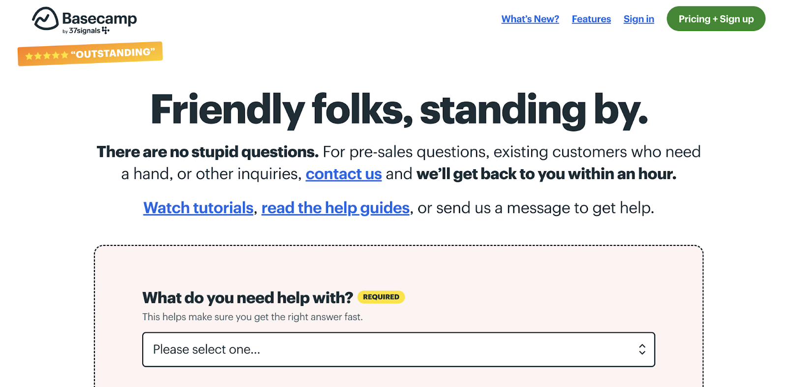
And their support page reassures users that “there are no stupid questions.” And says users who submit a question can expect a response within an hour.
Key Takeaway
Being friendly and showing you care builds an emotional connection with customers that could be more powerful than talking extensively about your tool’s technical features.
17. Mural
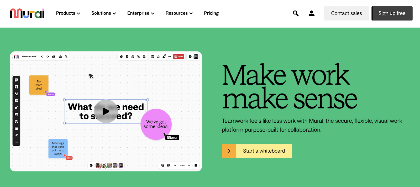
Mural is a visual collaboration tool with a website that brings their product to life through animations and videos.
The homepage headline ("Make work make sense”) and playful, conversational snippets (l“No more silos!”) speak directly to the frustrations people can face with disorganized, confusing work processes.
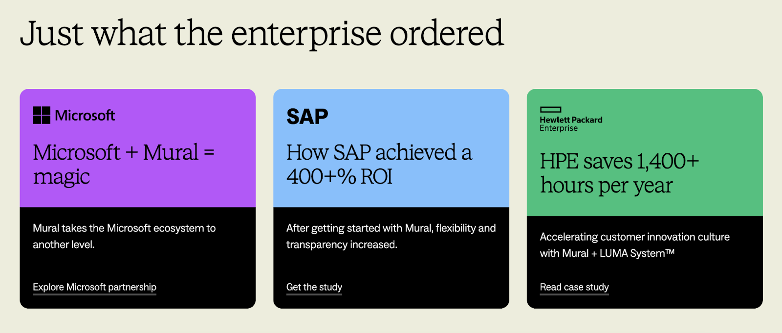
The company also shares data-driven case studies about well-known enterprise clients to show their value:
Key Takeaway
Strike a balance between playful messaging and serious proof points—this shows you understand both the daily frustrations and high-stakes needs of your users.
18. Toggl
Toggl is a time-tracking tool, and their website transforms a potentially sensitive topic into a positive conversation about data-driven decision making.
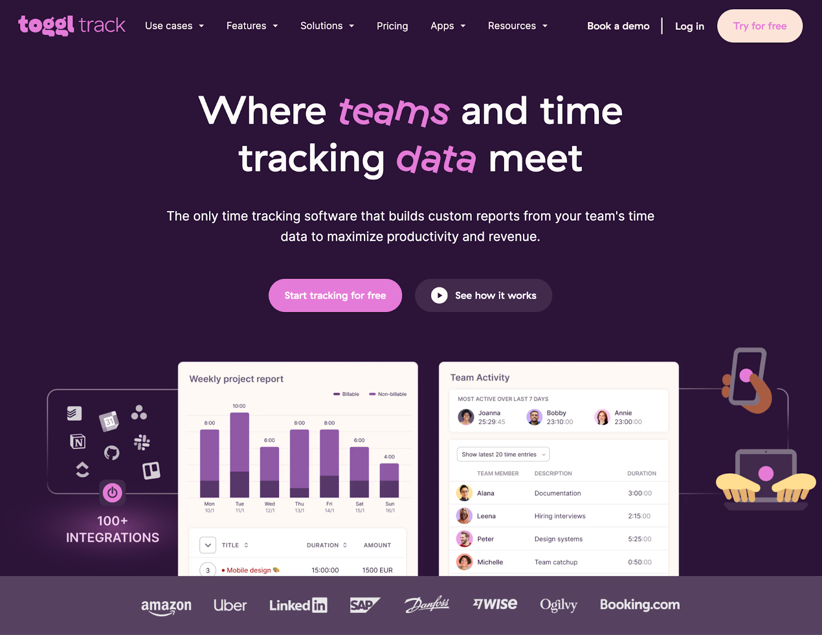
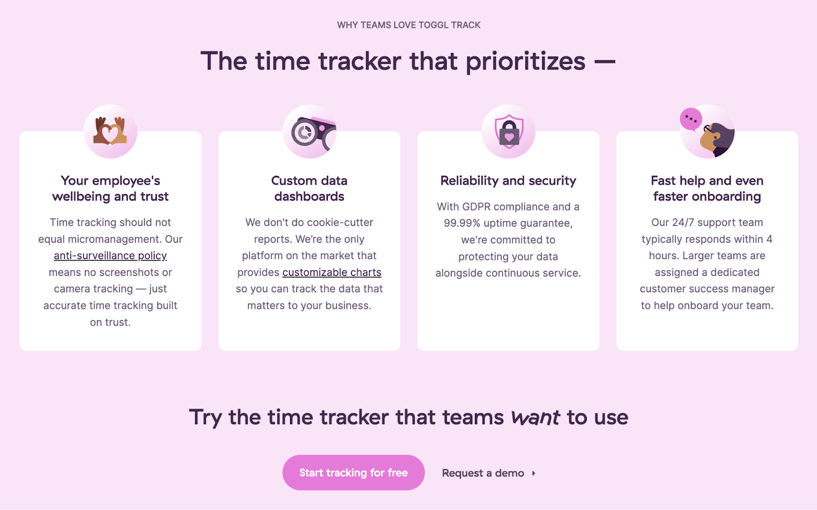
Rather than dodge concerns about surveillance, they share how their tool provides transparency that empowers teams.
For example, Toggl’s homepage does a great job of addressing specific concerns that some customers may have around time tracking—like the risk of micromanaging.
Key Takeaway
If your product centers on something that might be controversial, address it and set the record straight. Speaking to those concerns can help buyers see your software’s value.
19. Coursera
Coursera's website serves different audiences—students, sales professionals, marketers, and more—and creates dedicated spaces on their site for them.
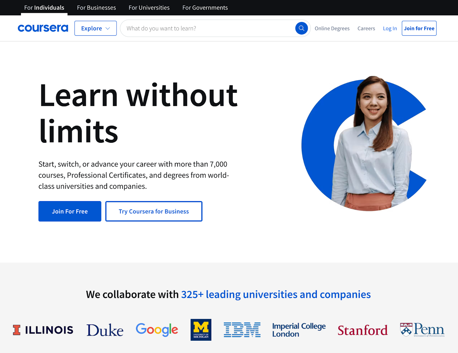
Their clean, distraction-free design leads with a simple course search bar to make it approachable for anyone seeking education.
Rather than cramming their homepage with content for every type of user, Coursera uses clear navigation paths: "For Individuals," "For Business," "For Universities," and "For Government."
This structured approach helps each visitor quickly find relevant programs without wading through irrelevant options.
Key Takeaway
If you serve a varied group of users, consider how your messaging and design can allow you to speak to each of them.
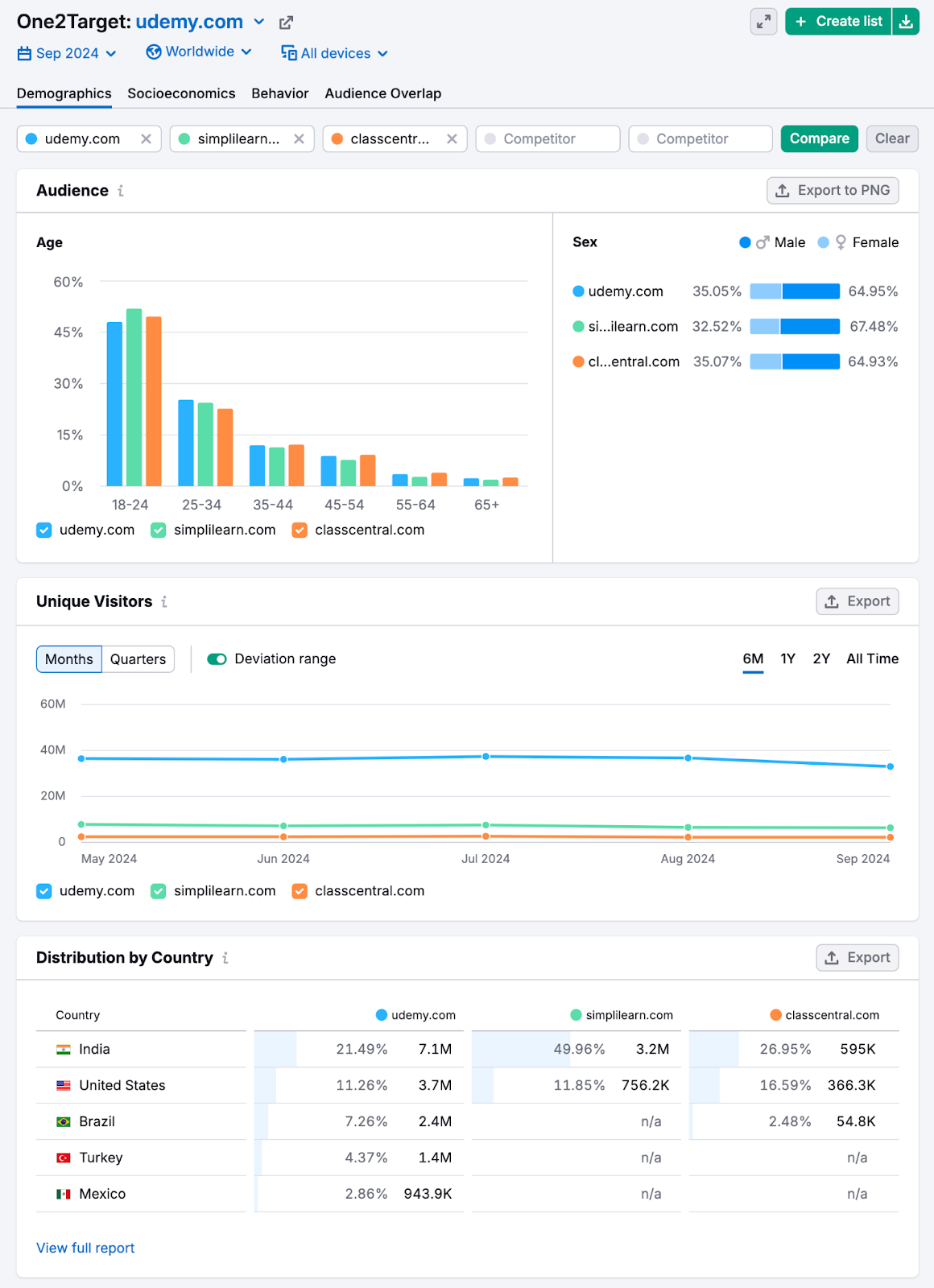
To gain a better understanding of your target audience segments, use Semrush’s One2Target tool.
Just enter up to five competitors and click “Analyze.”
You’ll see useful data points related to the audience’s age, gender, income, education level, most-visited social media channels, and more.
20. Vimeo
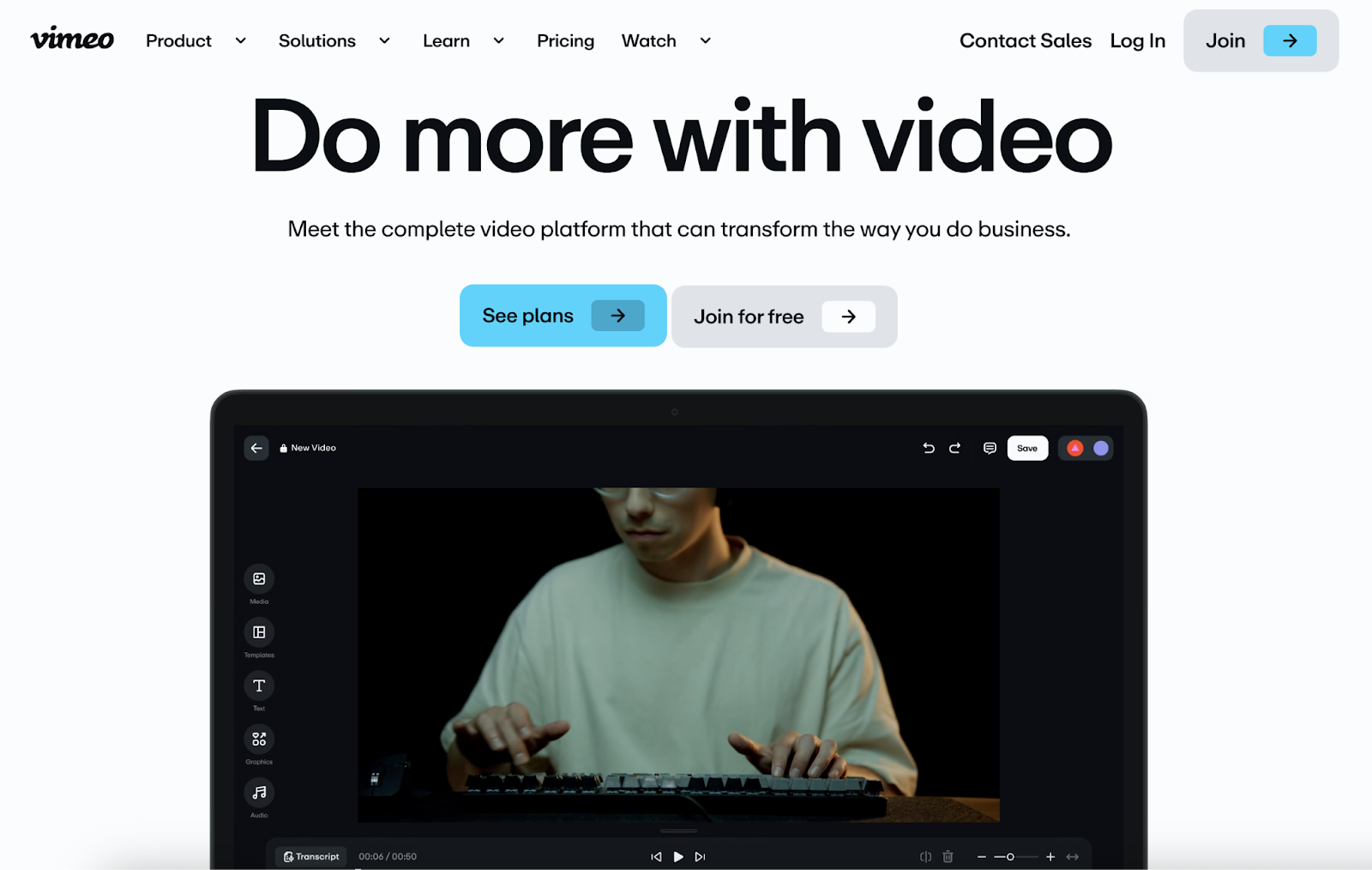
Vimeo is a video hosting, editing, and sharing platform, and their simple yet striking website lets product visuals do the talking.
On the homepage, the hero video cycles through different styles and effects to demonstrate what the platform can do. This helps visitors quickly understand what they can use the tool for.
The copy is straightforward and aspirational, simply encouraging users: “Do more with video.”
Key Takeaway
Show rather than tell. If your product is focused on video, let demonstrations and examples make your case instead of relying on extensive copy.
21. Docusign
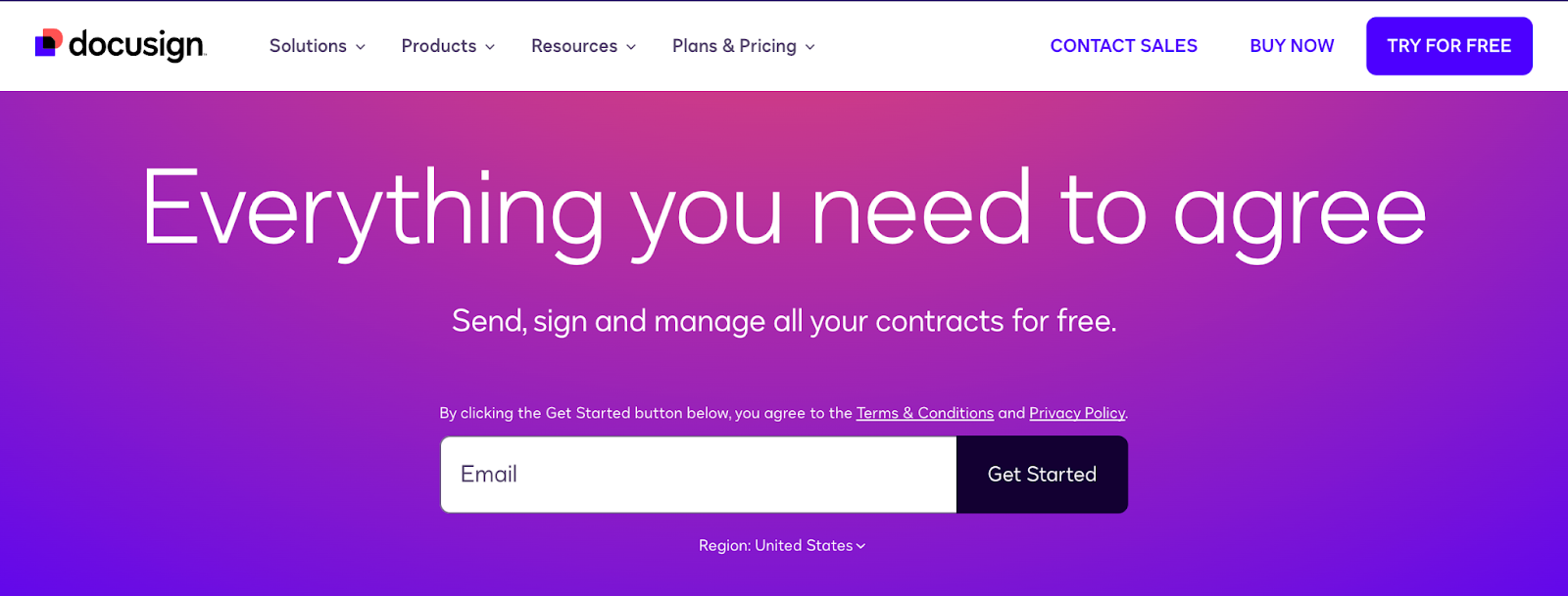
Docusign’s homepage uses simple language to clearly explain how they enable people to send and sign contracts (and other documents) online.
Beginner-friendly copy sums up exactly what the tool does (“Everything you need to agree”)—no legal jargon or complicated wording.
Docusign’s bright and colorful homepage counteracts what might otherwise feel like a boring concept. And the main focus on the homepage is the sign-up form that only requires an email address.
Key Takeaway
Simple copy can make a complicated topic more accessible, which might make users more likely to sign up to use your tool.
22. Keap
Keap’s website is unique in that the copy does the talking, which allows the process automation platform brand to explain exactly what the software does.
The homepage messaging drives home the key benefits and hints at affordable pricing (a key concern for small businesses).
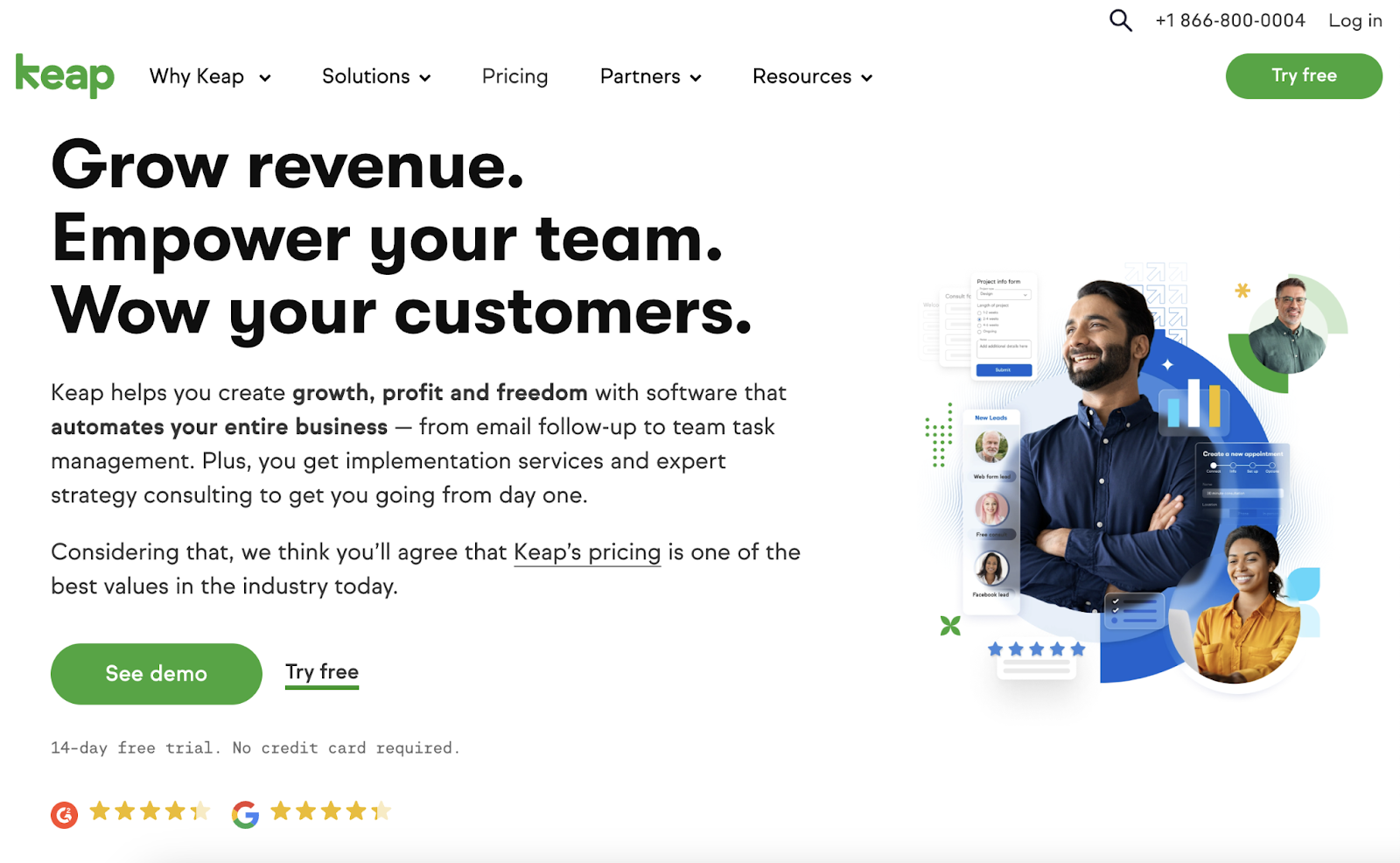
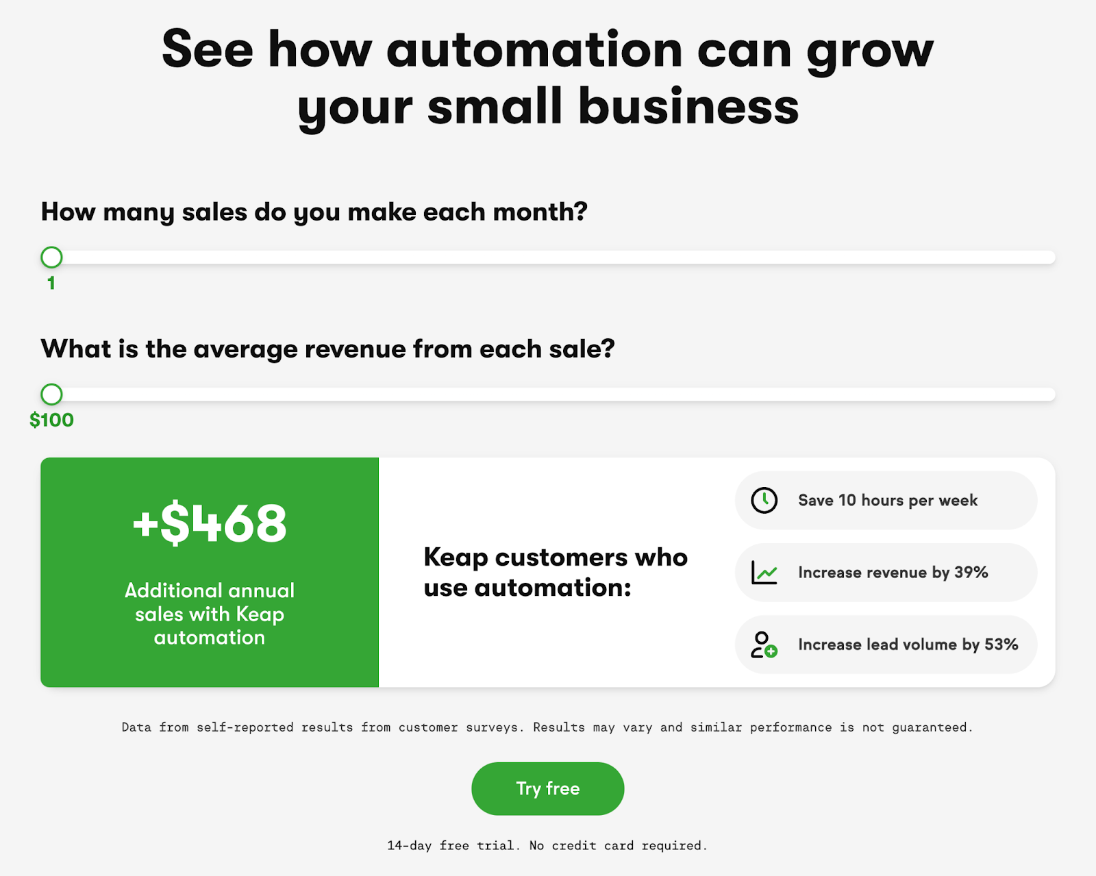
A stand-out feature on the homepage is the interactive calculator. You can input your business metrics to see how automation impacts sales and revenue.
Key Takeaway
Interactive tools engage potential customers and can even demonstrate the value of your software.
Just be sure to check that it doesn’t impact the speed and functionality of your site.
To measure your site speed and improve technical SEO, try Semrush’s Site Audit tool.
23. Grammarly
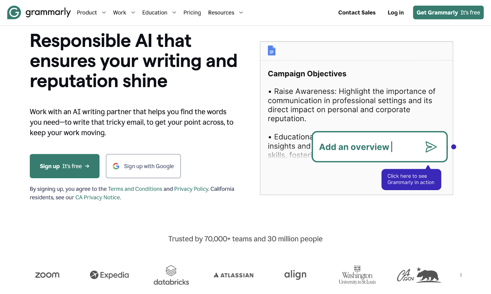
Grammarly is an AI-powered writing assistant, and their site is one of the best B2B/B2C SaaS websites because they use numbers and social proof to back up their value.
Grammarly’s homepage emphasizes that 70,000+ teams and 30 million people use their tool, including well-known companies like Washington University, Zoom, Expedia, and Atlassian.
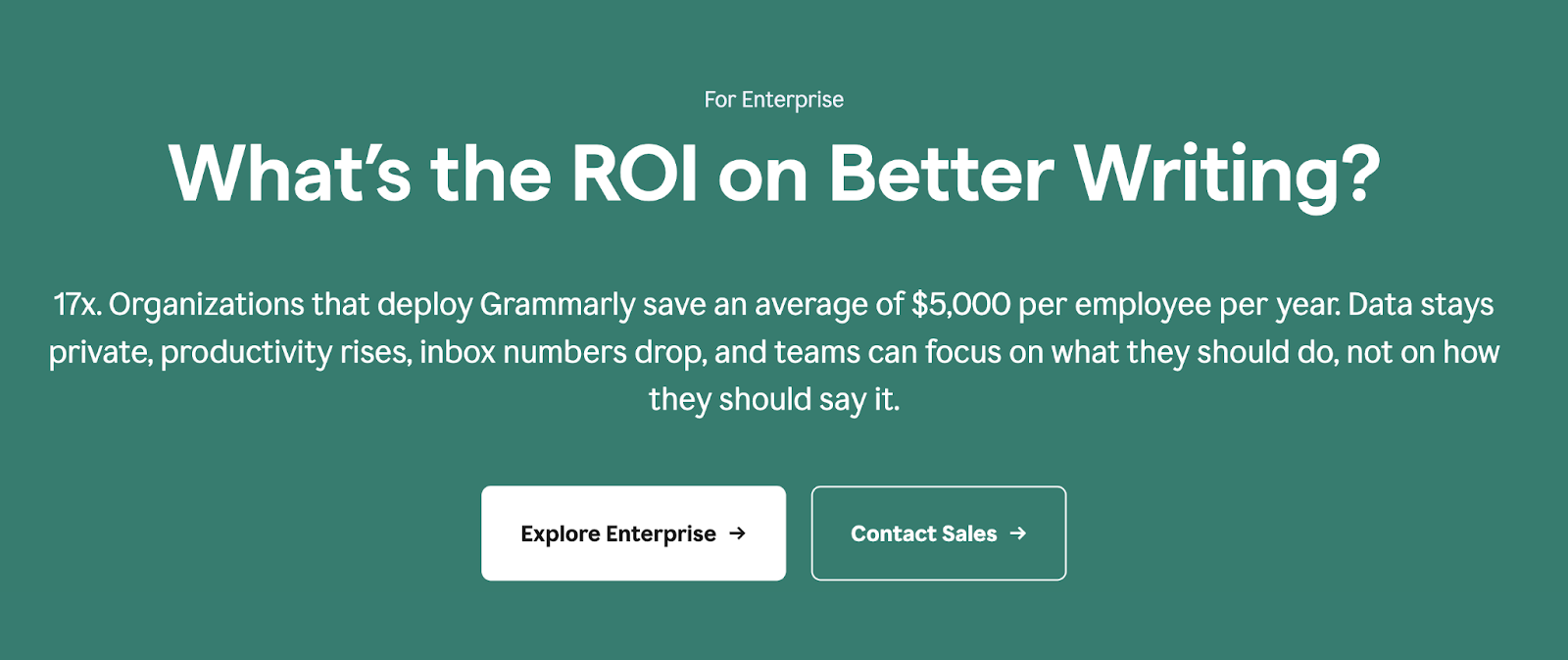
Farther down the homepage, Grammarly asks, "What's the ROI on Better Writing?" And immediately answers with concrete data.
Key Takeaway
Showcasing well-known customers and real numbers can reassure potential customers that your product is widely trusted and effective.
24. Canva
Canva is a graphic design platform with a website that shows users it’s possible to create stunning designs in minutes—even if they aren’t professional designers.
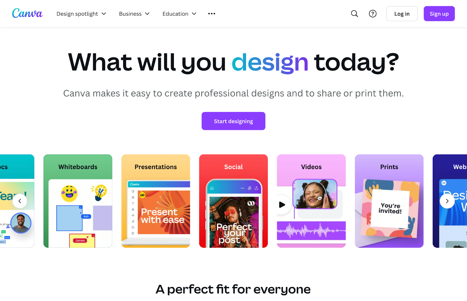
The homepage headline ("What will you design today?") invites users to start creating immediately.
Canva also highlights the wide range of design options, including documents, presentations, and social media posts.
The overall messaging drives home how easy Canva is to use. They even say it’s a “perfect fit for everyone.”
Key Takeaway
Think about what makes your product stand out. If it's simplicity, say that to help users understand how accessible your product is.
25. Gusto
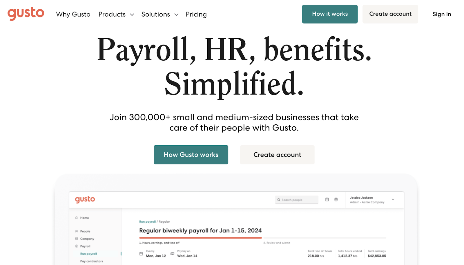
Gusto is a payroll and human resources platform that has a website focused on showing (not telling) prospects how the software can make running a business easier and faster.
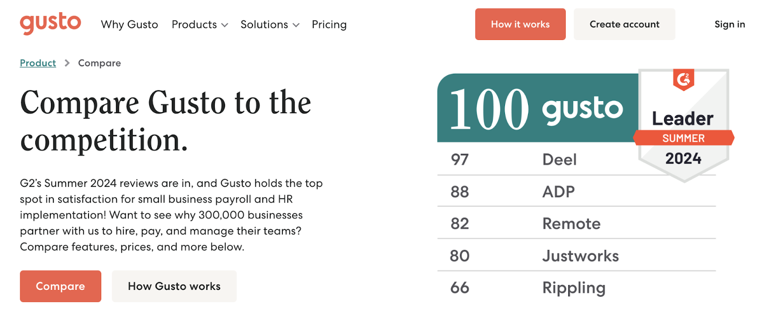
On the comparison page, users can evaluate Gusto alongside various competitors:
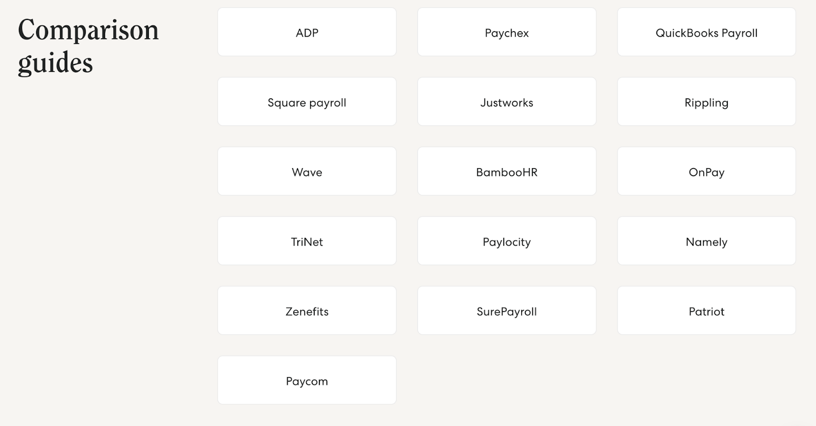
Gusto has also created a bunch of in-depth comparison guides. Which can be particularly useful for prospects who are considering switching from one of those competitors to Gusto.
Key Takeaway
Share comparisons that highlight your specific strengths and position your product as the best choice.
Wondering which companies to focus on and how your brand stacks up? Check out our guide to doing a competitor analysis.
26. Freshbooks
FreshBooks is an accounting software for small businesses and solo business owners with a website that focuses on simplicity and affordability.
First, their homepage headline promises that it “makes the hard part easy.” And they frequently incorporate a special offer (50% off at the time this was captured) alongside a “Buy Now & Save” button.
This all entices customers to sign up.
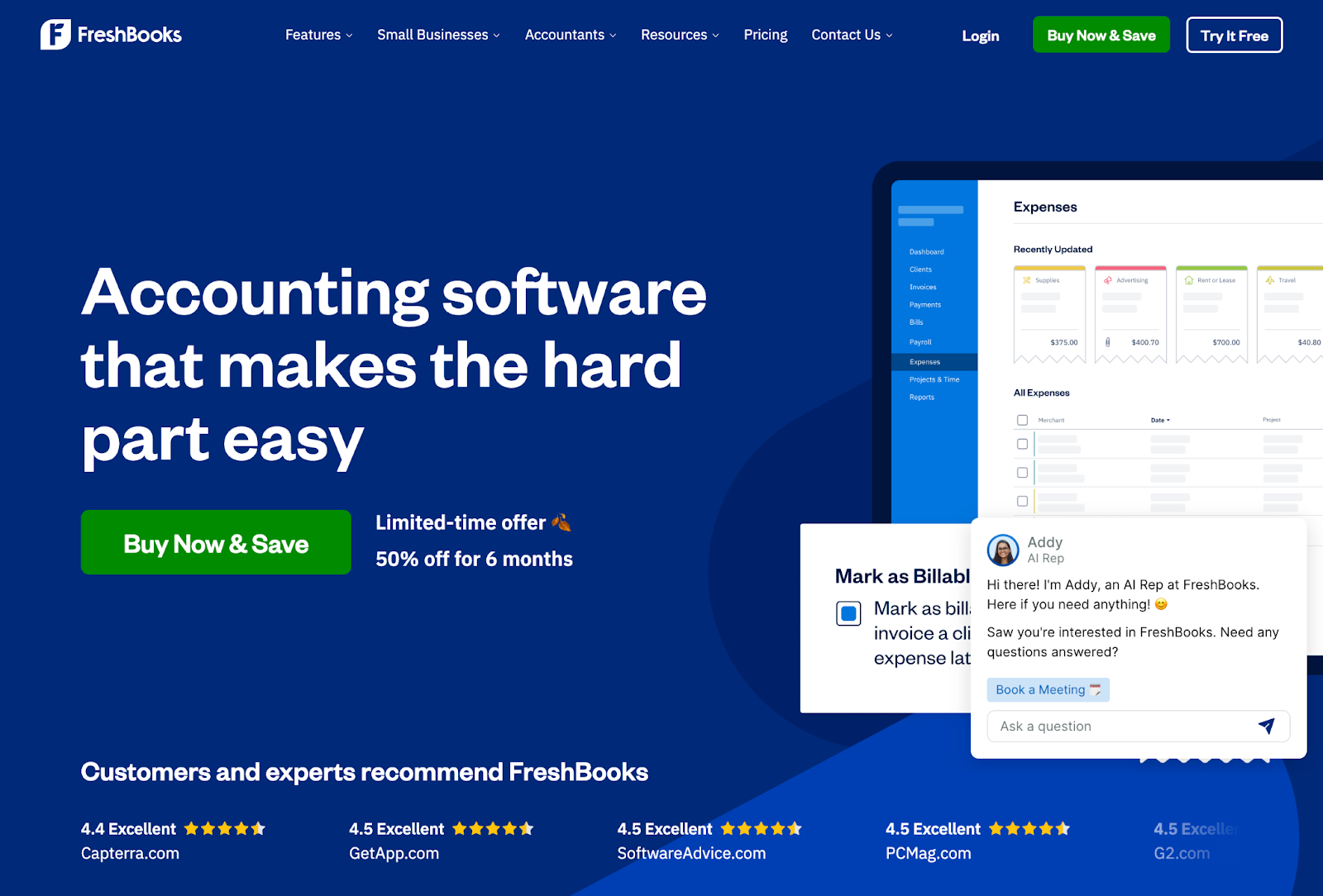
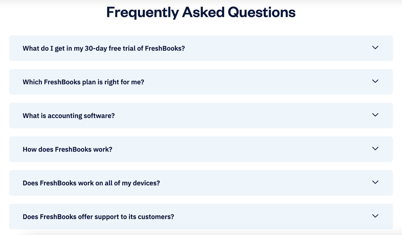
Another cool thing about Freshbooks’ homepage is the FAQ section.
They dig into common user questions like what’s included in the free trial and how to get in touch. Which lets users quickly find answers and also reduces how many requests the FreshBooks team gets.
Key Takeaway
Incorporate an FAQ section to address common questions your audience has.
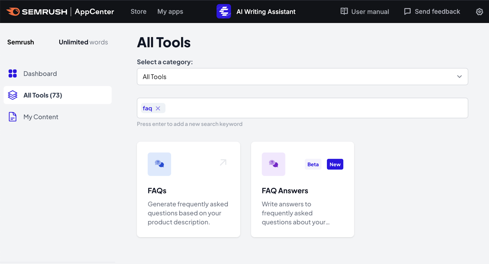
Need a hand writing your FAQ section?
Use the AI Writing Assistant app.
Just select the FAQ option and enter some information about your business to generate some options.
Optimize Your SaaS Website
Now that you’ve seen many of the best SaaS website designs, you’re probably curious about what you can do to improve your own site
To create a site that appeals to potential customers and is primed for search engines, you need the right tools.
Semrush allows you to find important keywords, create relevant content, learn about your target audience, fix technical issues, and more.
Sign up for a free account to start exploring the platform.
