What Is Mobile SEO?
Mobile SEO is the process of optimizing your site so that it ranks higher in relevant search engine results on mobile devices, like smartphones and tablets, and delivers a better experience to mobile users.
It involves many of the same best practices as desktop SEO and plays a huge role in SEO as a whole.
But people are using mobile devices for search more than ever. So it’s crucial to prioritize the mobile experience.
This includes optimizing site design, content, and more with mobile in mind.
Even the keywords you target may differ when optimizing for mobile site SEO.
The Importance of Mobile SEO
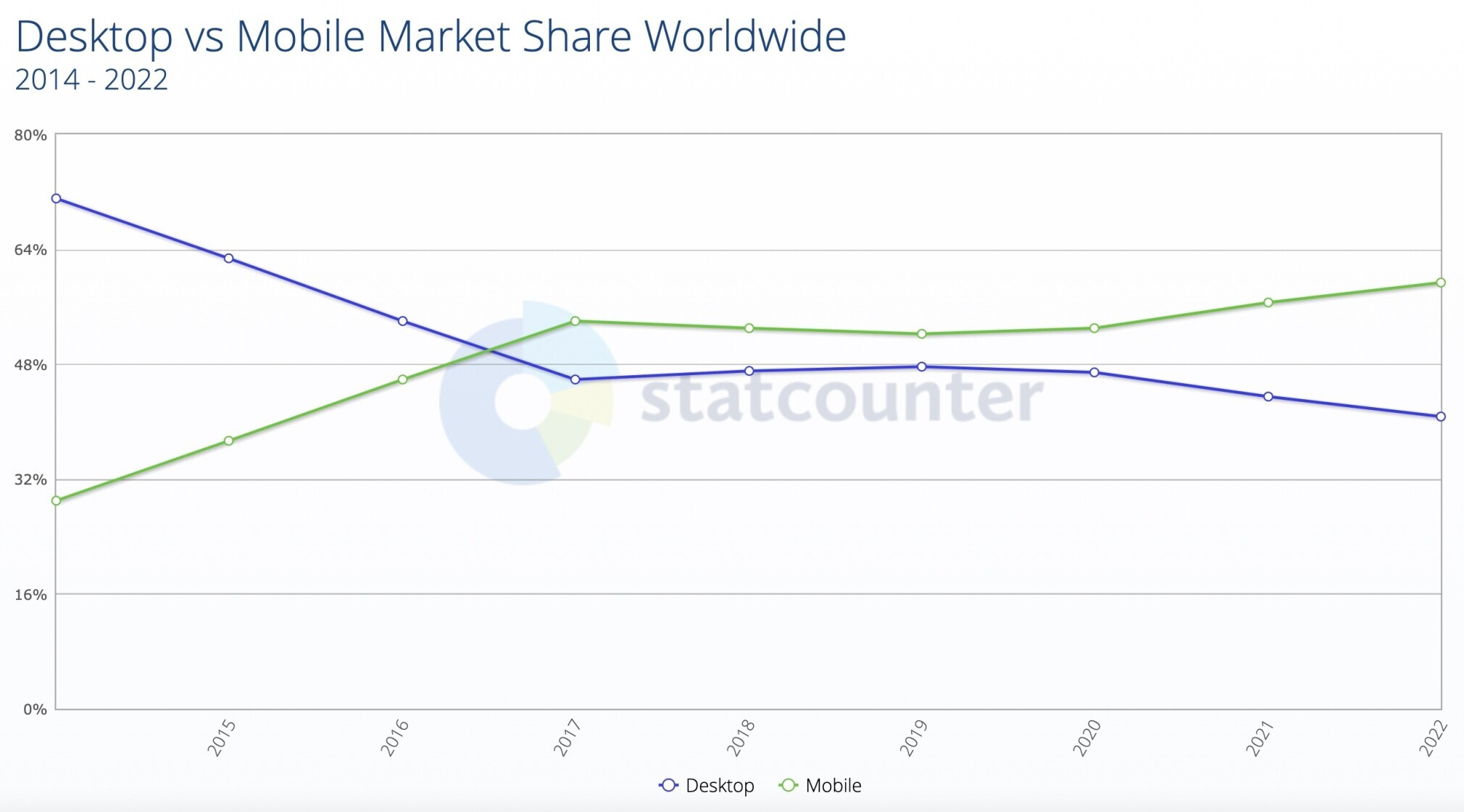
Over 60% of organic search visits now come from mobile devices.
As mobile searches are on the rise, desktop searches continue to decrease:
And according to Google, 56% of in-store shoppers used their smartphones to research products while they were in a store in the past week.
So even if your business has a lot of foot traffic, you’ll still miss out by ignoring mobile SEO.
Google Uses Mobile-First Indexing
Google now uses mobile-first indexing for every site on the web (apart from a few exceptions).
This means the mobile version of your site is the only one that counts toward rankings.
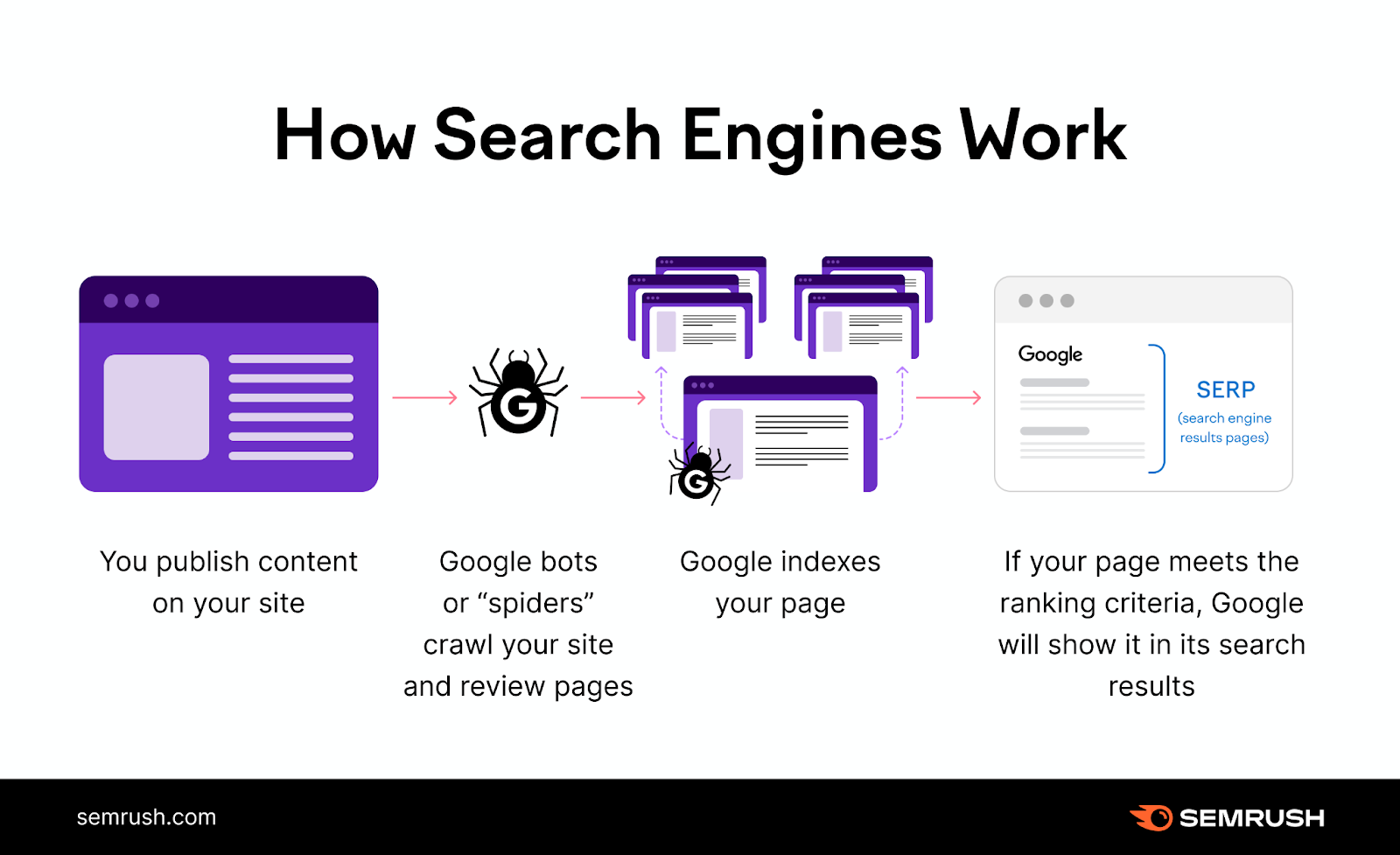
That said, if you have separate URLs for desktop and mobile (e.g., “example.com” and “m.example.com”), Google will show the version that’s most appropriate to the user in search results.
If you haven’t configured your site for mobile yet, the next section explains how.
3 Ways to Configure Your Website for Mobile
There are three options when it comes to making your site mobile-friendly:
- Responsive design
- Dynamic serving
- Separate URLs
We’ll start with the one that’s the easiest to use and maintain: responsive design.
1. Responsive Design
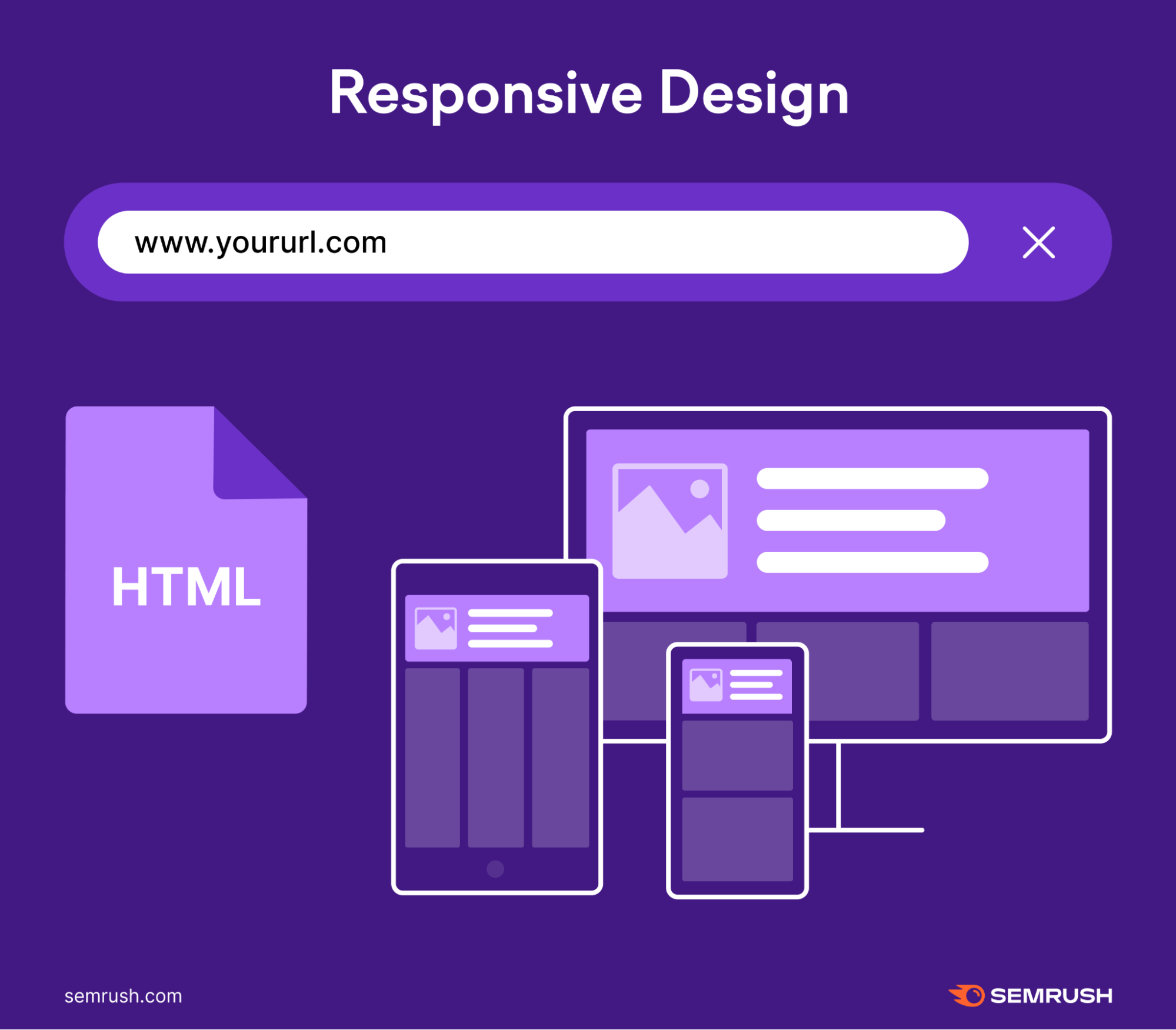
Responsive design allows you to serve the same page to both mobile and desktop users.
The server sends the same HTML code every time. CSS changes how the page renders based on the device. Like this:
Responsive design is best for SEO because it:
- Allows users to share pages and link to your content with a single URL (rather than a separate “mobile” URL)
- Reduces the chance of common mistakes that affect mobile sites
- Is less time-consuming to maintain than other methods
- Doesn’t require redirection for users to have a device-optimized view (which can reduce load time)
- Saves resources when Google crawls your site—Googlebot will only crawl the page once instead of multiple times
In fact, Google recommends using responsive design for your site.
Here’s what it looks like on a real page:
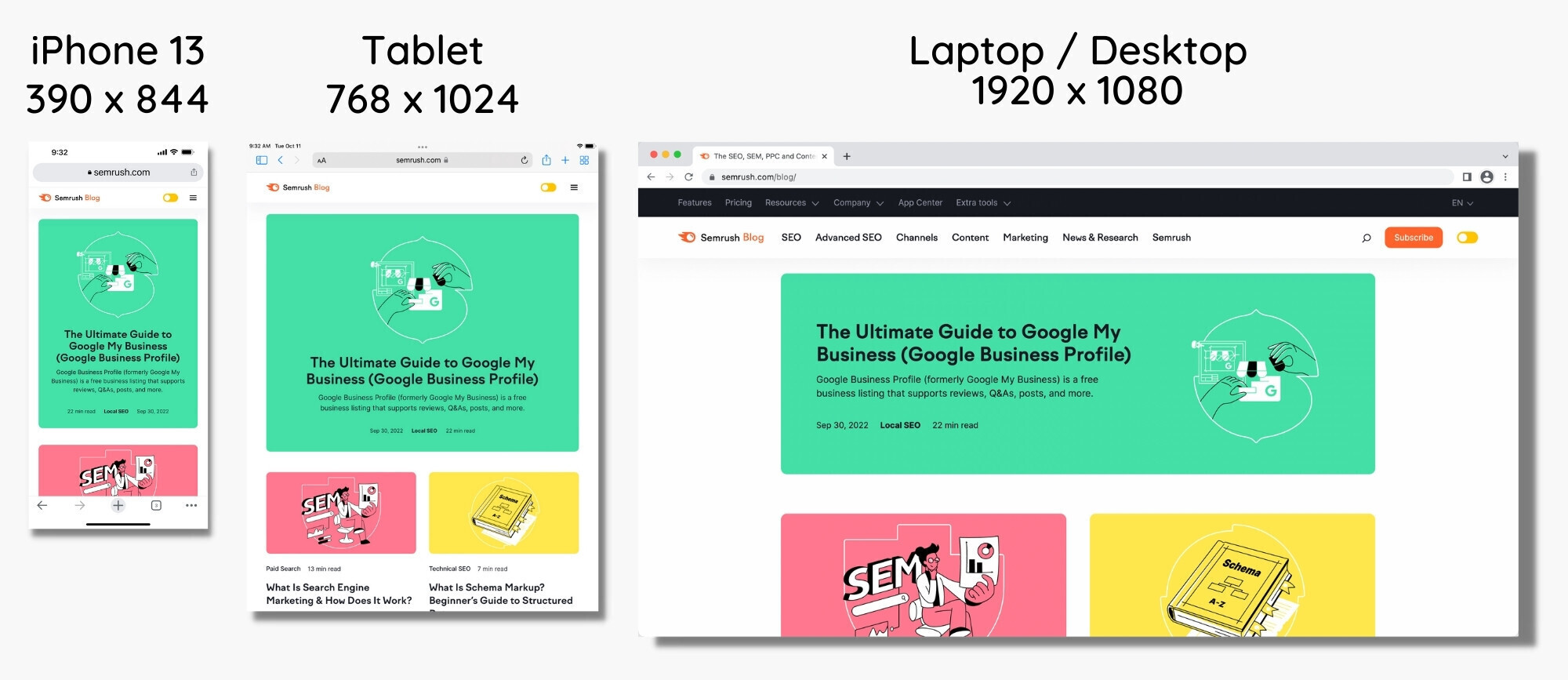
When using responsive design, you won’t need to deal with duplicate content issues or redirects that can slow down your site.
Instead, you can create one responsive page for each piece of content.
This will save you a ton of time.
Plus, you won’t have to worry about the design on responsive pages. The layout will always adjust to different devices accordingly.
It’s a win-win for mobile SEO.
2. Dynamic Serving
With the dynamic serving method, different HTML is shown based on the user's device. But the URL doesn't change.
Essentially, the content lives on the same URL. But the server provides different code to each device.
Here’s an example:

But Google prefers responsive design over dynamic serving.
Here’s why:
Dynamic serving sites can show users the wrong version of a page.
So servers can accidentally show a desktop version to someone using a smartphone. Which can be frustrating and create a bad user experience.
Read Google’s guide to dynamic serving to learn more about why they recommend using responsive web design instead.
3. Separate URLs
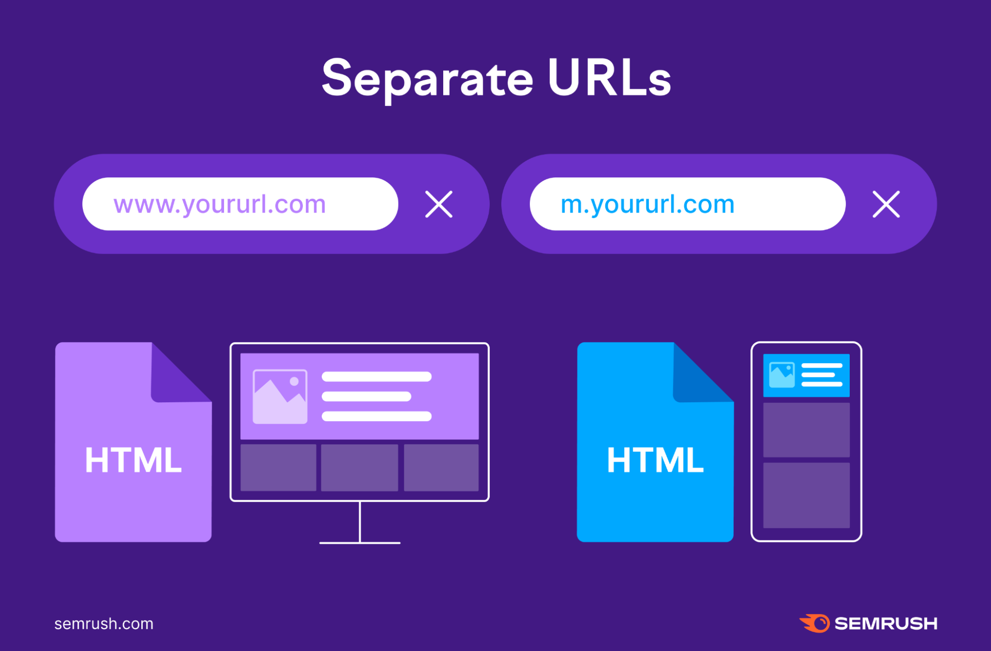
The last option is to set up separate URLs for your desktop and mobile sites. So you’ll have a URL for the desktop version of your site and another URL for the mobile version.
The desktop URL looks like your typical URL: https://www.yoursite.com/
While the mobile version usually replaces part of the URL with an “m” or the word “mobile”:
https://m.yoursite.com/
Like so:
Google strongly recommends avoiding this tactic.
When someone visits your site, the server will determine what device the visitor is using and direct them to either the mobile or desktop version of your site.
The issue with this solution is that it can take a lot of effort to manage.
And because there are two versions of each page, you’ll need to add either rel="canonical" tags or rel="alternate" tags to their HTML codes. This lets Google know which is the primary version of each page.
- On mobile pages: Set a rel="canonical" tag pointing to the desktop version
- On desktop pages: Set a rel="alternate" tag pointing to the mobile version
If you don’t properly set these tags, Google may register desktop and mobile pages as duplicate content. Which can be confusing for Google when it’s trying to rank the correct page.
You can read more about the process in Google’s guide to separate URLs.
In short:
If you don’t set up the separate URLs properly, you could spend a lot of time fixing technical SEO issues you can avoid in the first place. And your Google rankings could suffer.
How to Check if Your Site Is Optimized for Mobile
Once you’ve set up the mobile version of your site, you can check how user-friendly it is with a variety of tools.
Let’s start with Google Search Console (GSC).
Google Search Console
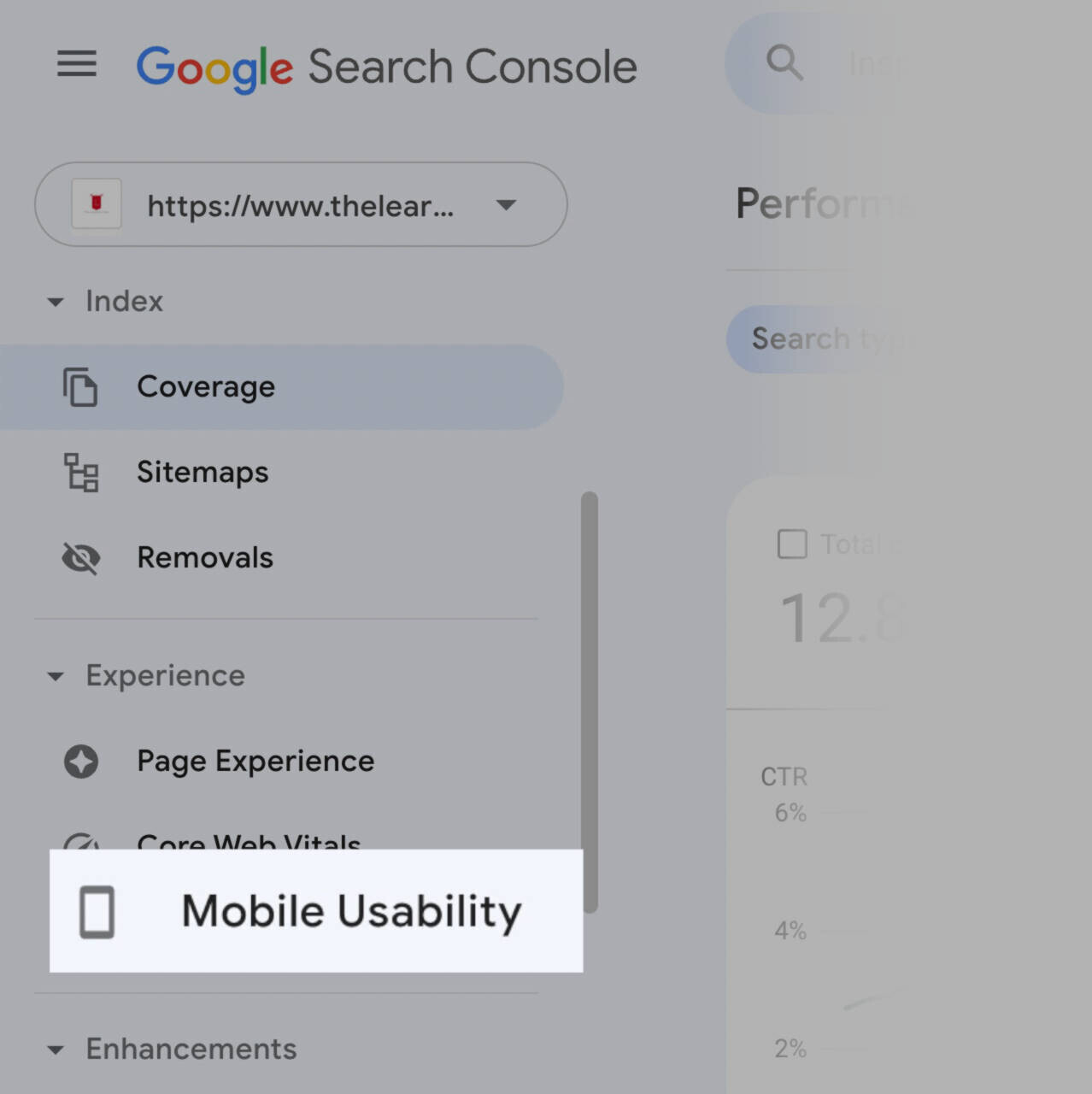
Once you log into your GSC account, click “Mobile Usability” in the sidebar.
The tool will let you know if there are any mobile issues. Like if the text on a page is too small or if clickable elements are too close together.
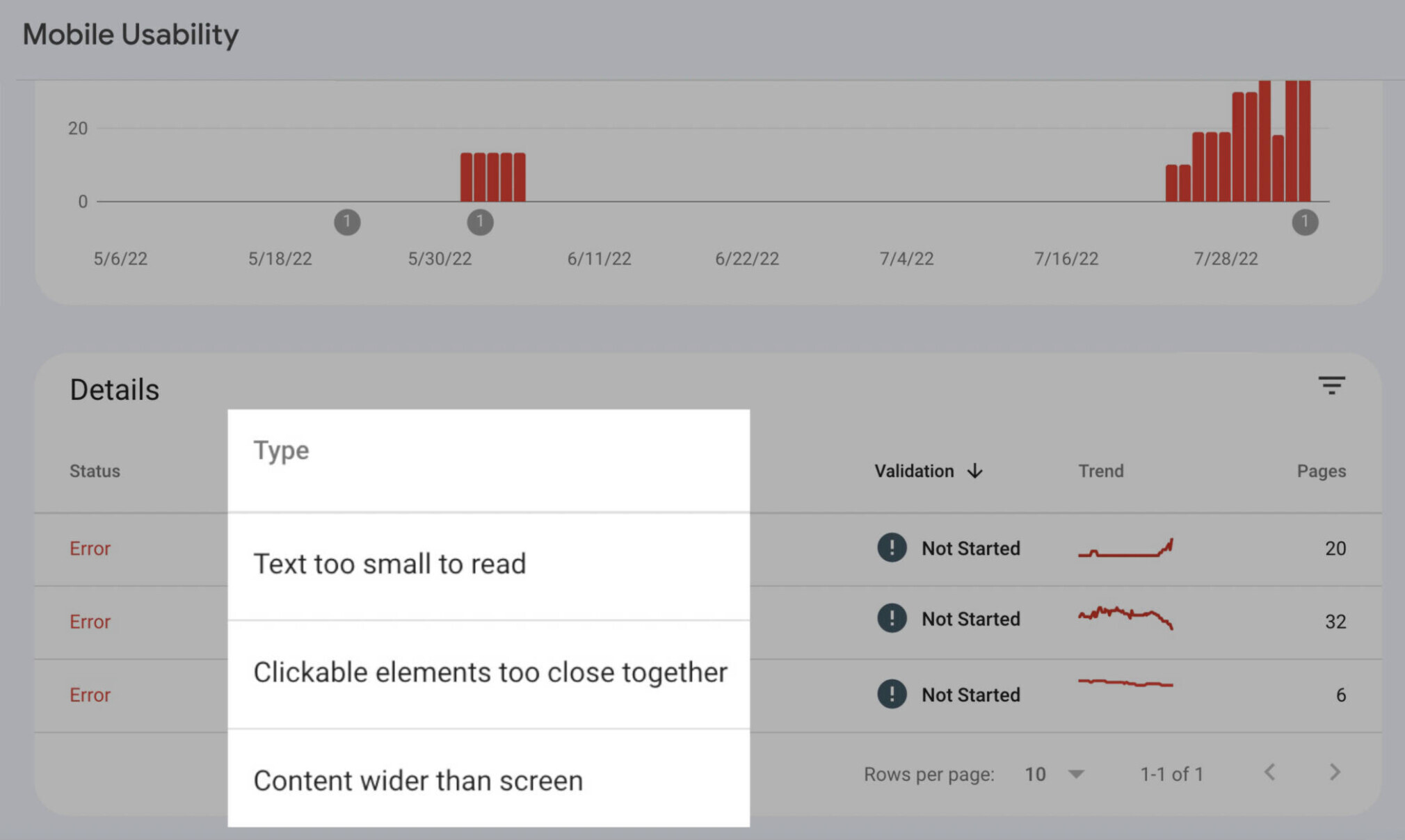
Use these insights to make changes to pages if needed.
Mobile-Friendly Test Tool
Another option is Google’s Mobile-Friendly Test tool. This tool allows you to check the mobile usability of individual pages.
There’s no need to log in with this one—all you need to do is paste your URL into the tool.
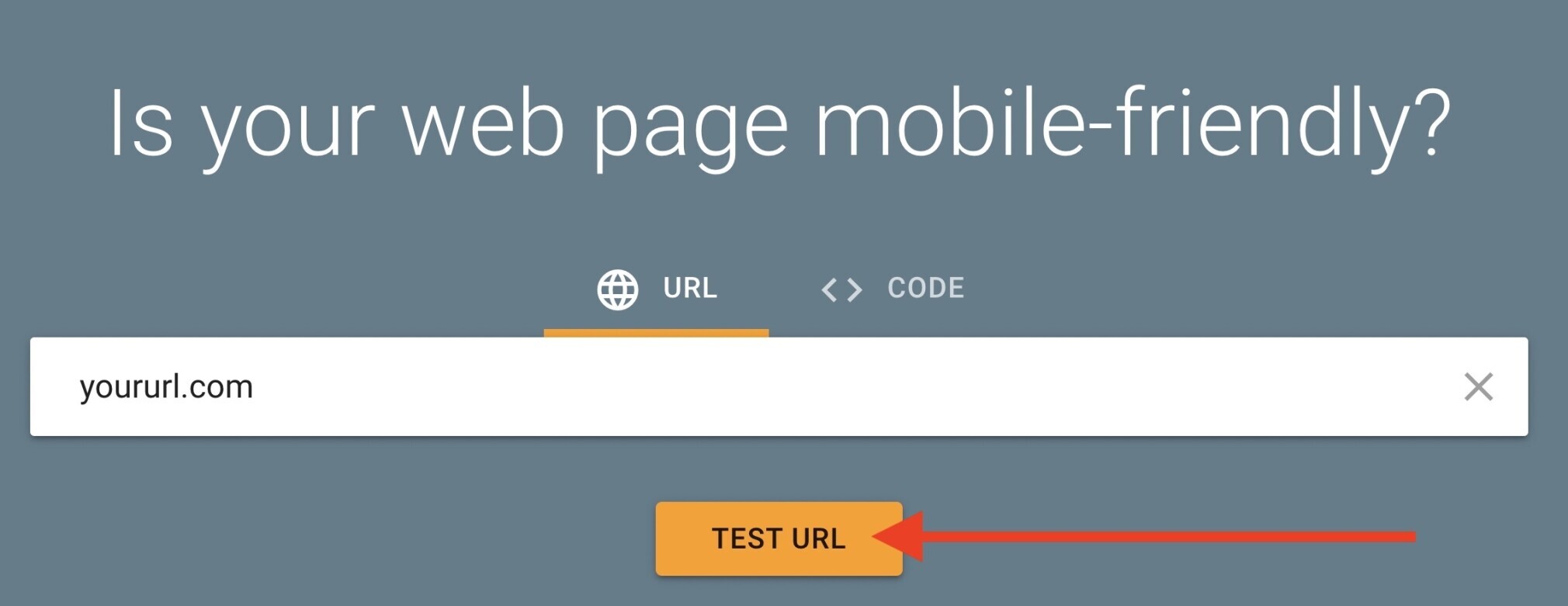
Then, it will tell you if the URL you entered is mobile-friendly.
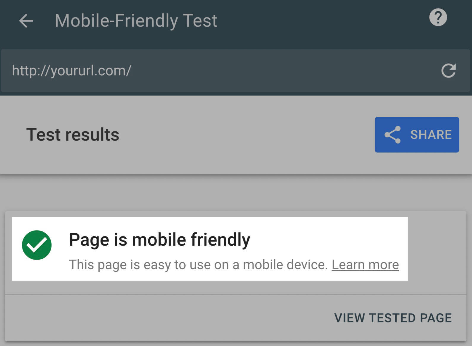
And if not, it will let you know what areas to address.

If you need to learn more about an issue, hover over it and click on the question mark that appears.
You can learn more about the six types of mobile usability errors in Google’s Mobile Usability guide.
Semrush Site Audit
Semrush’s Site Audit tool checks your site for over 140 technical issues, including many related to mobile site SEO.
After setting up, go to the “Issues” report to view a full list of errors, warnings, and notices.
Click “Why and how to fix it” for advice on any issue. Or follow the blue links to see affected pages.
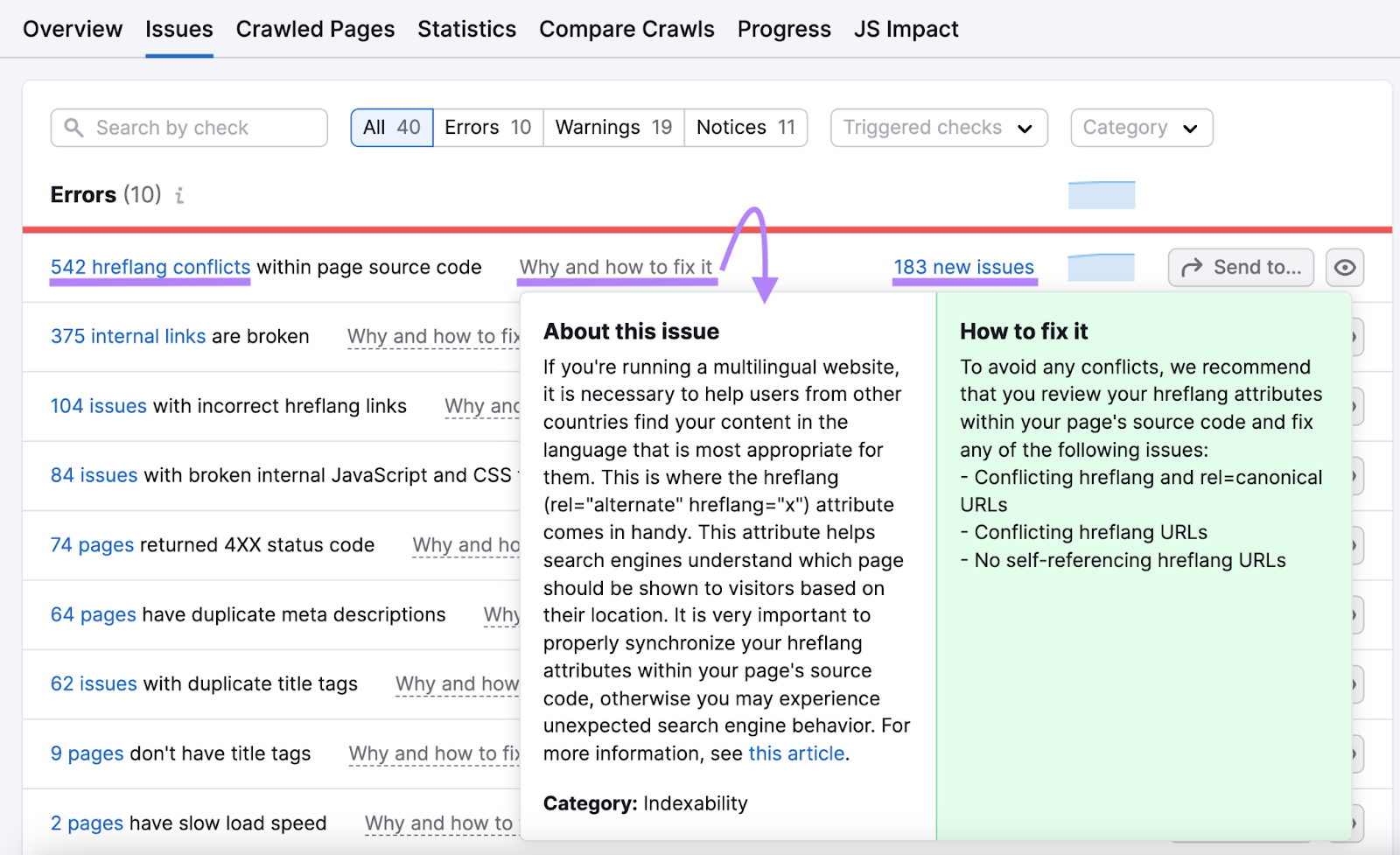
Many of these issues affect SEO across device types.
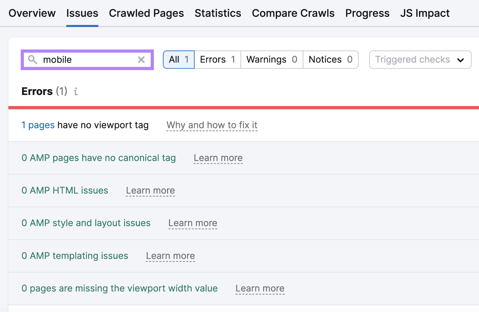
But you can search for “mobile” to focus on mobile-specific issues. Such as those concerning AMP (Accelerated Mobile Pages) or viewport meta tags.
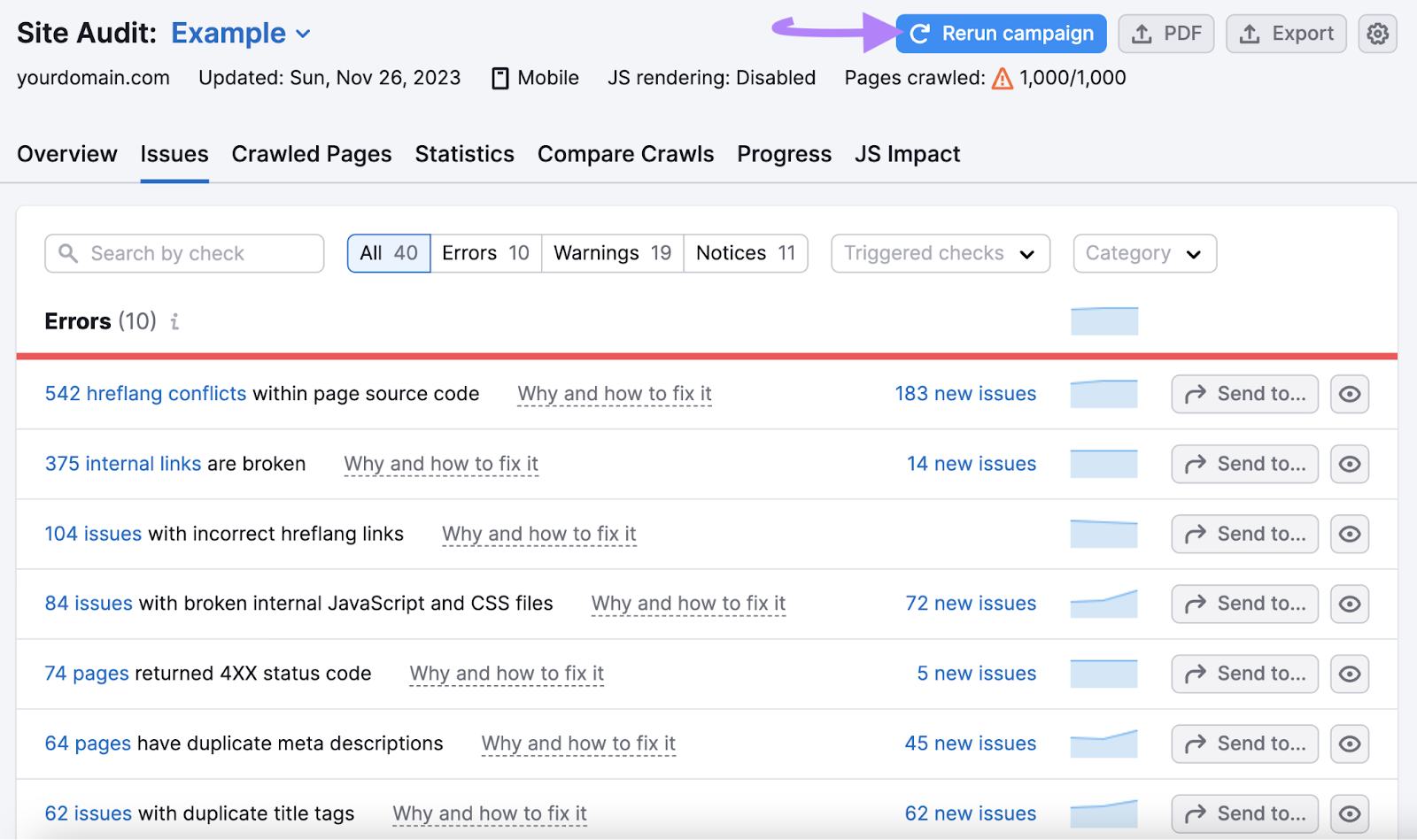
After making improvements to your mobile SEO, rerun your audit. To ensure the issues have been fully resolved.
PageSpeed Insights
Google uses page experience as a ranking factor. And page experience includes how quickly your page loads.
Google recommends that mobile sites load in under a second. Luckily, they offer a tool that checks for speed issues: PageSpeed Insights.
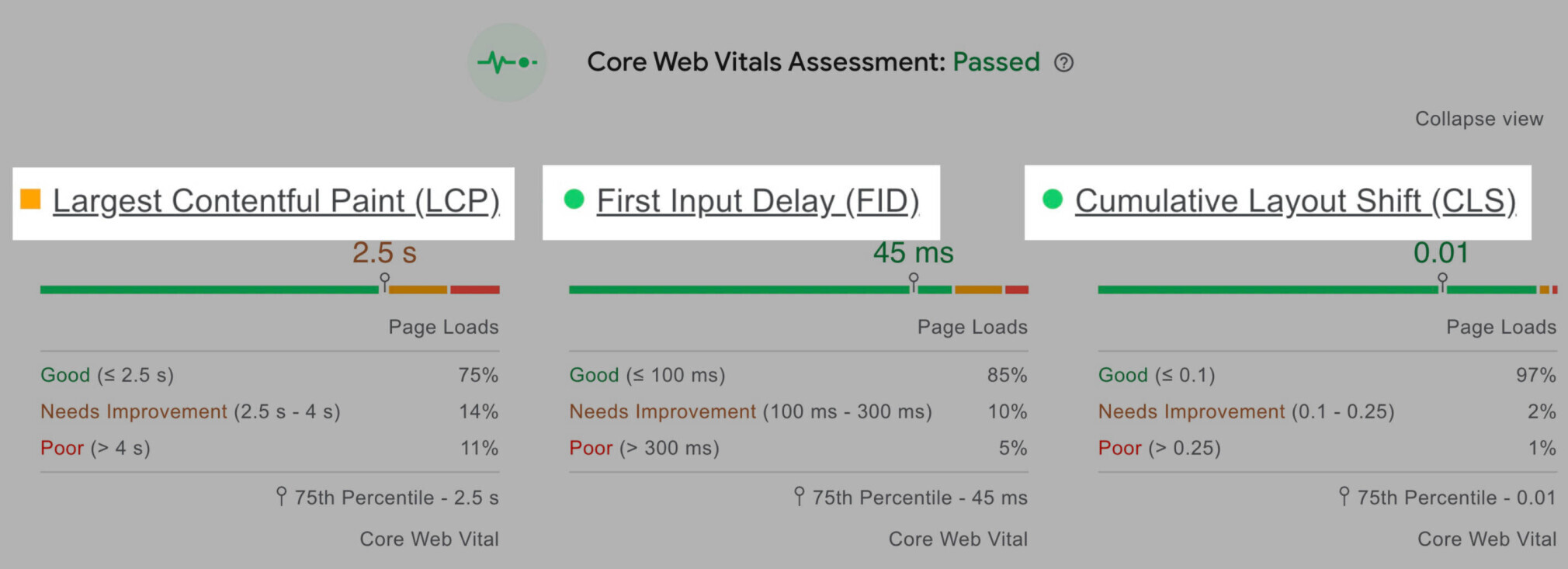
PageSpeed Insights will assess your Core Web Vitals—i.e., a group of factors that affect page experience.
The Core Web Vitals are:
- Largest Contentful Paint (LCP). The amount of time it takes for the main content to load.
- First Input Delay (FID). The amount of time it takes for your website to respond to the first interaction (e.g., a click) from a user.
- Cumulative Layout Shift (CLS). How much your webpage shifts (or “moves down”) as more content (e.g., banners, images) loads.
To use PageSpeed Insights, enter your URL into the tool to get a full report.

Your report will look like this:
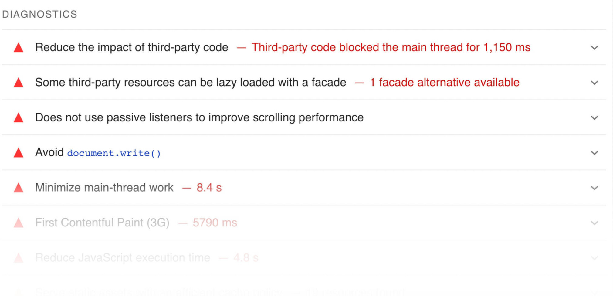
It also gives you a Diagnostics report. That lists existing errors and code that might slow down your page load time.
And an Opportunities report that gives you suggestions for increasing page speed.

Increase page speed to improve the user experience and show Google that you’re answering searchers’ needs—quickly.
8 Mobile SEO Tips & Best Practices
Now that we’ve covered the basics, let’s discuss how to do mobile SEO.
Here are eight essential tips and mobile SEO best practices:
1. Create Mobile-Friendly Content
We’ve already discussed using resources like the Mobile-Friendly Test tool and PageSpeed Insights to check whether your pages are mobile-friendly.
Now let’s cover how to create mobile-friendly content in the first place.
Use Short Paragraphs
Keep in mind that short paragraphs on desktop will appear much longer on mobile. To keep things readable, include no more than one idea per paragraph.
There’s no magic number of sentences to add per paragraph. But reducing the number of sentences in a paragraph can make it easier to read.
It’s also helpful to split up longer sentences into shorter ones. That way, mobile users can skim more easily.
Here’s an example of a skimmable series of paragraphs on mobile:
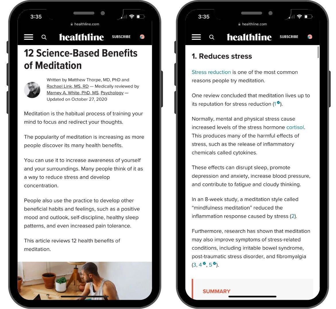
You can further break up text with bulleted or numbered lists, tables, images, or videos.
Keep Introductions Short
For the same reasons as above, it’s best to keep your introductions on the shorter side.
Users will only see a few paragraphs at most when they navigate to your site. So it’s your goal to hook them early. Get to your main point quickly. Elaborate as you go within the article.
And if the article is centered around a question-based keyword, answer the question at the very beginning.
For example, if someone searched “how many ounces in a cup,” they would ideally find the answer in the first sentence.
Don’t Be Afraid of White Space
White space is one of the most valuable elements of web design. Including white space (or simply blank space) between text blocks, images, margins, and more improves the readability of any page.
White space can improve comprehension by as much as 20%.
Take a look at the difference between these two examples:
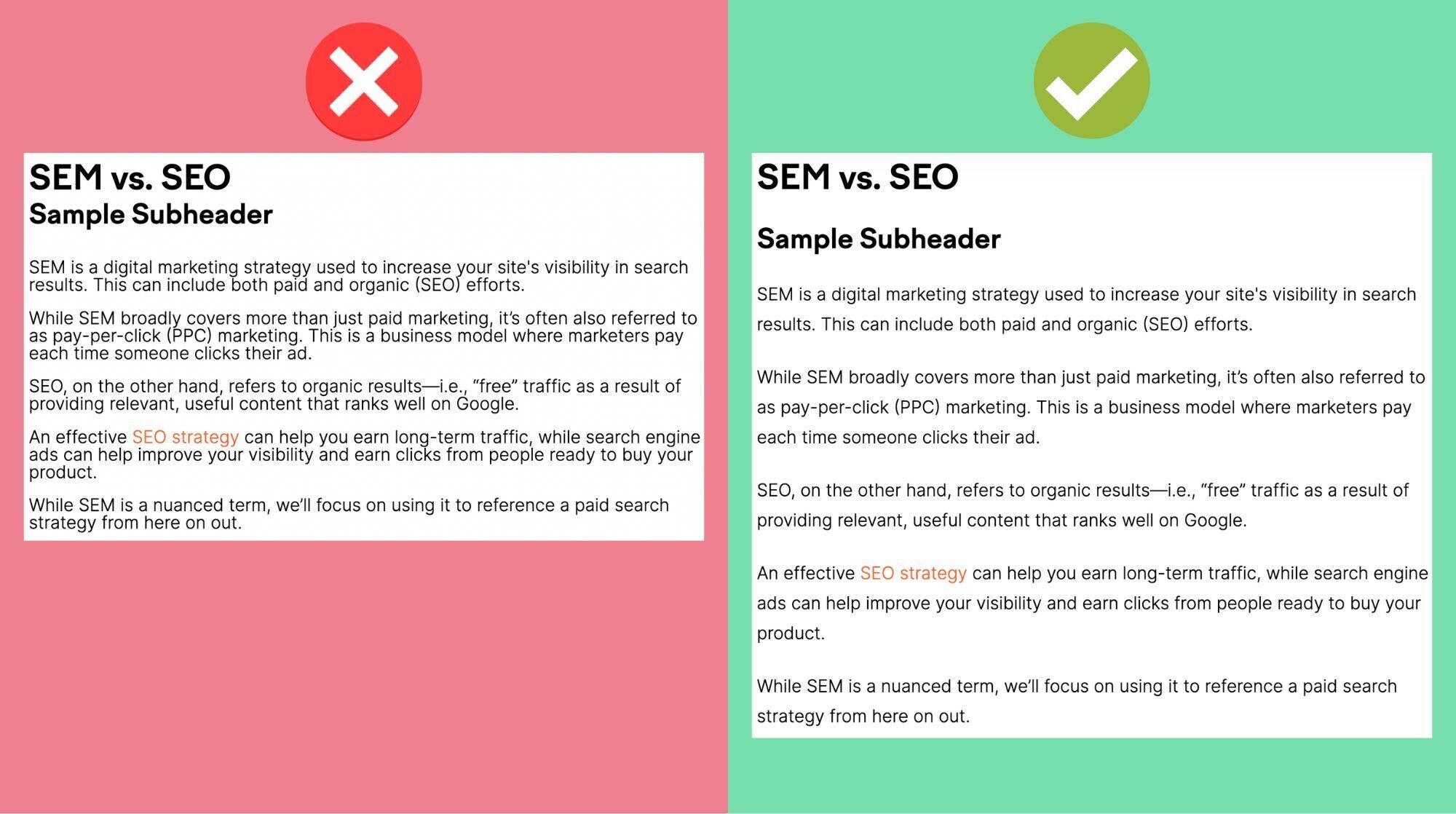
The additional space between headings and lines on the right makes it much easier to skim.
Avoid Intrusive Popups
Google has been penalizing “intrusive pop-ups” for years.
And has specifically called out intrusive interstitial pop-ups, which cover the page’s main content as soon as the page loads.
Here are examples of what not to do from Google:

The pop-up covers the main content in each of these examples.
It’s OK to use pop-ups to ask users to accept cookies or verify a user’s age. You can even include a traditional ad—so long as it uses a “reasonable” amount of screen space.
Like this:
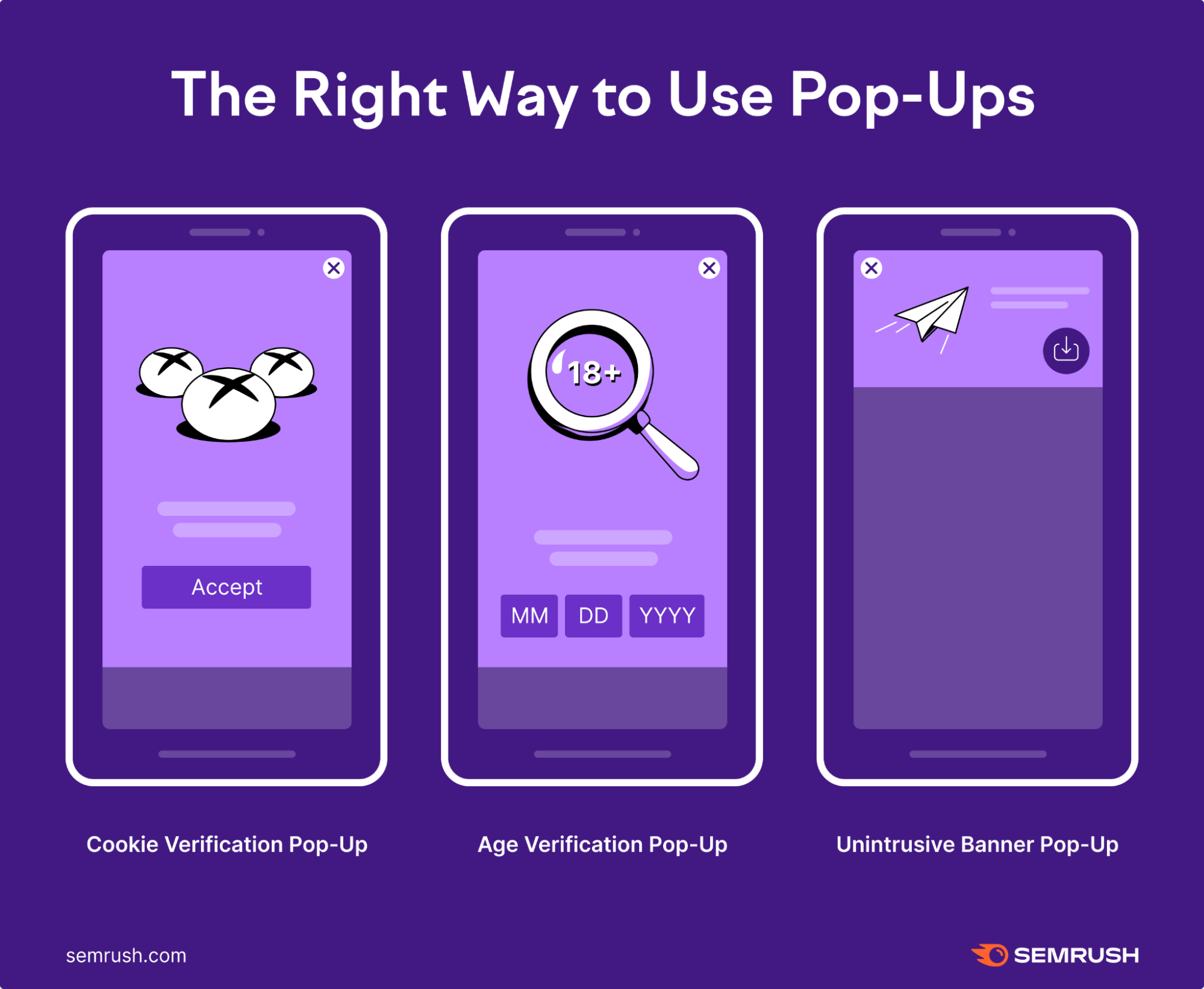
So if you’re going to use pop-ups, be sure to use them purposefully. And definitely don’t hide content on your page behind an ad.
2. Use Structured Data on Your Mobile Website
Structured data organizes content so that Google can more easily understand it. And schema markup is the code that represents this data in a way that search engines can understand.
Schema markup can add things like recipe stars or reviews directly to your results in the SERPs. This turns your normal SERP snippets into rich snippets (or results with extra data displayed).
That can make your webpages stand out even more in the SERPs.
Here’s what “how to” schema looks like on the SERP and in code:
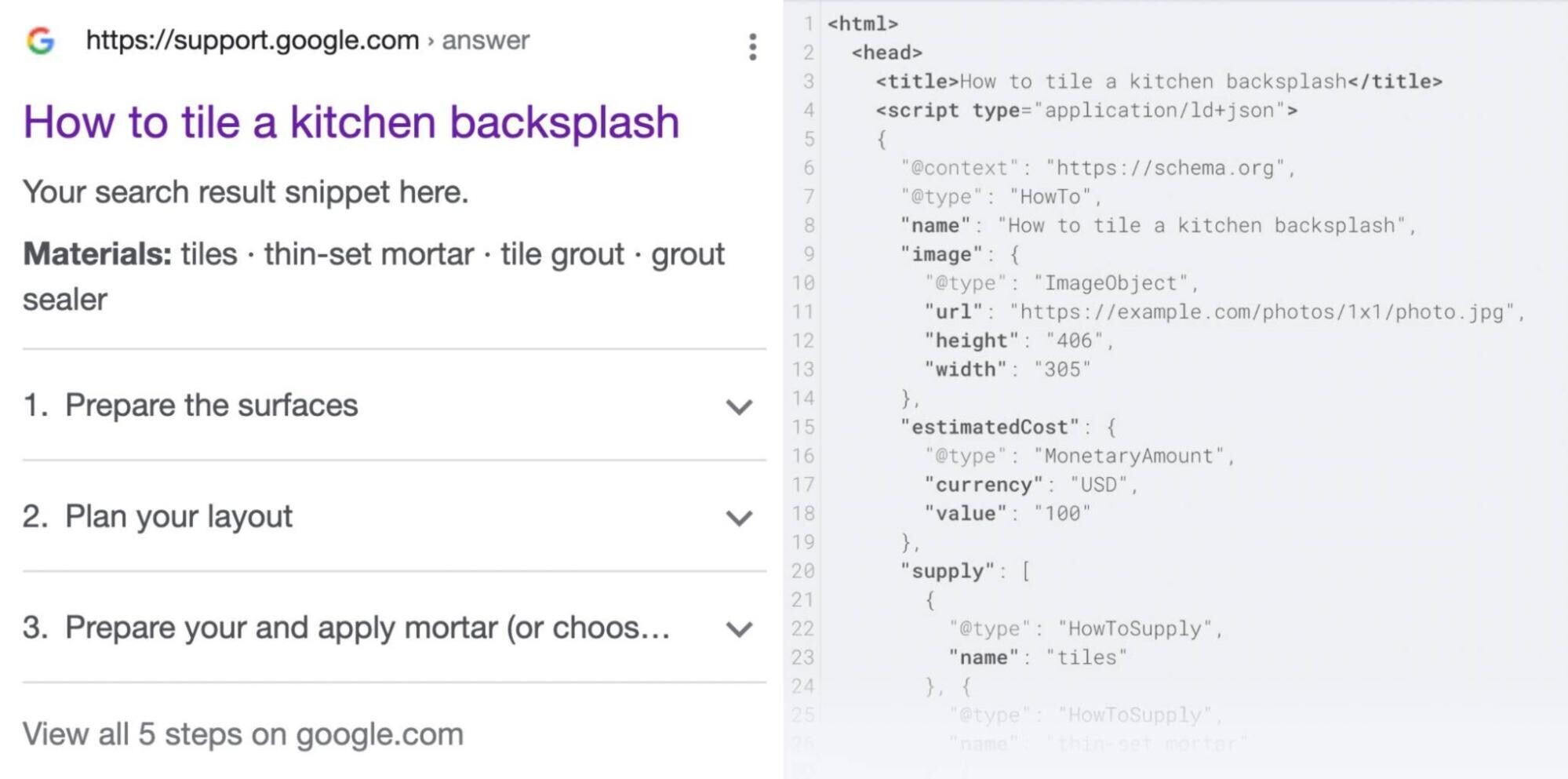
But keep in mind that mobile searches appear in cards in a single column, like this:
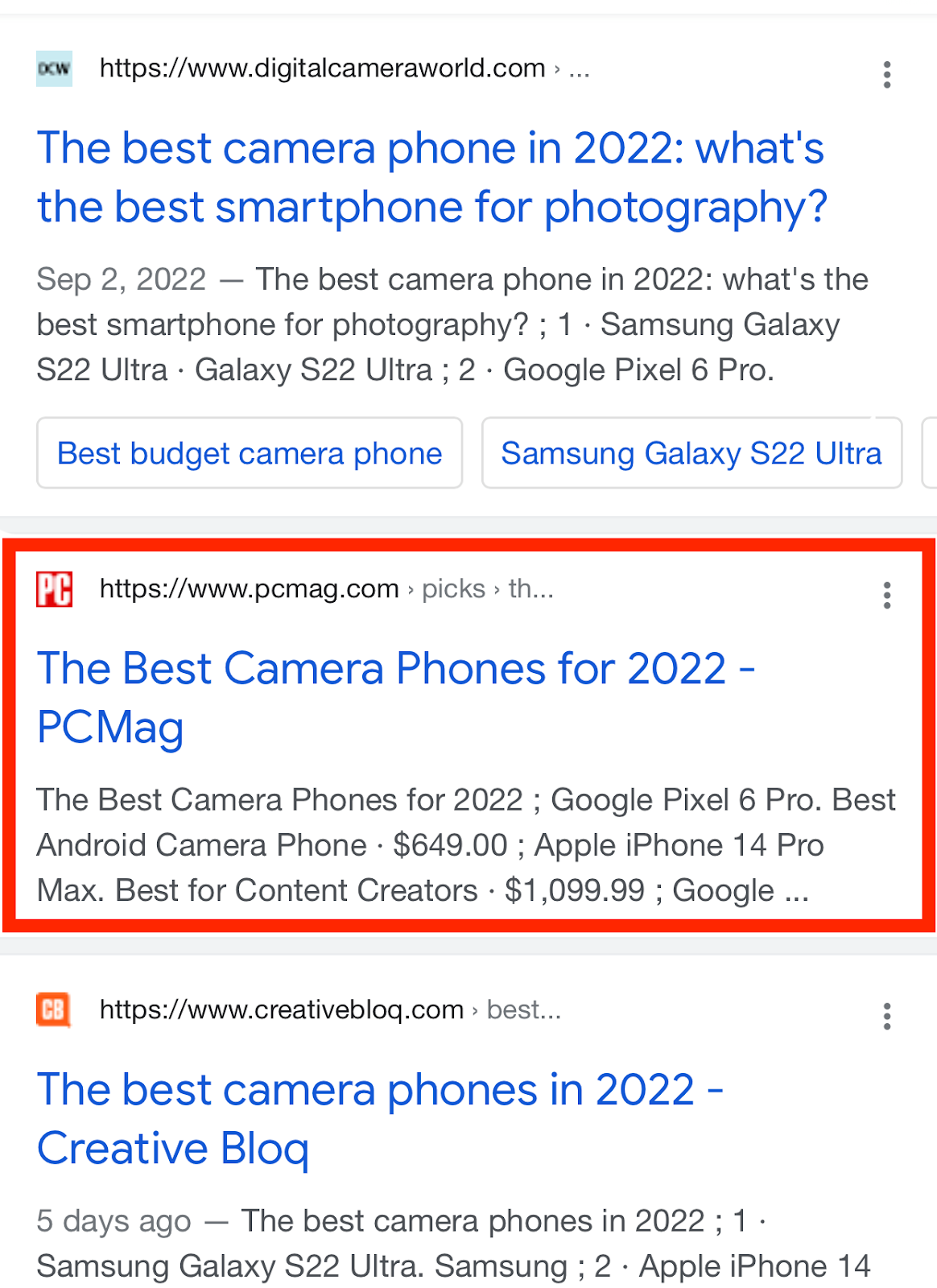
Say you want to add an FAQ section below your meta description using schema markup. The actual code might look like this:
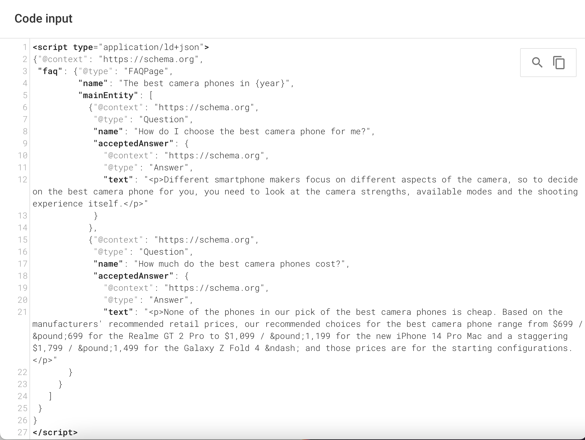
And this is how it looks in the search results on desktop:
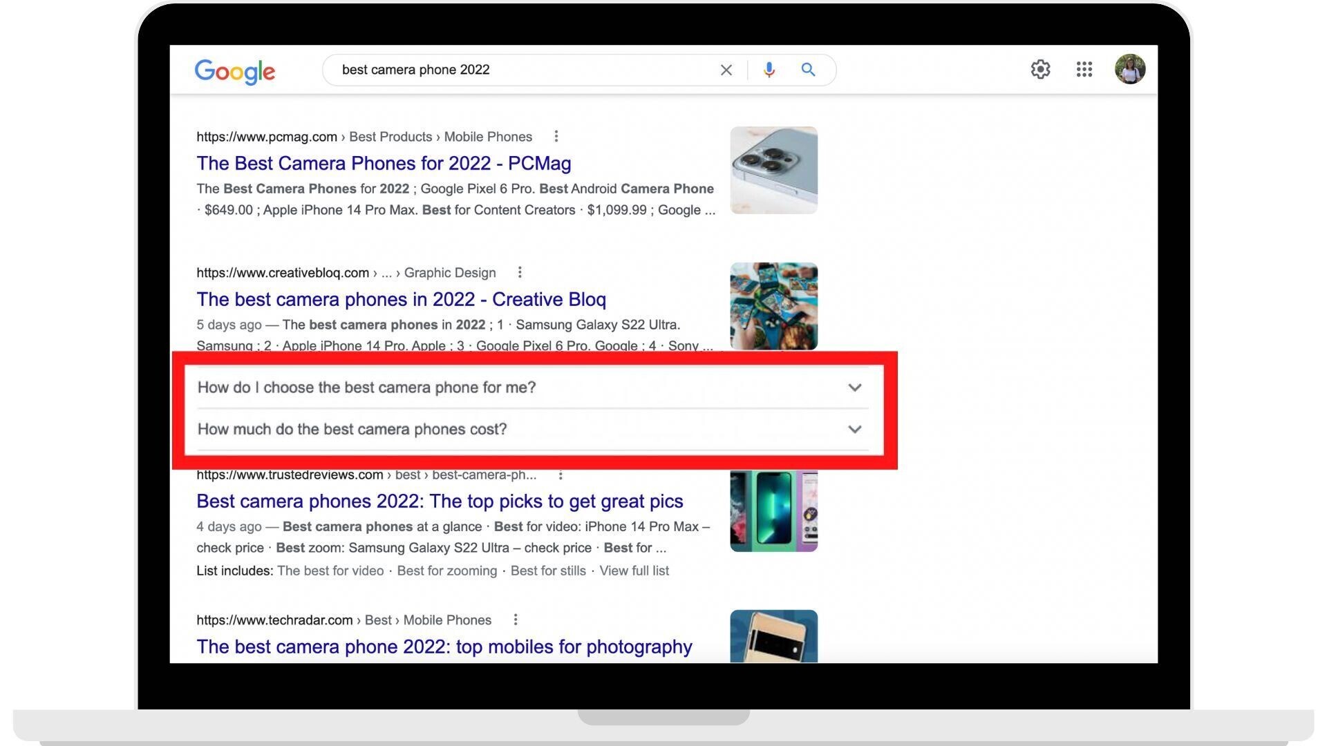
And here’s how it looks in mobile search results:
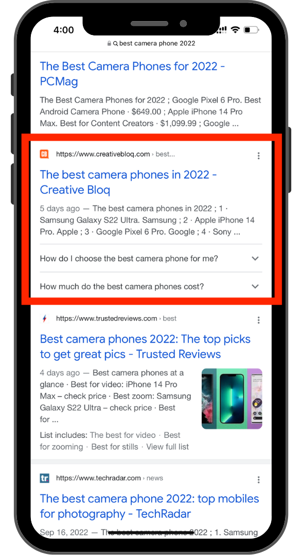
You’re working with a lot less space on mobile since there’s only one column of results. So the rich results stand out even more.
So if your goal is to get more mobile traffic, it’s helpful to implement structured data for the additional contrast and space on the SERP.
To learn how to add structured data to your site, read our in-depth guide.
3. Target Voice Search-Friendly Keywords
Voice search-friendly keyword lists are crucial for mobile SEO.
In fact, 65% of consumers between ages 25 and 49 use voice-enabled devices often.
So it’s a good idea to optimize your content for people using voice search on their phones—i.e., optimizing for conversational or semantic search.
People using voice assistants to search typically speak more casually. To optimize for this, find question-based long-tail keywords.
For example, users might search “buy playstation 5” on a desktop. But when speaking, they may speak more casually and ask “where can I buy a playstation 5?”
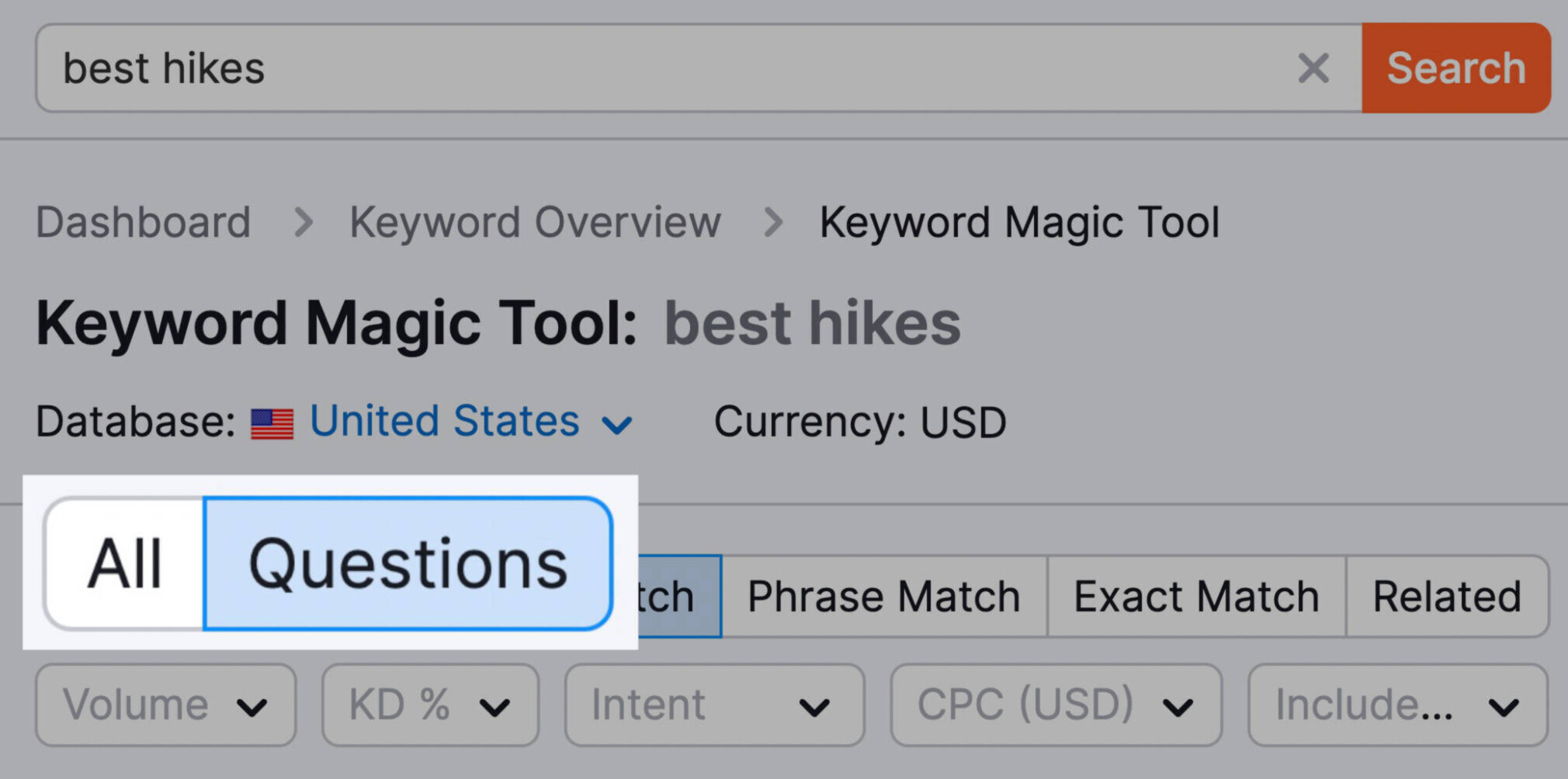
To find more examples of long-tail keywords, go to the Keyword Magic Tool and search for one of your target keywords.
We looked up “best hikes.”

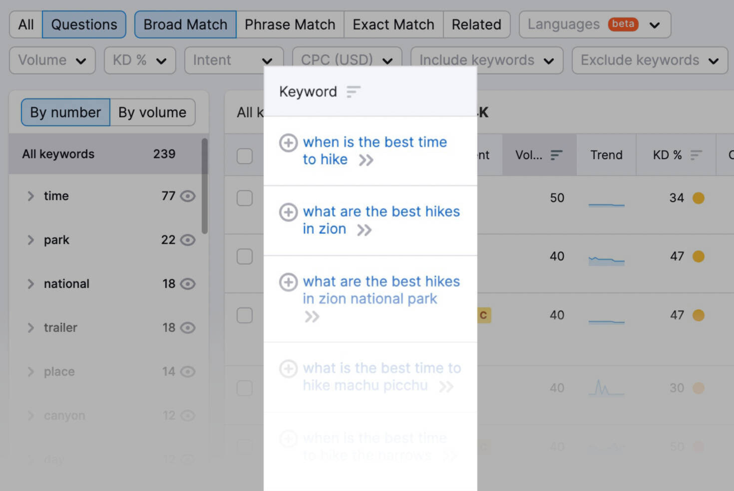
Then, filter your list of keywords by “Questions.”
You’ll get a list of questions that people usually search for.
4. Optimize Mobile Site Speed for Better UX
Plenty of Google tools can help you see how your mobile site is faring. Like PageSpeed Insights and the Mobile-Friendly Test tool.
However, you can also get detailed information on page performance directly in our Site Audit tool.
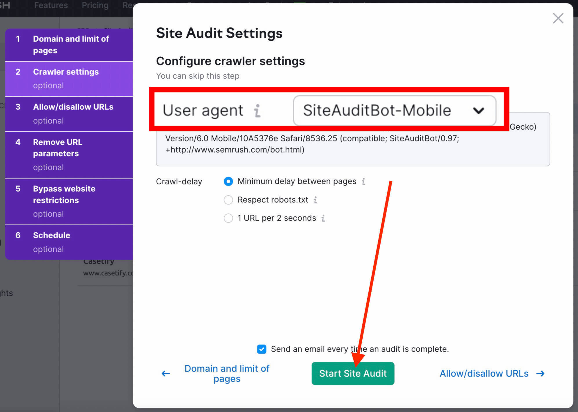
Start by setting up an audit for your website.

Double check that your crawler settings are set to “SiteAuditBot-Mobile.” Then, click “Start Site Audit.”
Once your audit is complete, navigate to the “Core Web Vitals” report found under Thematic Reports on the main page.
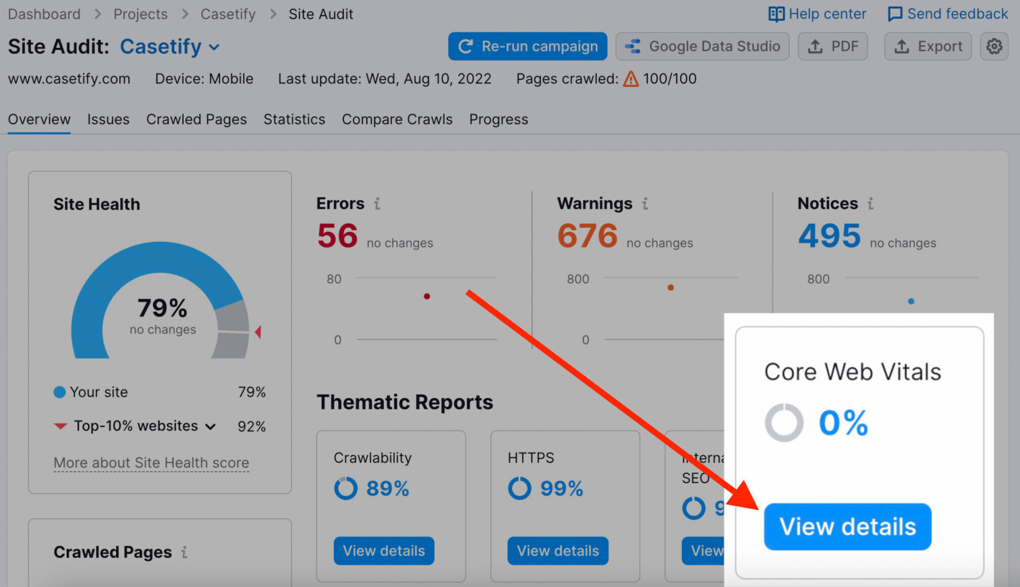
Here, you’ll find an overview of your site’s Core Web Vitals score. As well as a list of suggested improvements for specific pages:
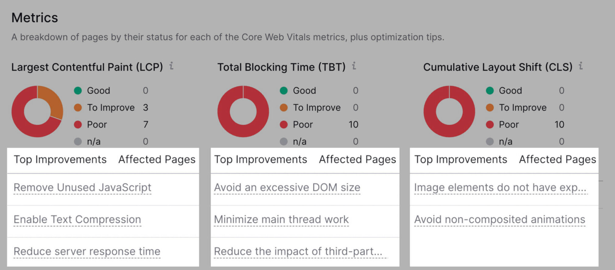
We recommend making these adjustments (along with any other technical adjustments you need to make on your site). Then, re-run your Site Audit to check that everything is in order.
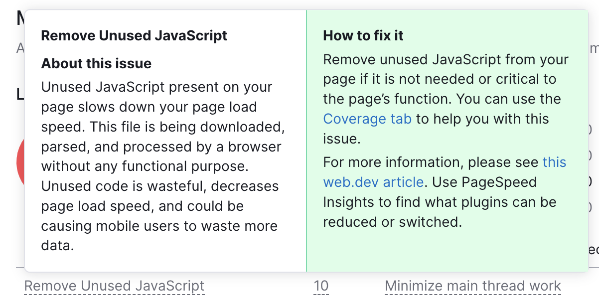
Click on the task you want to start with for a quick overview of what’s happening and how to fix it.
Here’s one example:
To learn more, read our guide to measuring Core Web Vitals with Site Audit.
5. Optimize Title Tags & Meta Descriptions for Mobile SERPs
Optimizing your title tags and meta descriptions can improve the CTR (click-through rate) of your page.
To optimize your title tags for mobile search, keep your title tag between 50 and 60 characters.
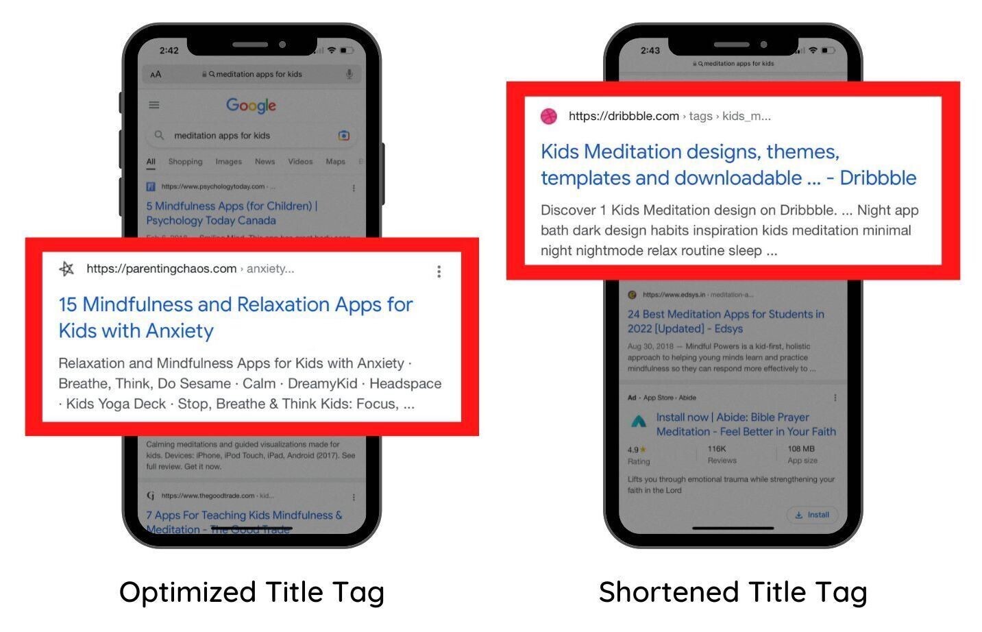
Google shortens or rewrites 99.9% of titles that are over 70 characters long. Titles at the recommended length are less likely to get shortened or rewritten.
Additional title tag tips include:
- Target one primary keyword
- Avoid keyword stuffing
- Make each page’s title unique
- Front-load important information
As for meta descriptions:
Your best bet is to keep your meta descriptions under 120 characters.
Any longer, and they’re likely too long for mobile. (And Google will cut them off or rewrite them.)
So, keep them under 120 characters. This way, users will be able to read the whole thing whether they’re on desktop or mobile.
Additional meta description tips for mobile include:
- Summarize your page’s content
- Use unique descriptions for every page
- Include your primary keyword
- Add a call to action or a value proposition to encourage clicks
6. Monitor Your Keyword Positions on Mobile
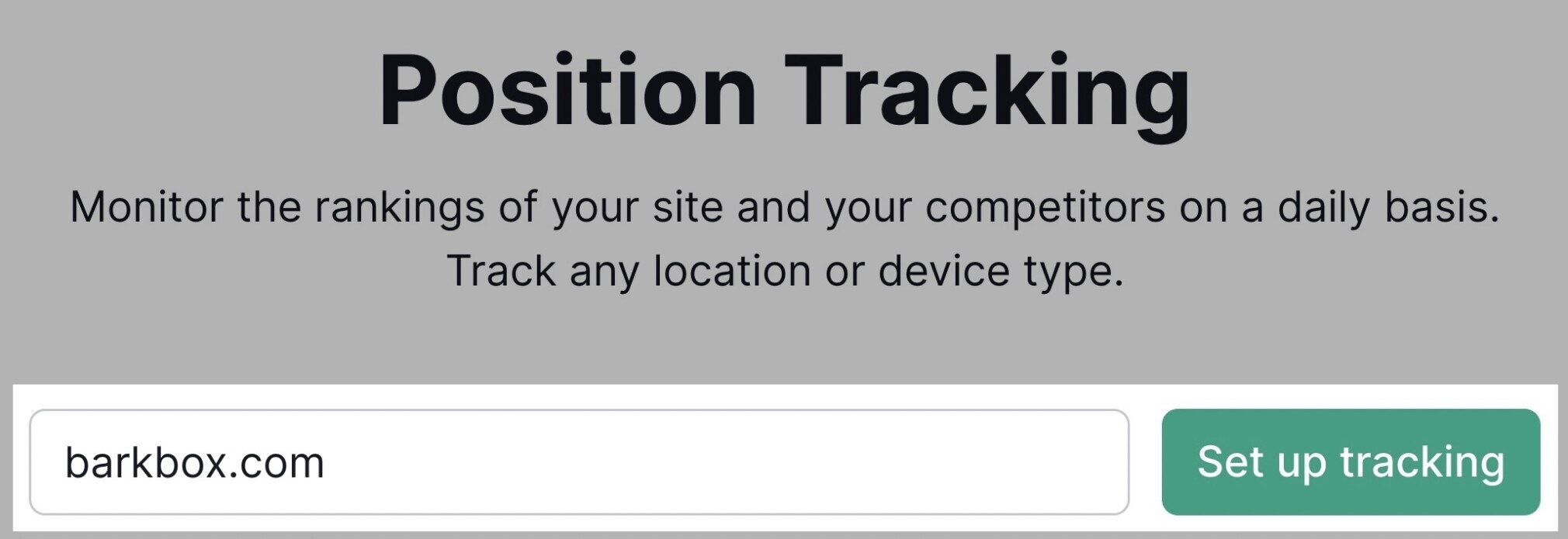
Keep tabs on your mobile rankings by setting up a Position Tracking campaign.
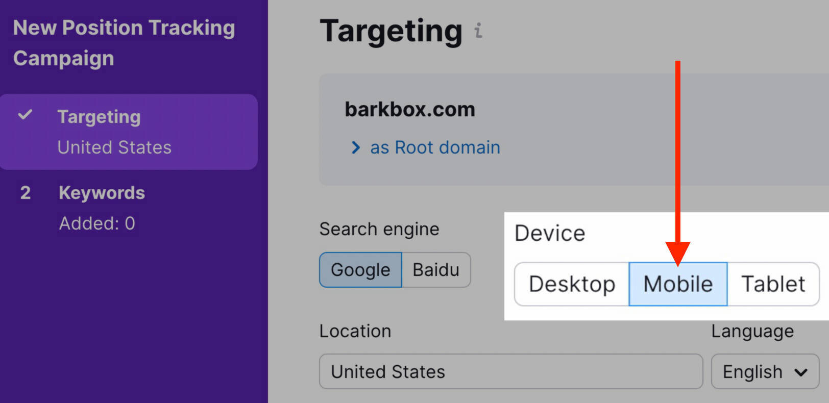
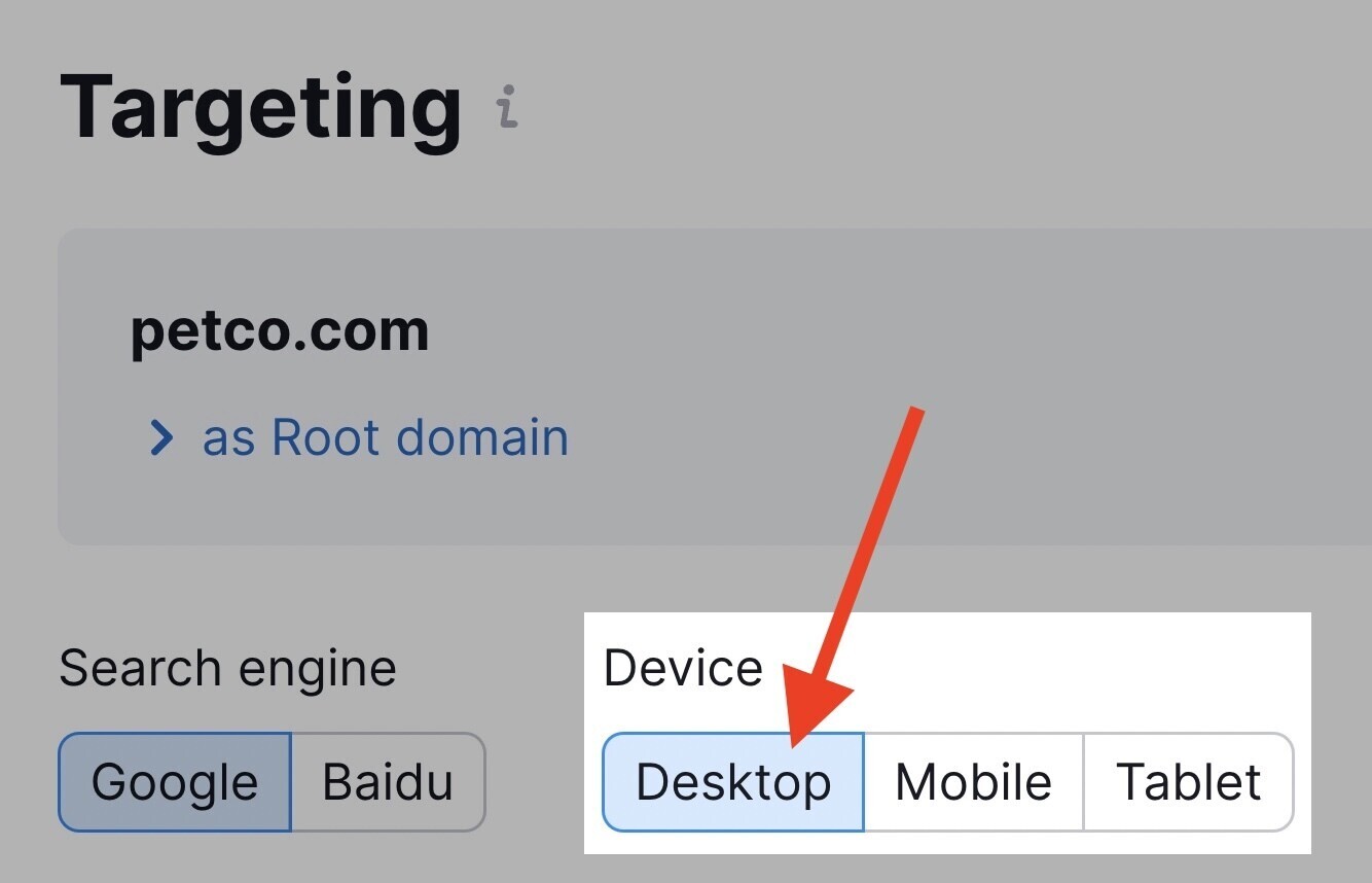
When setting up your campaign, be sure to select “Mobile” under the device category.
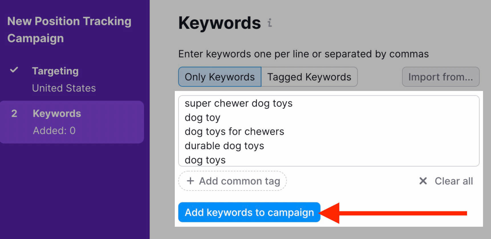
Enter the keywords you’d like to track. Then click “Add keywords to campaign.”
Once setup is complete, go to the “Overview” tab.
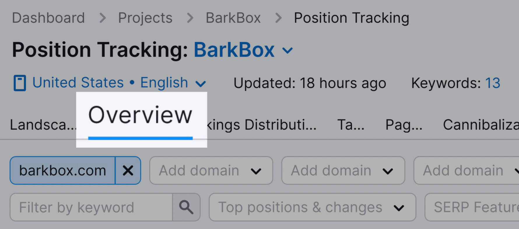
Scroll down to see an overview of rankings for the keywords you chose:
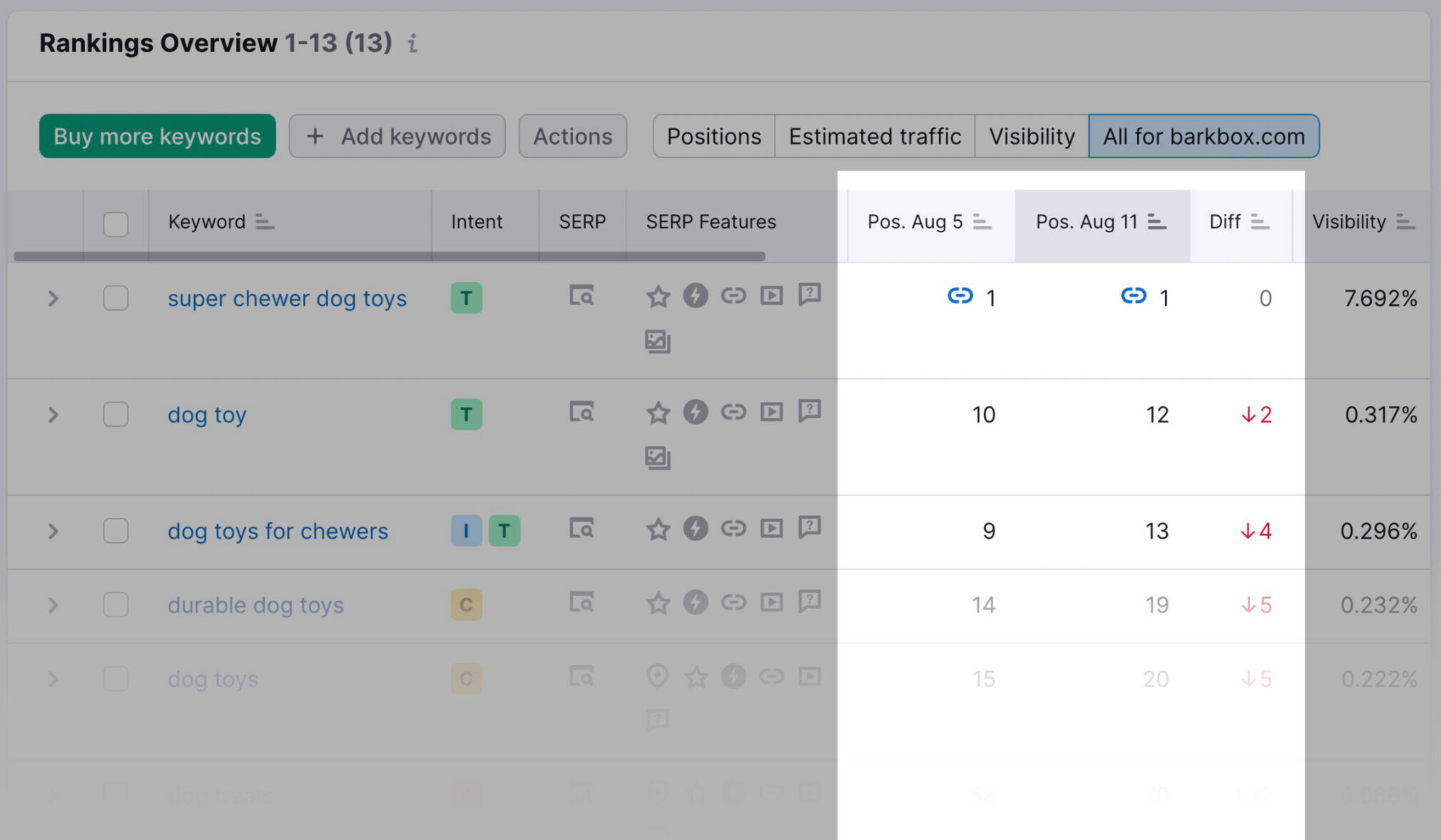
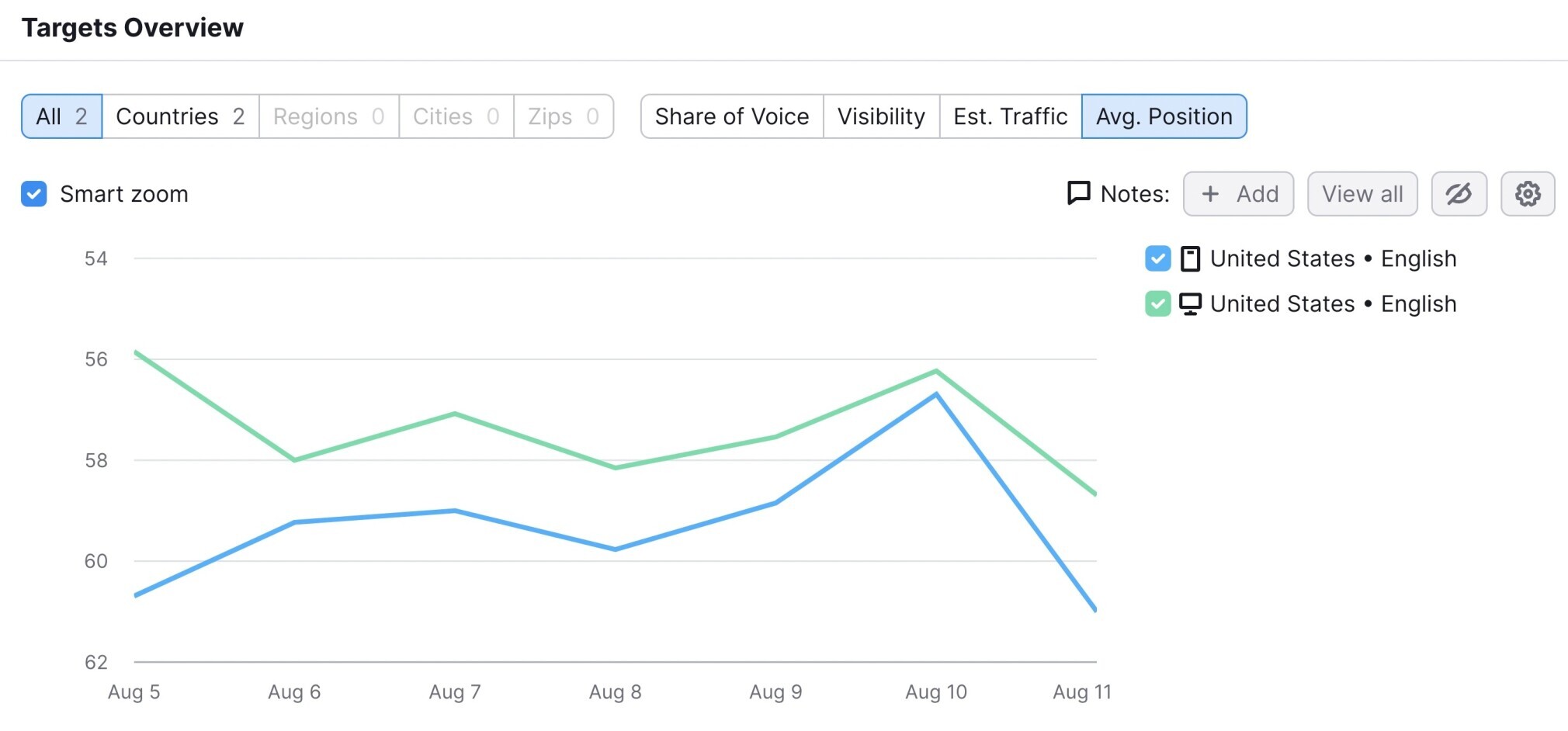
Want to compare mobile vs. desktop traffic for your tracked keywords? If you have a Semrush Business or Guru account, you can do so by visiting the “Devices & Locations” tab.
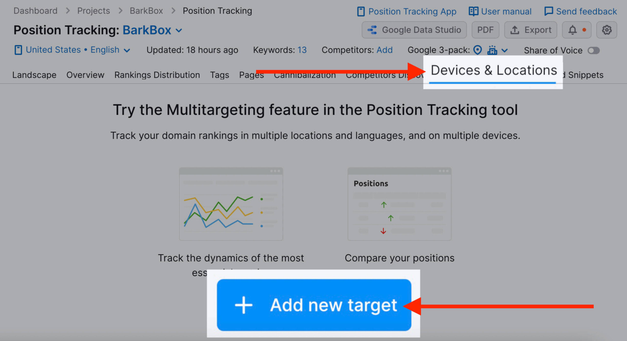
All you need to do is click “Add new target,” where you’ll add the same keywords you added earlier. Just be sure to choose “Desktop” instead of “Mobile” this time.
Now, you can see the difference between desktop and mobile performance for the keywords you’re tracking:
Want to keep an eye on your tracked keywords with minimal effort? Click on the bell icon at the top right of the screen to subscribe to a weekly email from your Position Tracking campaign.

7. Review Your Competitors’ Mobile SEO Performance
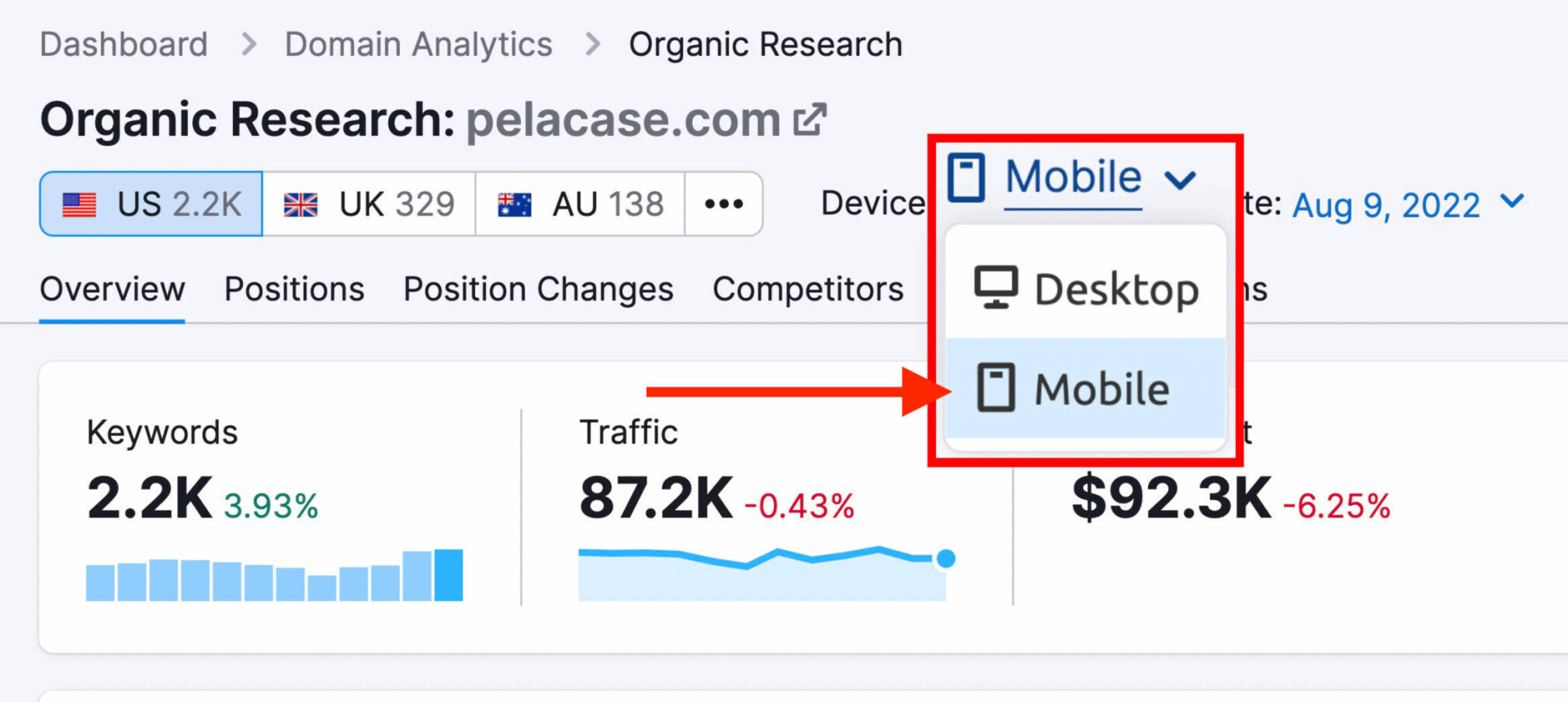
To get a bird’s-eye view of your competitors’ mobile performance, head to a competitor research tool like Semrush’s Organic Research.
Here, you can find your competitors’ best keywords, discover new organic competitors, and observe domains’ position changes.
Start by entering the domain you want to review.

The main overview page will look like this. (Be sure to toggle the device to “Mobile” to get the correct data):
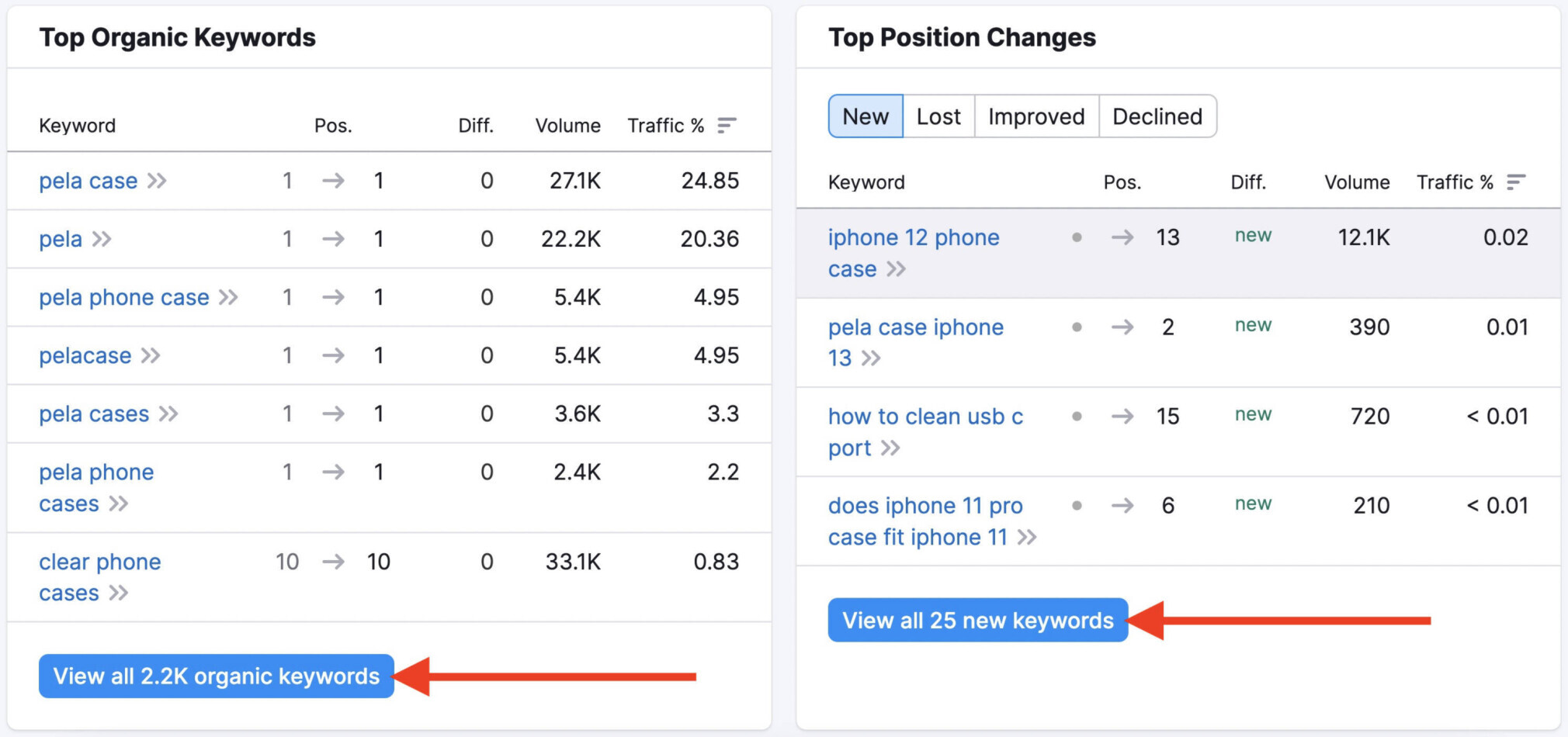
Scroll to see your competitor’s top keywords and position changes. And click into the corresponding reports for more detail:
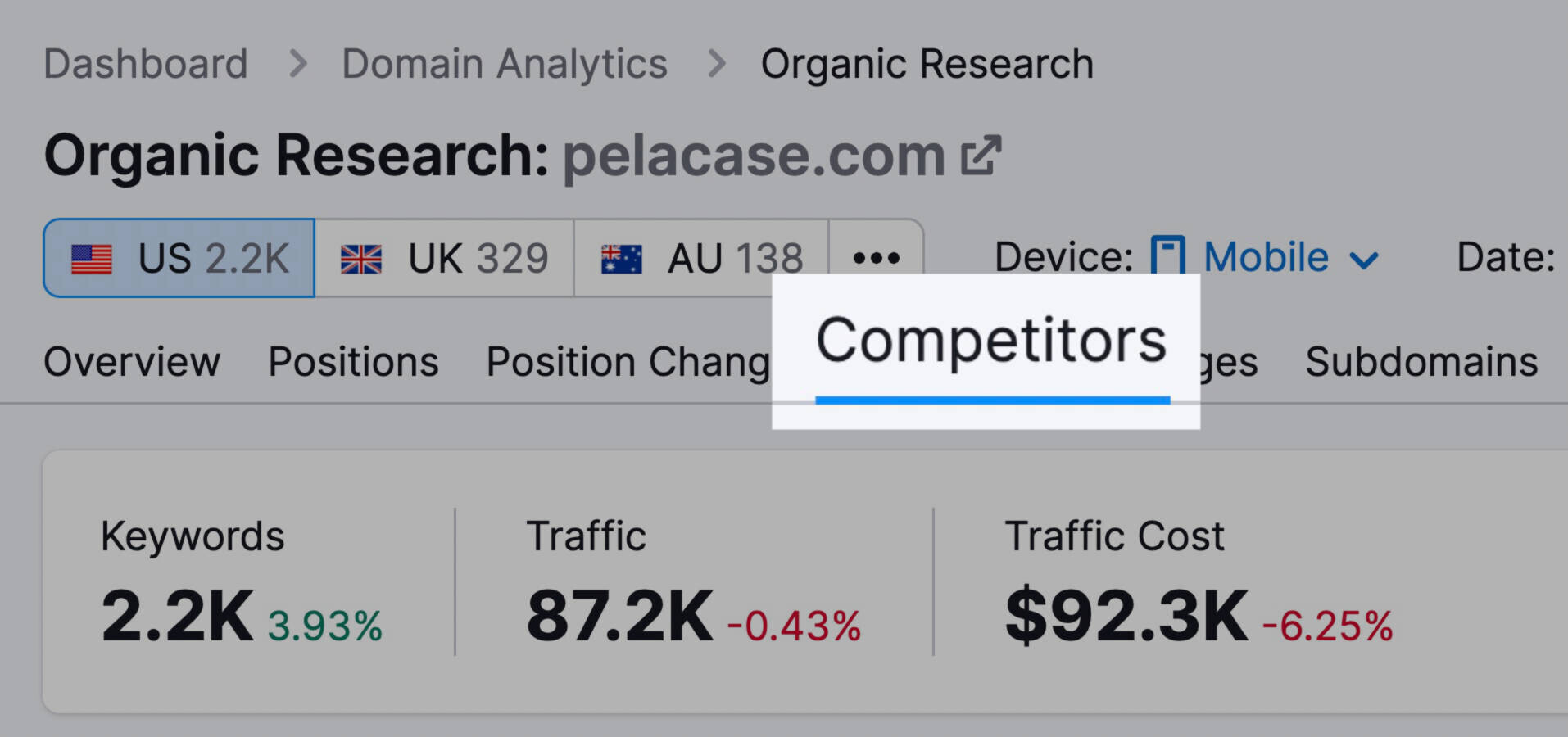
To find related competitors, click on the “Competitors” tab at the top of the screen.
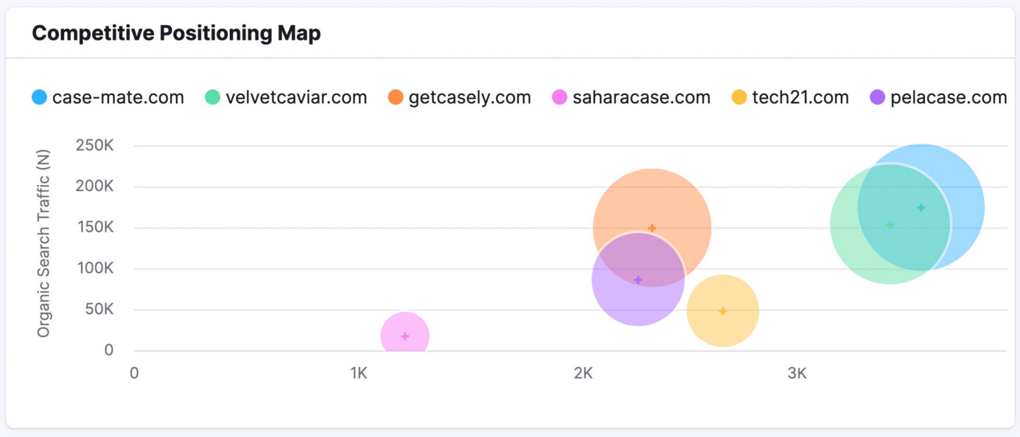
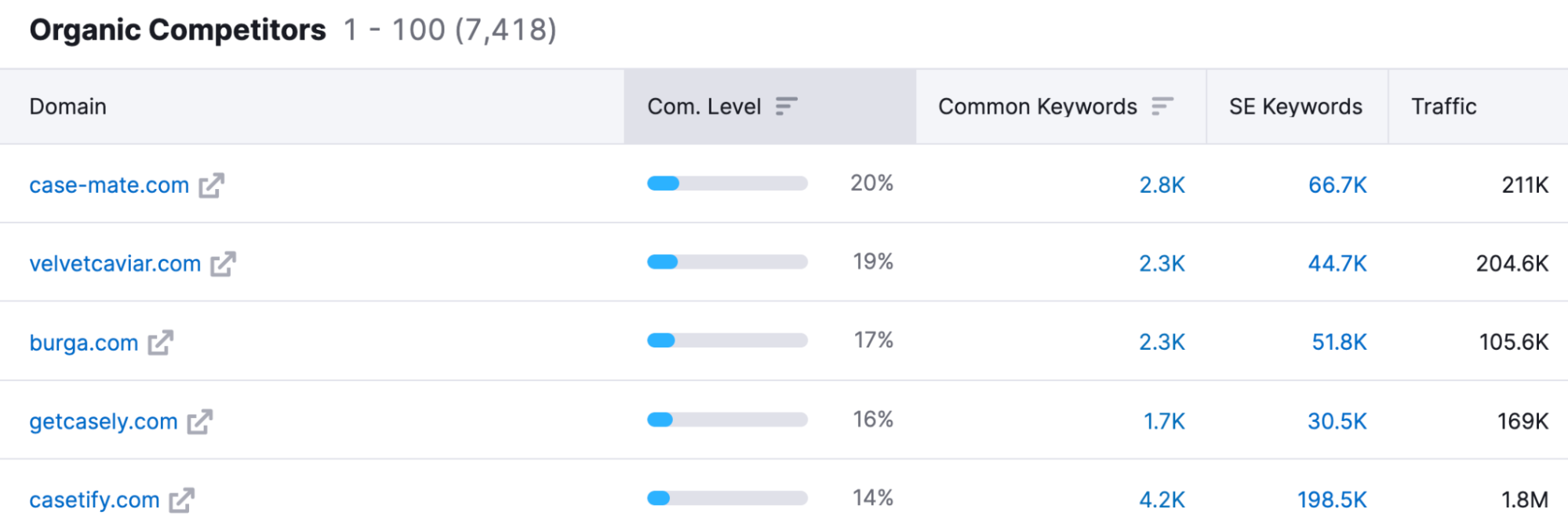
You’ll see a Competitive Positioning Map highlighting the top competitors. As well as a graph that covers shared keywords, competition level, and more of all competing sites:
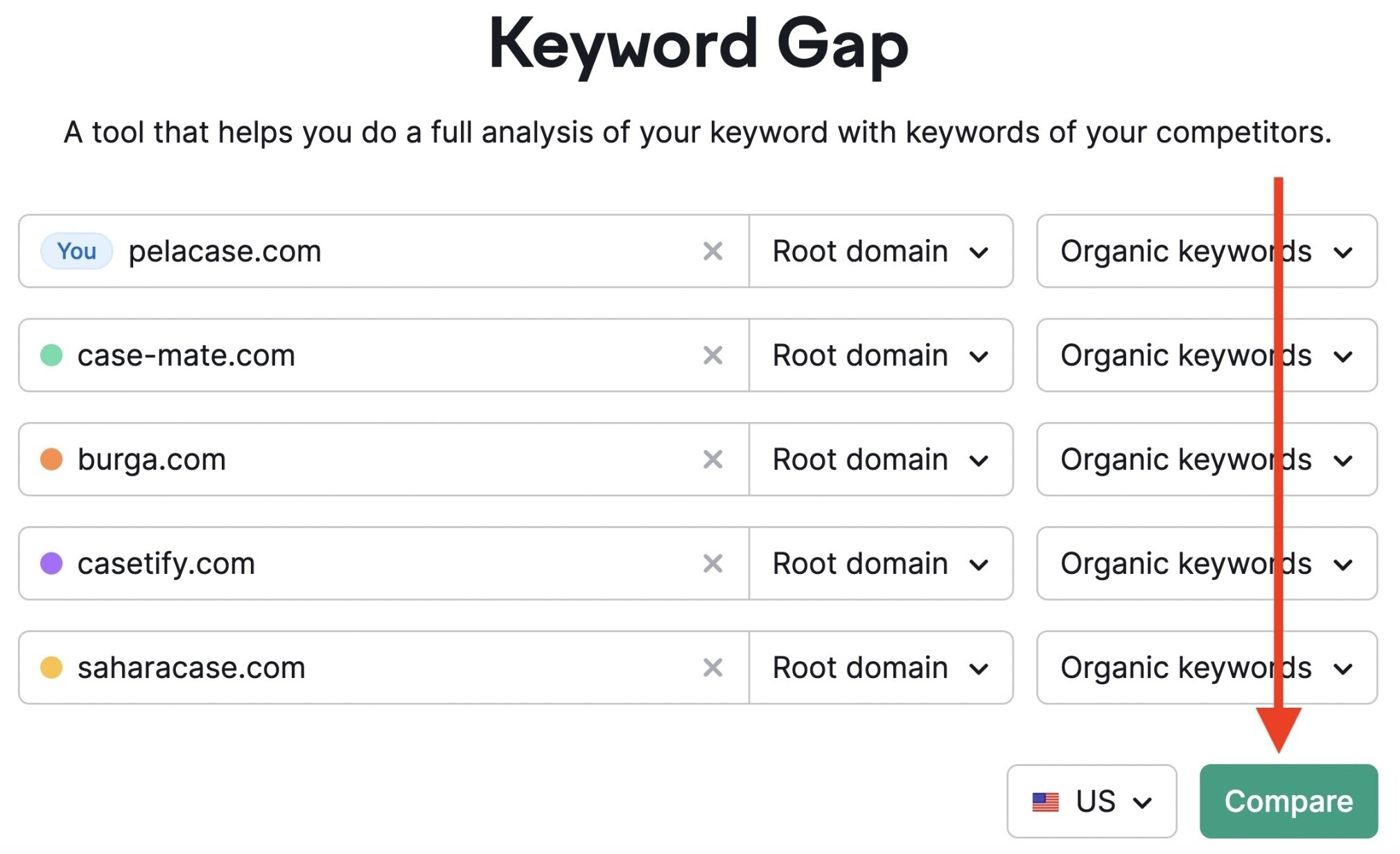
Another way you can find opportunities is with the Keyword Gap tool.
Go to the tool and enter your domain alongside the domains of up to four competitors. Then hit “Compare.”
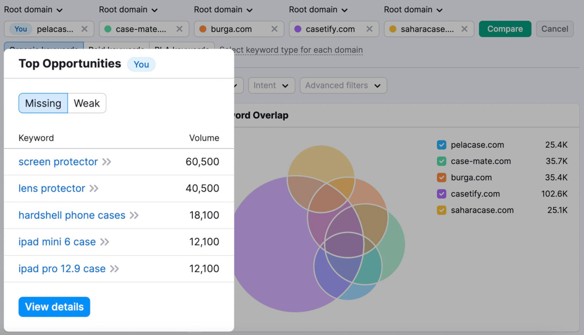
You’ll get a report containing a short list of keywords that your competitors rank for (but you don’t).
Below that, you’ll also see a table with more keywords. The table has data about how you and your competitors are ranking for each keyword.
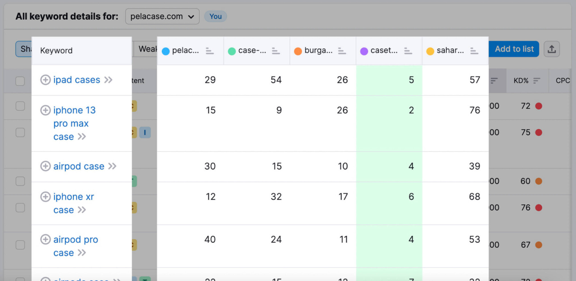
Analyze your competitors to find keyword opportunities you might have missed otherwise.
8. Compare Desktop vs. Mobile Site SEO Performance
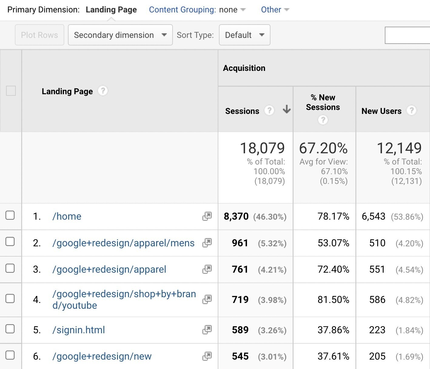
You can use Google Analytics to compare how your pages are performing on desktop vs. mobile.
Start by logging into your Google Analytics account. Navigate to “Behavior” > “Site Content” > “Landing Pages” on the left-hand navigation bar.
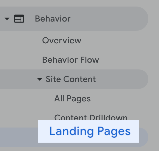
Here, you’ll see a list of all your pages. The best-performing pages are listed first.
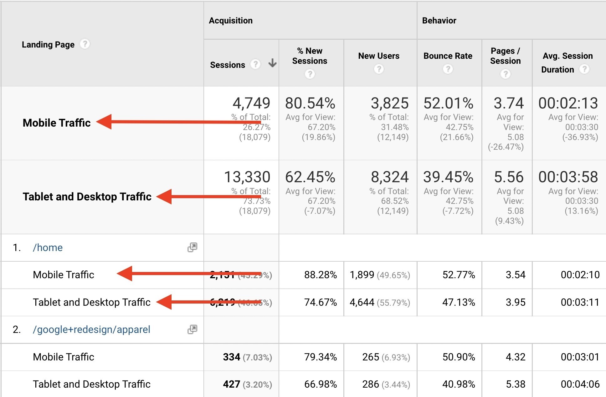
To include mobile and desktop information for each page, click on “Add Segment” at the top of the page.

Select “Mobile Traffic” and “Tablet and Desktop Traffic” segments. Then click “Apply.”
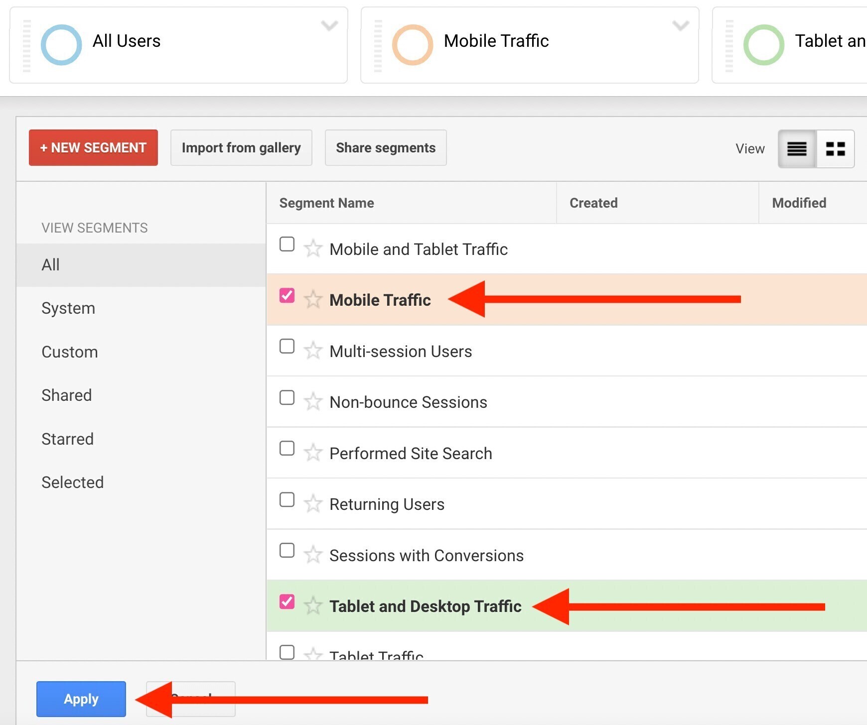
Now you’ll see mobile vs. desktop (and tablet) traffic for each page.
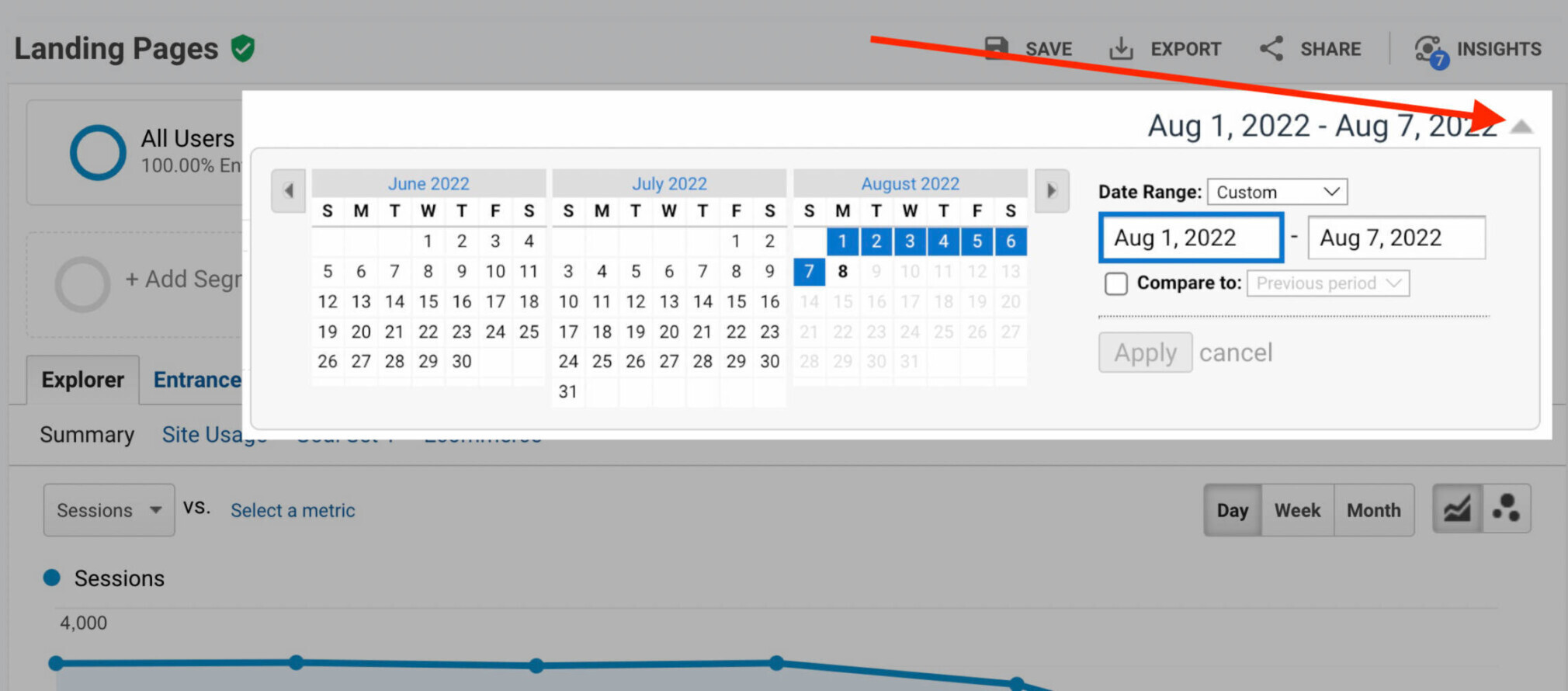
You can also tweak the date range for more specific results.
Check for any pages that are getting a lot of desktop traffic compared to mobile traffic.
Most users search via mobile these days, so an influx of desktop traffic may indicate an issue with the mobile usability of the page in question.
Supercharge Your Mobile SEO with Semrush
More users than ever are turning to mobile devices over desktop. So it’s crucial to pay attention to how mobile-friendly your site is.
Now that you know how to do mobile SEO, it’s time to apply mobile SEO best practices to your own site.
To test out any of the Semrush tools we used above, sign up for a free trial today.
