What Is a Viewport Meta Tag?
A viewport meta tag is HTML (HyperText Markup Language) code that tells browsers how to control viewport dimensions and scaling. It’s a key ingredient of responsive web design and ensures your content is easy to view.
A viewport is the user’s visible area of a webpage. It varies by device and when you resize browser windows.
For example, the default viewport size on a tablet is smaller than on a desktop screen. A smartphone viewport is typically smaller than both.
If a user resizes a desktop browser window, they also manipulate the viewport. The display may stay the same or reformat.
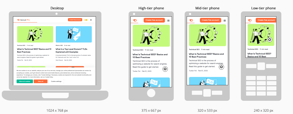
Viewports are rarely the same size as a fully rendered webpage, so browsers use scrollbars to let users access all of a site’s content.
Notice how you don’t just see more or less of the same page on each device. The layout changes, too:
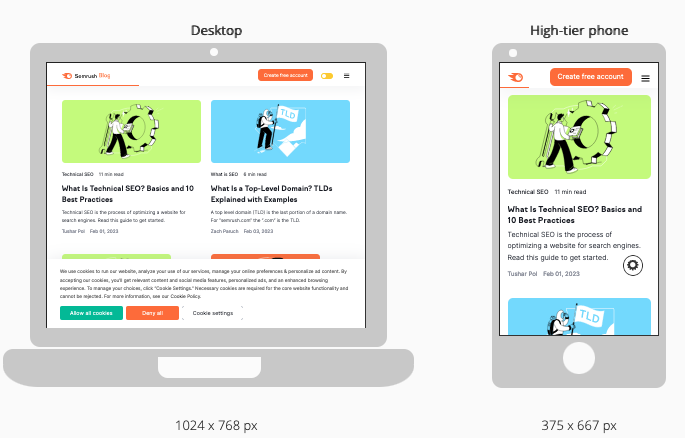
This kind of responsive website design enhances UX (user experience) and can positively impact your SEO efforts.
How Does a Viewport Meta Tag Work?
A viewport meta tag adjusts your content to a user’s screen. It makes a page more responsive and prevents users from having to scroll horizontally or zoom.
Here’s an example of how a viewport tag impacts a basic page:
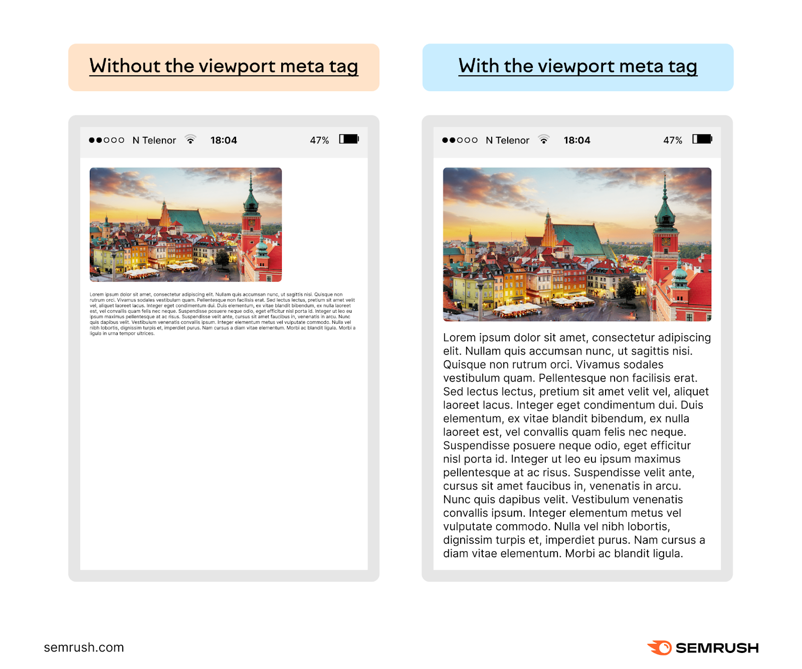
The text in the display on the left is unreadable. And the display doesn’t make good use of the space available. Users must zoom in on both the photo and the text to view them.
The text on the right is immediately readable (aside from being dummy text) and the image fills the screen’s width. The user can see clearly without making adjustments.
Content on the page with a viewport meta tag is more convenient and engaging, so the user is likely to spend more time with it.
Adding meta viewport tags will make your page more responsive. And while it makes pages mobile-friendly, it isn’t the same as a mobile page. Here’s the key difference:
- A responsive page automatically adapts to its viewing environment regardless of device (i.e., the desktop version of a site vs. an iPad). Users have access to your entire site.
- A mobile page is designed for use on mobile browsers only. Content on these pages is separate from your main site. It usually has a separate “mdot” subdomain (i.e., “m.[yourwebsite].com”). Users may not have access to your entire site.
How Viewport Meta Tags Affect Marketing Performance
Using viewport meta tags is a simple way to improve user experience on your site. This can also increase your organic traffic.
Ultimately, both outcomes can help you meet your marketing goals.
Improve User Experience to Keep People on Your Site
Viewport meta tags make your content easier to read. Which means visitors are more likely to stay on your pages longer.
The longer people stay on your site, the more chance you have to:
- Gather valuable information (via web forms or website analytics)
- Convert them (the ultimate win)
Almost three-quarters (73.1%) of web designers questioned by GoodFirms say non-responsive design is among the main reasons users leave a website:
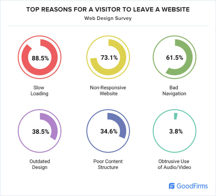
Image source: GoodFirms
You can test this theory on your own site. After adding viewport meta tags, track the following metrics to see if engagement improves:
- Average engagement time: How much time a user spends with your webpage in focus on their screen. This should increase, too.
- Bounce rate: The percentage of sessions Google counts as non-engaged. This is when a user leaves your website within 10 seconds without clicking a link or triggering an event. A decrease signals higher engagement.
You can view average engagement time on a Google Analytics dashboard by going to “Reports” > “Lifecycle” > “Engagement” > “Engagement overview.”
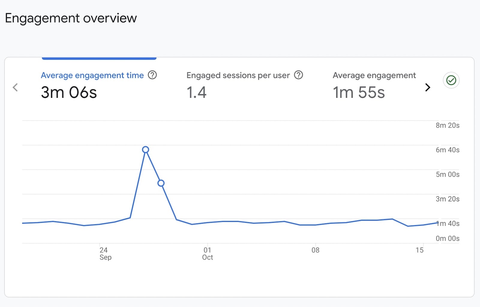
Bounce rate is a little more difficult to find with Google Analytics 4. For a how-to, check out our round-up of useful Google Analytics metrics and where to find them.
Further reading:
Help You Rank Higher in Search Engine Results
The viewport meta tag itself isn’t a direct ranking factor, but it provides a better user experience. This can improve your website’s ranking in Google’s search engine results pages (SERPs).
A big reason for this is Google’s shift to mobile-first indexing. This means it looks at the mobile version of your website when determining your ranking in the SERPs.
By having a proper viewport meta tag, you ensure your content is mobile-friendly. And having content users don’t have to zoom or scroll to read gives you a better chance of ranking.
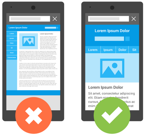
Image Source: Google
How to Use Viewport Meta Tags
Most content management systems (CMS) will automatically set optimal viewport meta tags for your website.
You can also set it yourself by editing the code of your website.
A viewport meta tag, like other meta tags, is HTML that goes into the page’s <head>.
A typical page will contain something like this:
<meta name="viewport" content="width=device-width, initial-scale=1">
The content attribute (“content=”) determines how the page will appear when it loads. You can adjust how your site will look by adjusting the device-width and initial-scale properties.
Width
Unsurprisingly, width controls the viewport's width. You can set a specific value (in pixels), such as width=500. It would look like this:
<meta name="viewport" content="width=500, initial-scale=1">
You can also use device-width, which will use 100% of the device's width. That looks like this:
<meta name="viewport" content="width=device-width, initial-scale=1">
Device-width is simpler. And ensures the best user experience by adjusting to various screen sizes.
Initial-scale
Initial-scale dictates the level of zoom when a page loads. You can set it from 0.1 up to 10. The default is 1.
A zoom level of 3 would look like this:
<meta name="viewport" content="width=device-width, initial-scale=3">
Other Properties
There are other ways you can adjust that viewport meta tag too. These properties are:
- Height: This works the same as width. You can set it to a specific number of pixels or use device-height (recommended).
- Minimum-scale: This controls how much zoom the page allows. It stops users from zooming out too far. It must be lower than or equal to the maximum-scale. The default is 0.1.
- Maximum-scale: This also controls zoom level by stopping users from zooming in too far. It must be greater than or equal to the minimum-scale. The default is 10. Anything less than 3 goes against accessibility guidelines.
- User-scalable: This controls whether the user can zoom at all. Valid values are 0 or no, or 1 or yes. Not allowing users to zoom goes against Web Content Accessibility Guidelines (WCAG). It also provides poor user experience.
- Interactive-widget: This specifies how interactive widgets, like virtual keyboards, affect a page's viewports. There are two categories of viewports: visual (whatever part of the page users currently see on their screen) and layout (all the elements on the page, visible or not). Valid values are:
- Resizes-visual: Resize only the visual viewport but not the layout viewport (default)
- Resizes-content: Resize both the visual viewport and layout viewport
- Overlays-content: Do not resize any viewport
Some browsers handle viewport properties differently to give users the best possible experience. For example, Apple has ignored all zoom-related meta elements since its iOS 10 release.
Others allow users to “force enable” zoom (i.e., bypass the user-scalable value) by changing accessibility settings. Here’s what Google Chrome’s browser options for Android mobile devices look like:
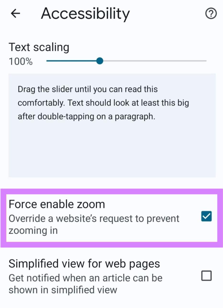
Look in your chosen browser’s accessibility settings for a similar option.
Where to Enter Your Viewport Meta Tag
If you’re setting your viewport meta tag manually, remember the recommended setting is:
<meta name="viewport" content="width=device-width, initial-scale=1">
This means any browser should render the page to the width of its own screen. Your content will adapt to different devices and always look its best.
You add this HTML to the <head> element of your website. It should look like:

Audit Your Site to Optimize Performance
Most CMSs automatically include viewport meta tags on every page. You can confirm this on your website by using the Semrush Site Audit tool.
Open the tool and find your domain. Select “Set up” if this is your first audit.
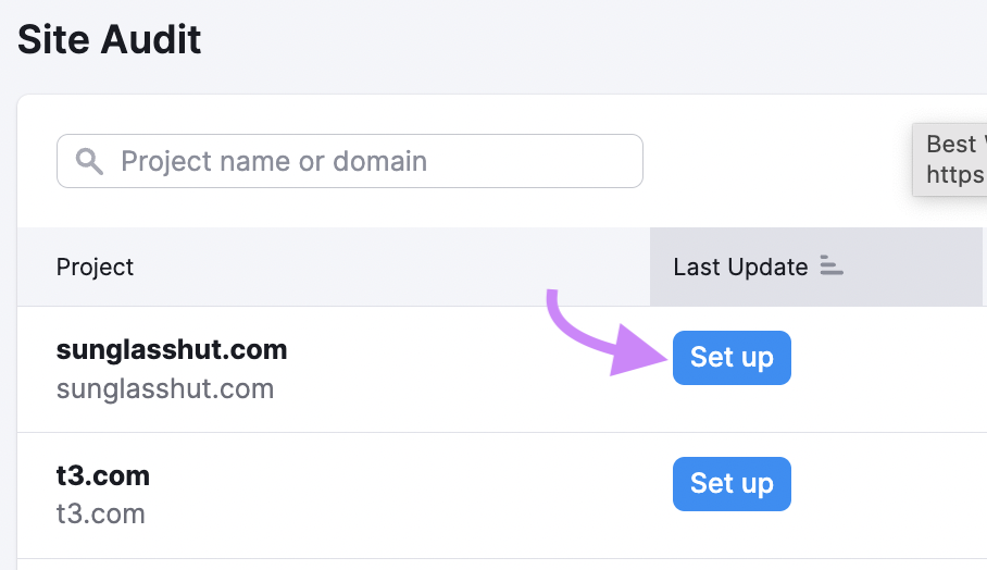
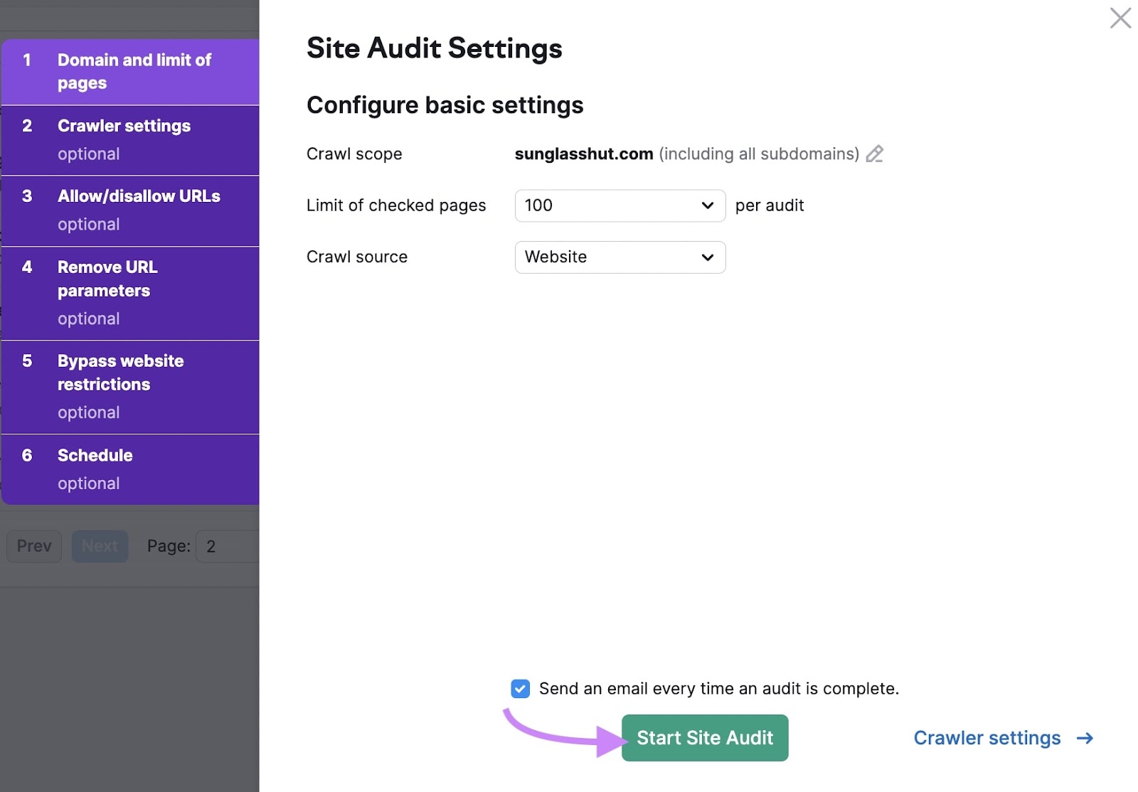
This will open the “Site Audit Settings” window. Configure the basics of your first crawl. (This detailed setup guide will walk you through the settings.)
Once you’ve configured the settings, click “Start Site Audit” to begin.
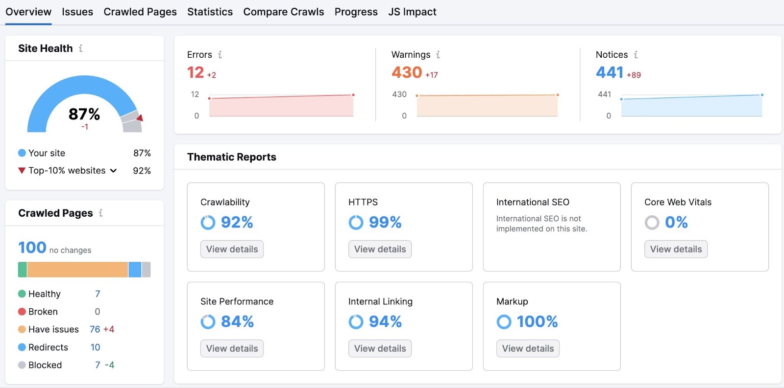
The tool will crawl your site, using the “Site Health” metric to create an overview of your site's health.
Click the “Issues” tab, then select the “Mobile SEO” category. You’ll see a list of errors, including any missing tags.
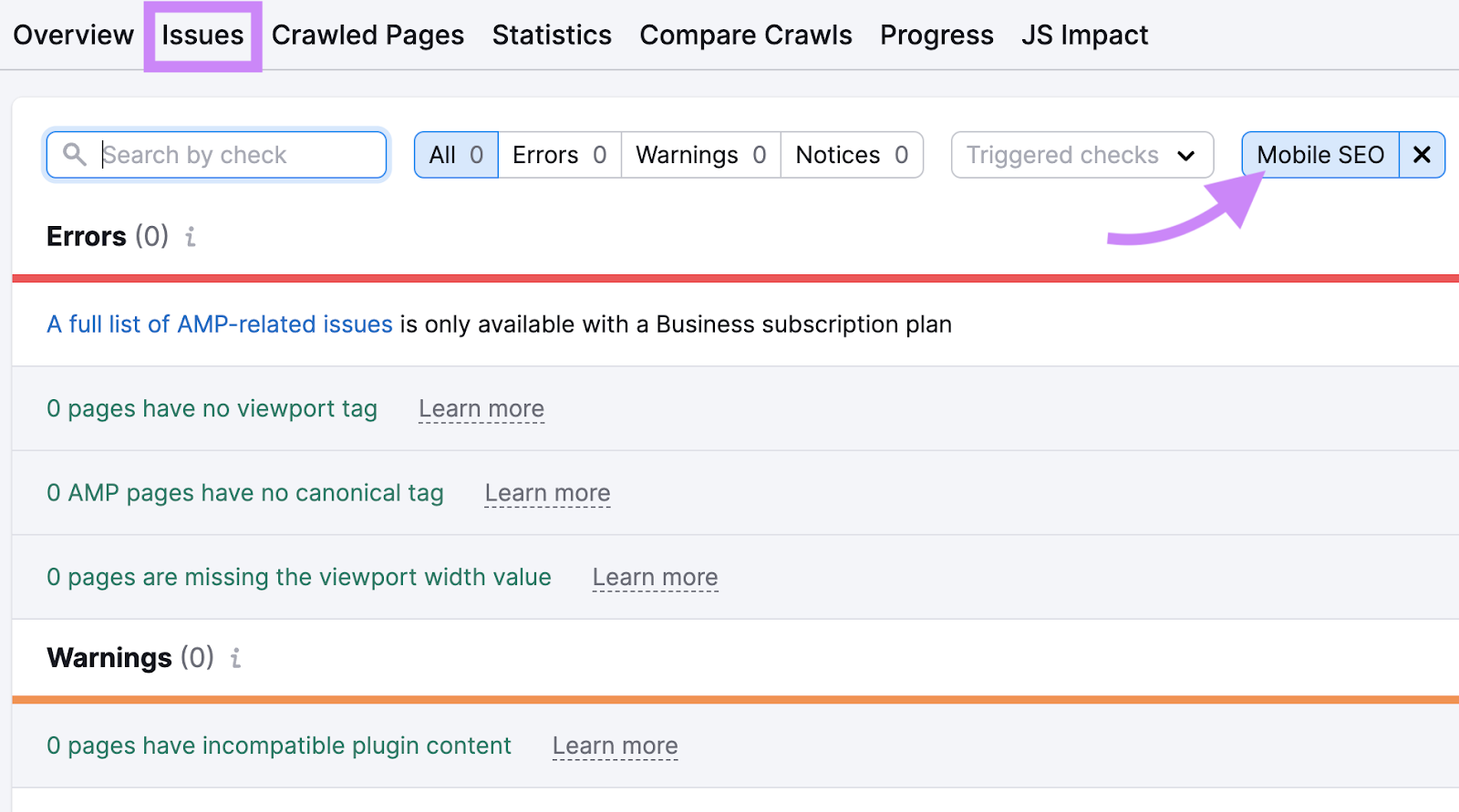
Click “Learn more” next to the error for quick instructions on how to fix the problem.
Optimize Your Meta Tags Today
Viewport meta tags are a small but vital part of optimizing your site for user experience, accessibility, and search performance. They are key building blocks in your overall on page SEO strategy.
Make the most of your meta tags (and other SEO elements) with Semrush’s On Page SEO Checker. Get information about your site and your competitors, along with recommendations on how you can improve performance now.
