What Is an Infographic?
An infographic is a compelling blend of visual data and minimalistic text. It presents information swiftly, clearly, and effectively.
Infographics include visual elements like charts, graphs, and illustrations. And these components aren't just for looks. They improve data comprehension.
So, what is the purpose of an infographic?
At its core, an infographic is a storytelling tool.
It turns complicated information into a visually appealing story that's simple to understand.
Benefits of Using Infographics
Infographics offer numerous benefits. Here are four main benefits of using infographics:
- Enhanced comprehension: Infographics make it easier to understand information by visually presenting it in a structured and organized manner
- Increased engagement: Infographics can attract the attention of viewers. They can also increase the overall engagement level of visitors on a page. This can result in more time spent on your website.
- Easy sharing: Infographics are highly shareable. Making them a powerful marketing tool. When a viewer finds the information in an infographic helpful or interesting, they are more likely to share it on social media platforms. This can exponentially increase the reach of your content.
- SEO boost: Infographics are a great way to add high-quality content to your website. Which search engines place a lot of value on. They also have the potential to generate backlinks. Which can boost your overall SEO efforts.
Further reading: 12 Reasons Why Infographics Still Matter in SEO
15 Infographic Examples and When to Use Them
1. Statistical Infographics: Bringing Data to Life
Statistical infographics focus on presenting statistical data in a visually compelling manner.
They're an effective way to display data-heavy research and survey results.
Here's an example of how this infographic can look:
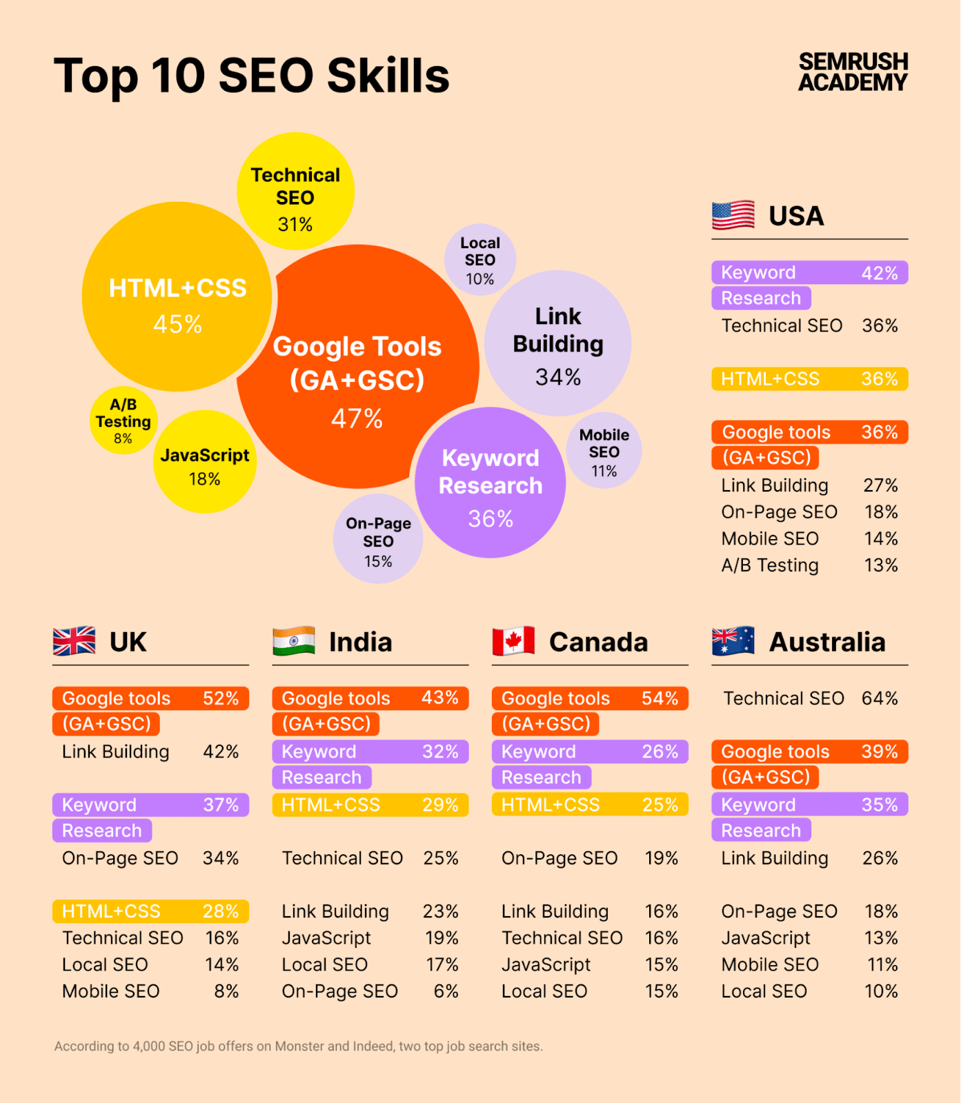
This infographic design is perfect for:
- Showing survey results
- Industry trends
- Data-driven insights with clear visuals in general
2. Informational Infographics: Simplifying Complexity
Informational infographics educate your audience by simplifying complex concepts or ideas. These infographics typically use icons, visuals, and concise text for that.
Here’s a good example:
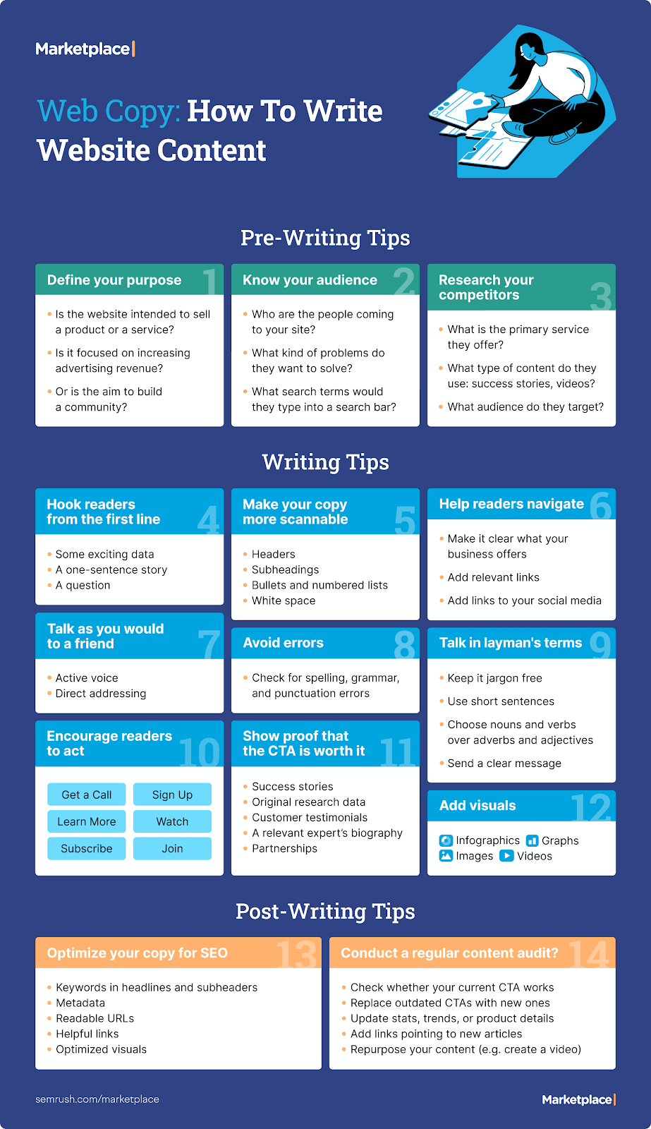
Informational infographics are great for:
- Step-by-step guides
- Tutorials
- Explaining complex processes in general
3. Timeline Infographics: Visualizing Progress and History
Timeline infographics arrange information chronologically and can show historical events, project milestones, or the evolution of a subject.
This helps your audience grasp the sequence and progression of events easier.
Here’s what a timeline infographic can look like:
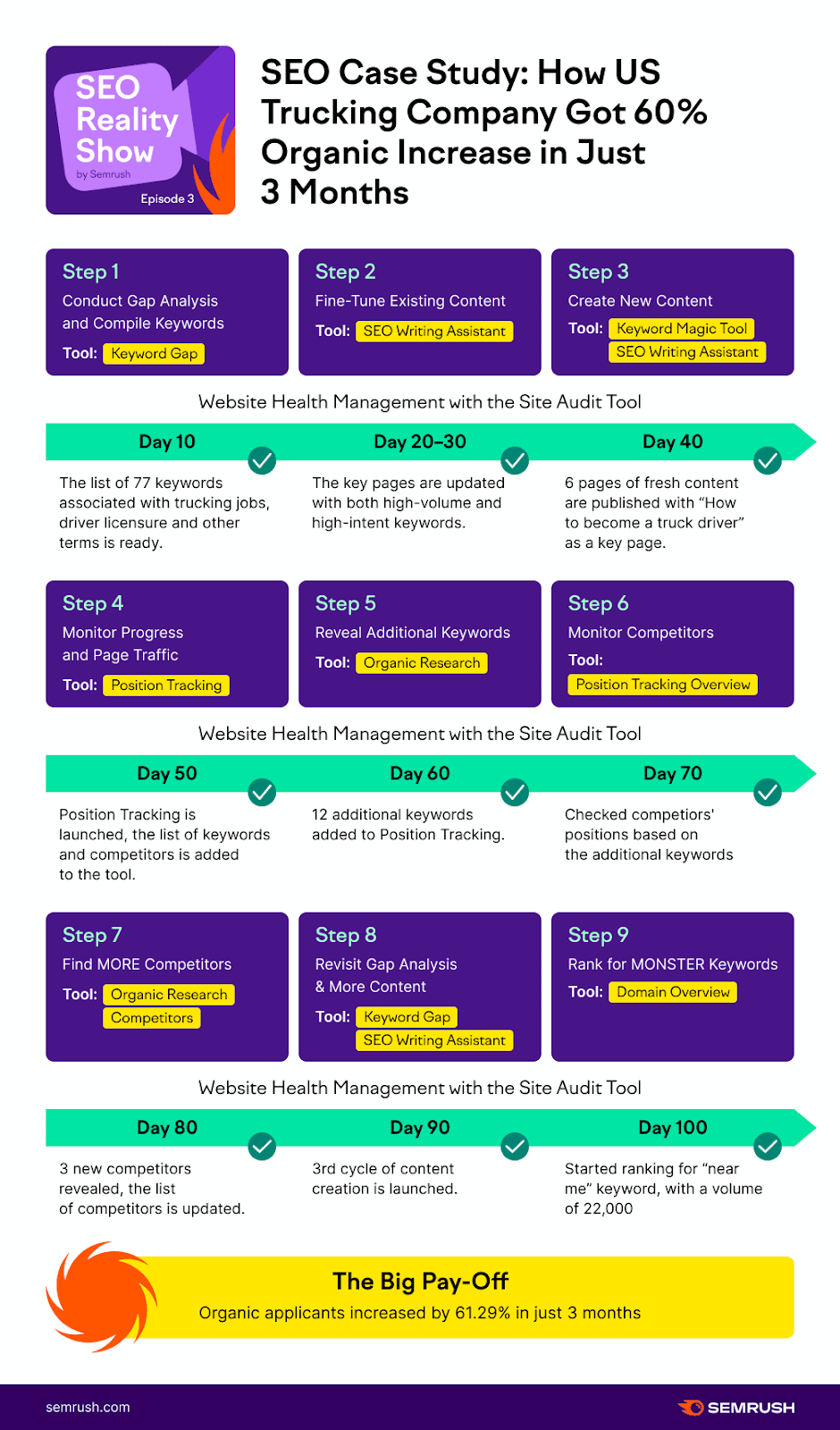
They're perfect for:
- Highlighting company achievements
- Emphasizing industry advancements
- Any narrative with a timeline structure
4. Process Infographics: Guiding Users Step by Step
A process infographic is invaluable for illustrating step-by-step processes or workflows.
They guide your audience through actions, simplifying complex procedures.
Here’s an example from Venngage:
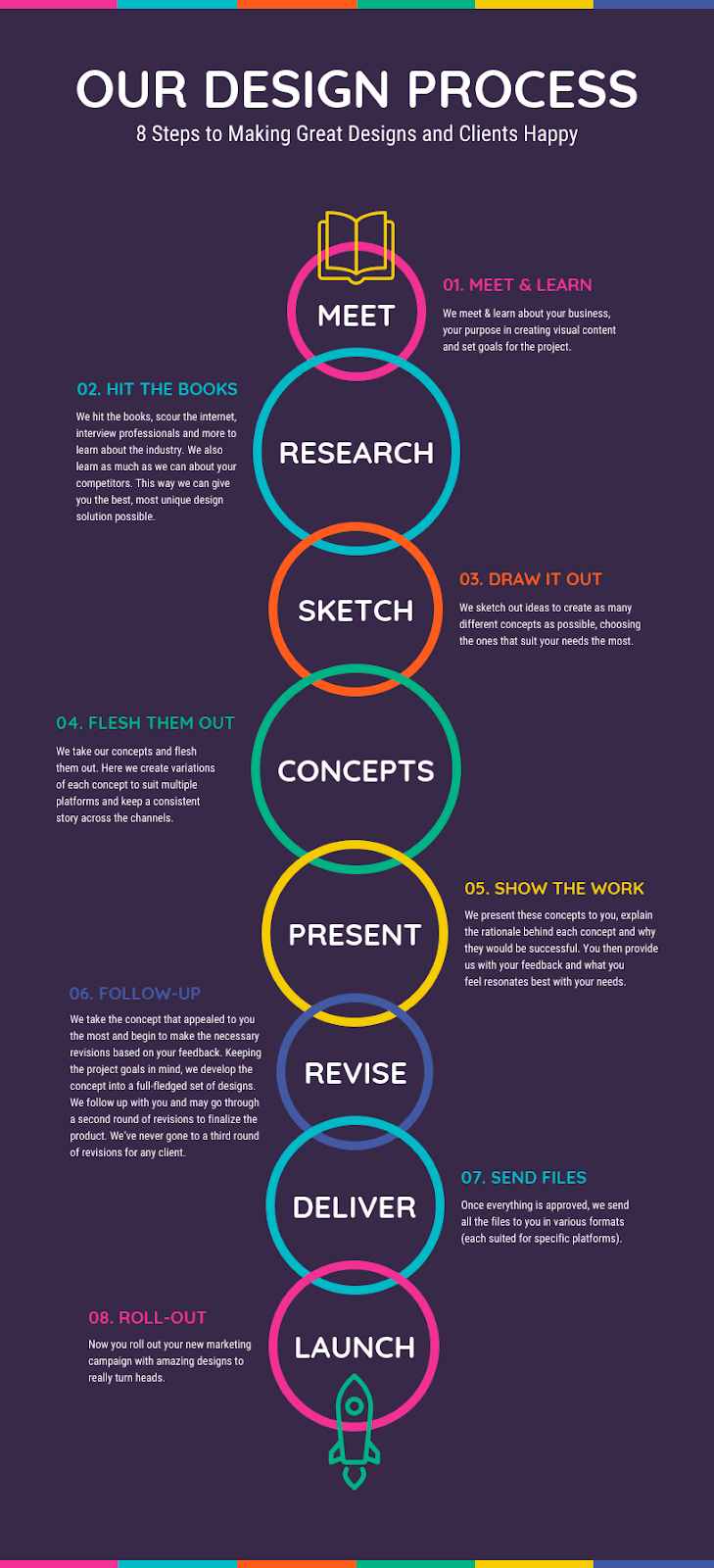
You can use them to outline:
- Content creation workflows
- Marketing strategies
- Any sequential procedures
5. Comparison Infographics: Highlighting Differences & Similarities
Comparison infographics analyze many subjects side by side. Highlighting their similarities and differences.
They allow you to compare products, services, or ideas while educating your audience.
Here’s one example:
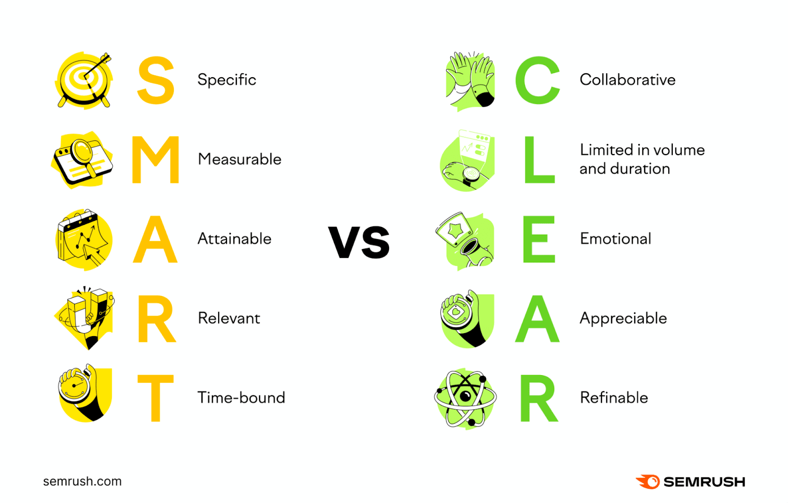
This infographic design is perfect for:
- Comparing products
- Evaluating platforms
- Contrasting solutions
6. Geographic Infographics: Visualizing Location-Based Data
Geographic infographics convey important geographical data. They can show trends, demographics, and travel patterns using maps, charts, and statistics.
Here’s how we used it in our report about cryptocurrency:
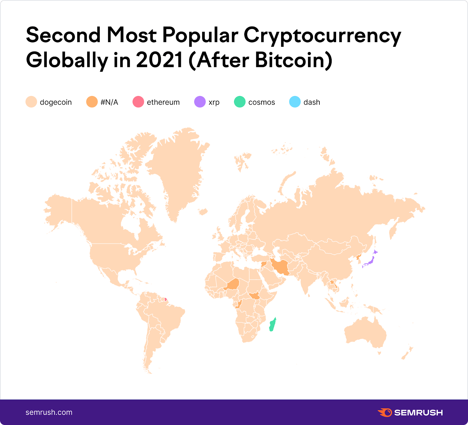
Geographic infographics are ideal for:
- Travel guides
- Market analyses
- Any content needing location-specific insights
7. Hierarchical Infographics: Illustrating Relationships and Hierarchy
Hierarchical infographics represent relationships, structures, or organizational hierarchies.
They ensure clarity when showcasing complex systems.
Below is a great example of hierarchical infographic:
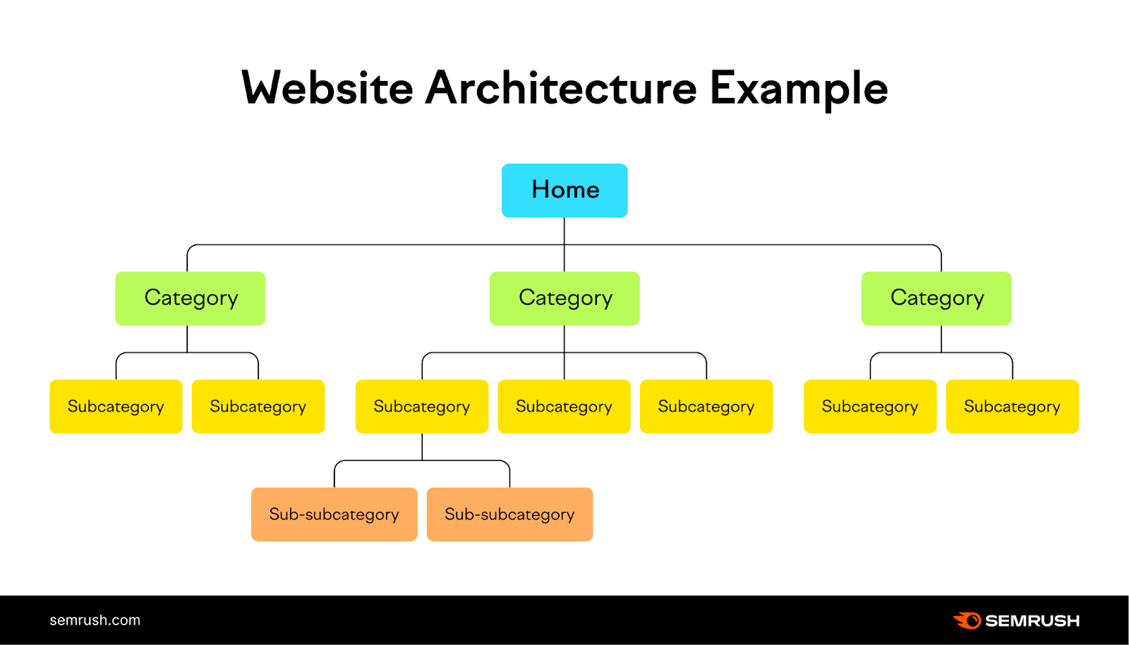
Hierarchical infographics are great for:
- Explaining team structures
- Showing the chain of command within an organization
- Categorizing information based on importance or influence levels in general
8. List Infographics: Condensing Information
List infographics visually represent information in a list format.
They are particularly effective for presenting a series of tips, steps, methods, or any set of information that can be broken down into individual items.
They also offer interactivity on your website. People might download a checklist if it’s useful for them. Which means they’re interacting with your site rather than just scrolling. This can enhance engagement.
It’s a simple yet effective way to provide extra value to your audience.
Here’s an example of list infographic from our on-page SEO checklist article:
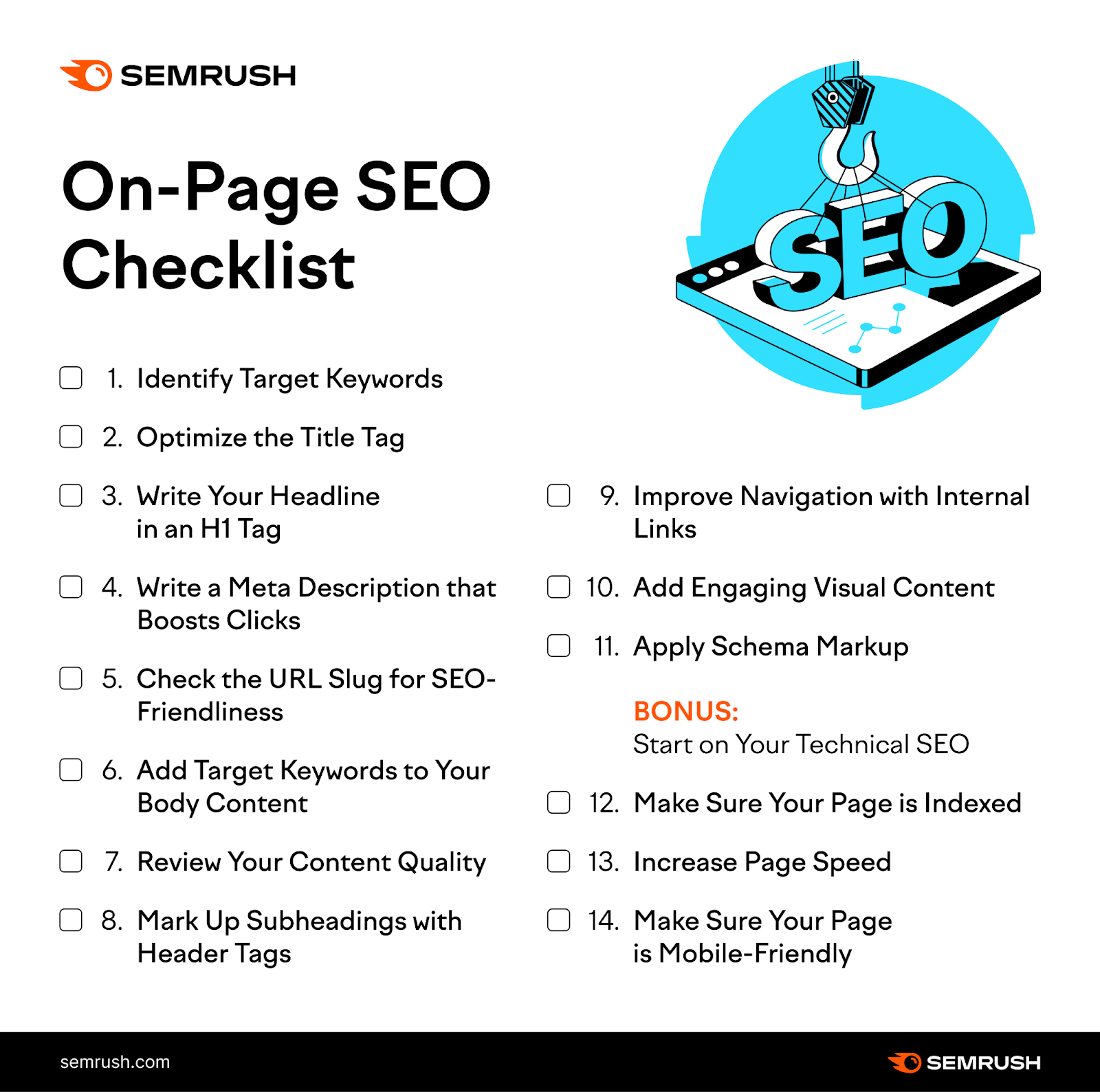
List infographics are ideal for:
- Outlining tips
- Providing quick takeaways or highlights for readers on the go
- Summarizing key points from a larger content piece
9. Anatomy Infographics: Explaining Parts of a Whole
Anatomy infographics use labels and detailed illustrations to explain parts of a whole.
These infographics are ideal for explaining the composition of objects, structures, or systems.
Here, you have an example from our article showcasing the anatomy of top performing content.
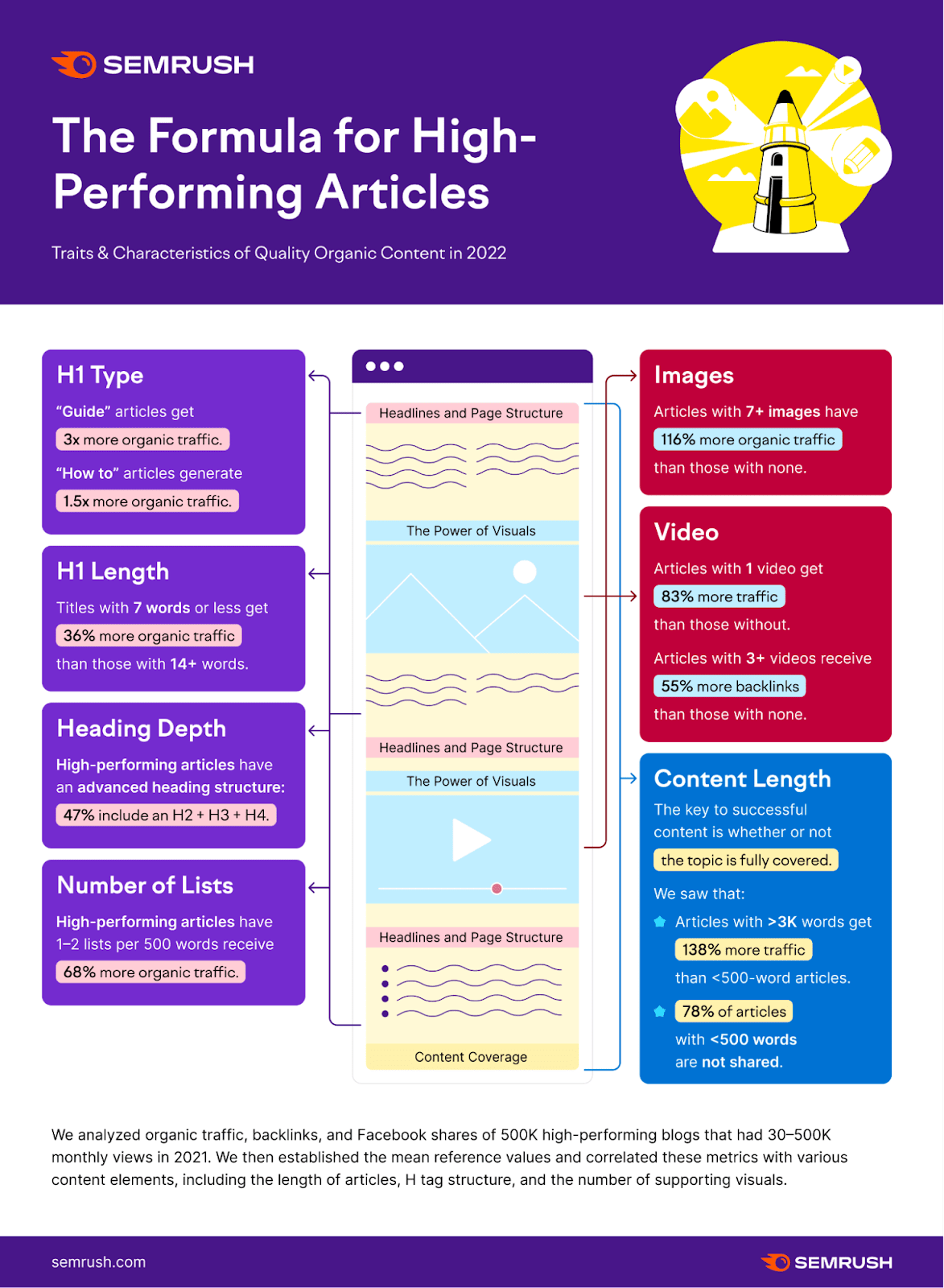
Anatomy infographics work best when:
- Demonstrating the various components of a product, like the different parts of a smartphone or the layers of a mattress
- Explaining a complex concept that has multiple facets
10. Cycle Infographics: Visualizing Cyclical Processes
Cycle infographics showcase processes that operate in a circular or cyclical manner.
Unlike linear processes which have a defined start and end point, cyclical processes loop back to the beginning. Indicating a continuous or repetitive sequence.
Here’s an example:
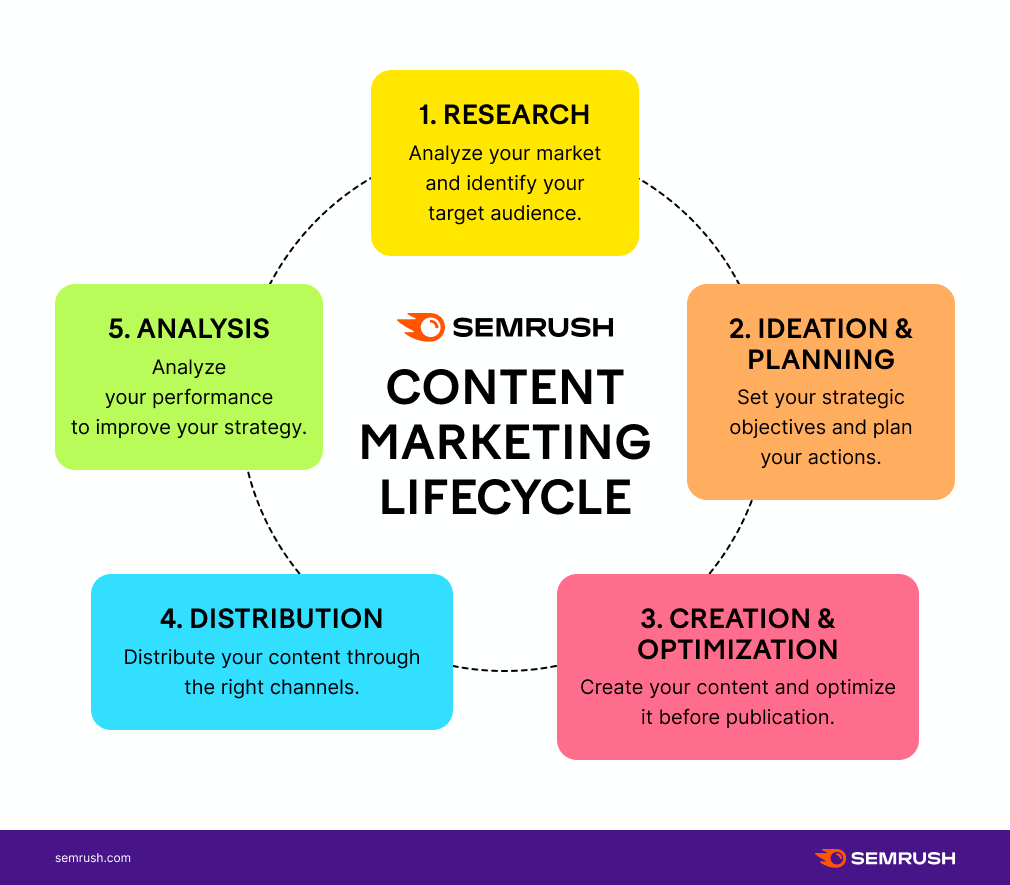
These infographics work great for:
- Highlighting economic cycles such as boom and bust patterns. Showcasing periods of economic growth followed by recession, and then recovery
- Depicting product life cycles showcasing the stages from ideation to product retirement
- Demonstrating any recurring business processes
11. Photographic Infographics: Incorporating Real Images
Photographic infographics use real photos to enhance data visualization.
They're particularly useful to give real world context to the data. Or to add authenticity to the information.
Quartz provides a great example of what this type of infographic can look like:

You can use photographic infographics for:
- Case studies
- Travel guides
- Any content that can benefit from real images
12. Visualized Article Infographics: Illustrating Blog Posts
Visualized article infographics condense blog posts into easy-to-read visuals.
They help readers understand and remember the content more easily. Or they can be used as a summary of longer articles.
Here’s an example from our article about infographic designs:
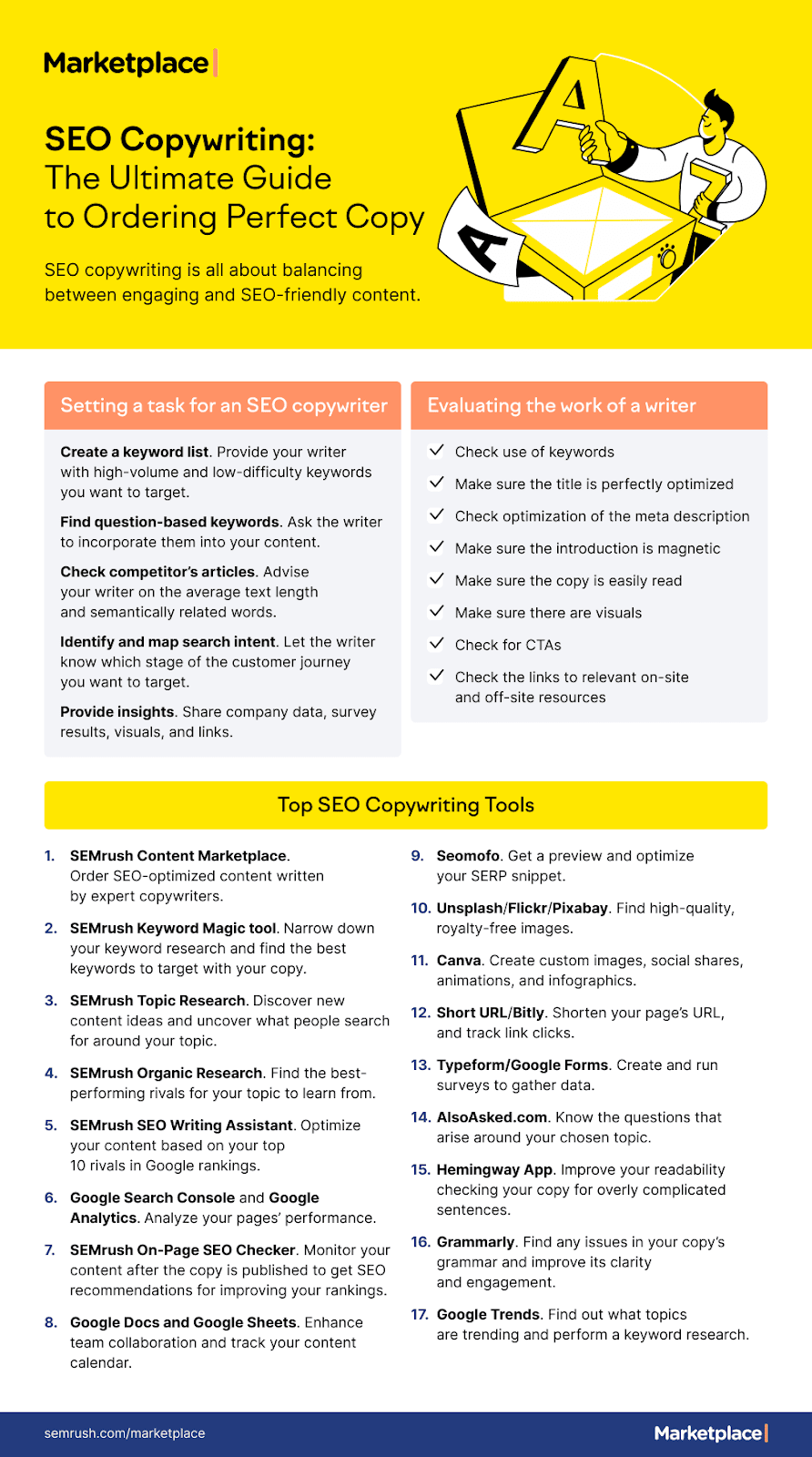
You can use visualized article infographics to:
- Summarize long-form content
- Generate engagement around your blog posts
- Make complex topics more accessible to readers in general
13. Quiz Infographics: Assessing Knowledge
Quiz infographics incorporate quizzes or interactive questions into an infographic format.
They can add a touch of fun and interaction. People can leave their answers in comments or share on social media to boost engagement.
Here's how MindJournal leverages this infographic type:
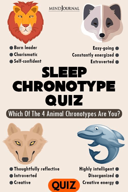
You can use quiz infographics for:
- Assessing knowledge and understanding of a particular subject matter
- Testing comprehension and recall of training materials
- To get feedback from your audience
14. Decision Tree Infographic: Branching Paths with Different Outcomes
A decision tree infographic depicts a branching path of decisions and their outcomes.
It helps the audience understand how different choices lead to different outcomes.
Here’s an example Sprinklr uses:
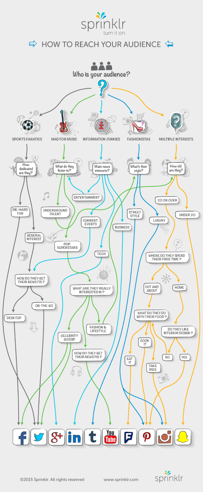
Decision tree infographics are ideal for:
- Personal finance
- Career advice
- Helping audiences understand how to troubleshoot problems
- Any other situation involving decision-making
15. Venn Diagram Infographics: Presenting Relationships
Venn diagram infographics represent relationships between data sets using overlapping circles.
Here’s how it looks:
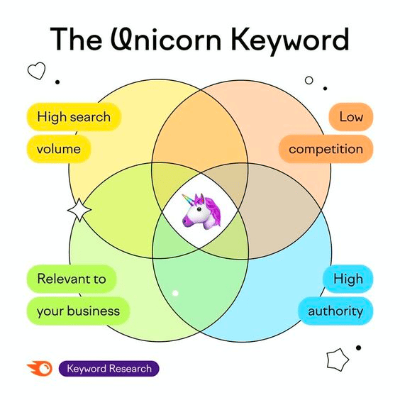
Venn diagram infographics are particularly useful for:
- Explaining intersecting topics
- Comparing differences and similarities
- Helping audiences comprehend connections between many concepts at once
Further reading: 41 Infographic Examples to Inspire You
How to Make an Effective Infographic: A Step-by-Step Guide
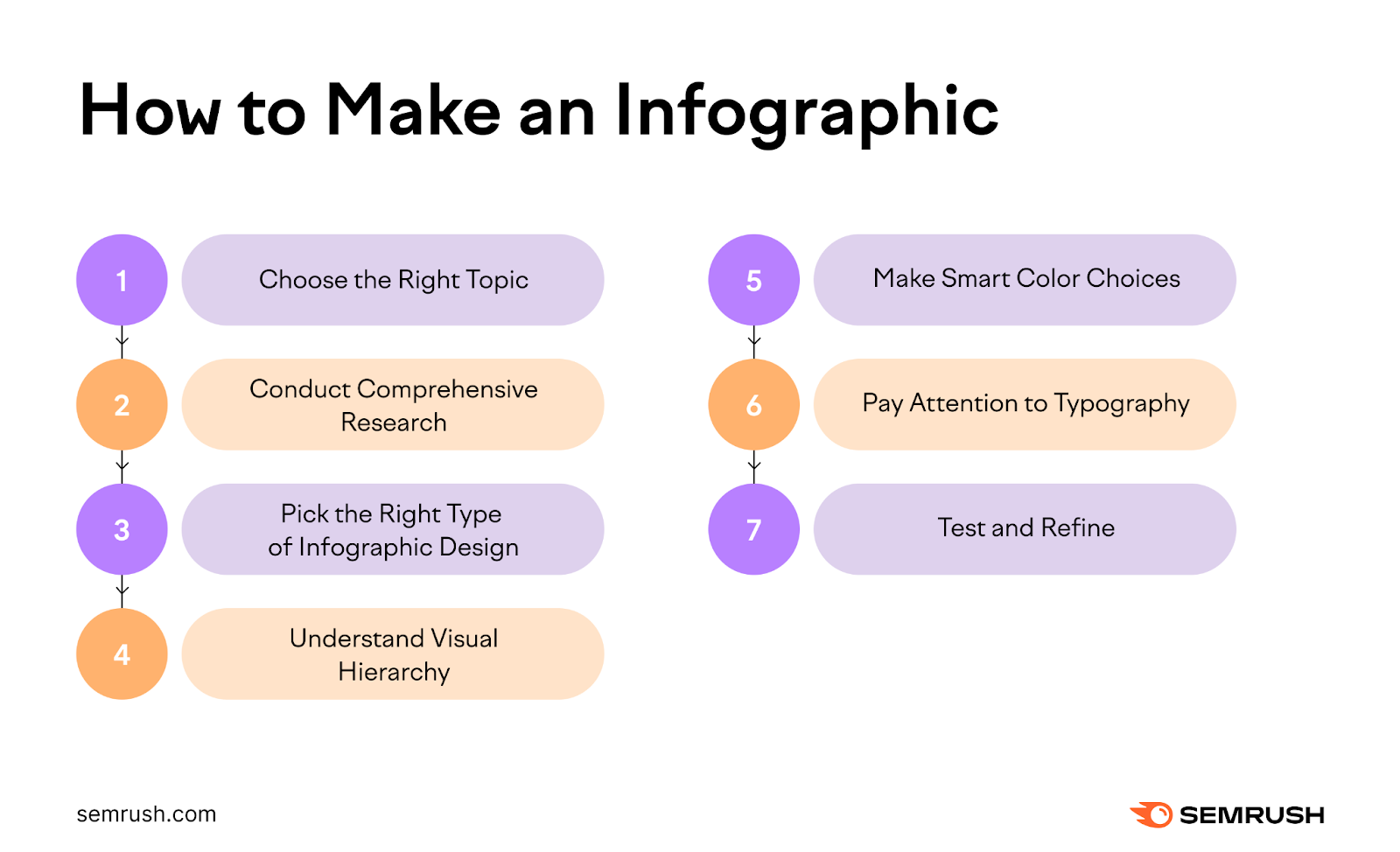
1. Choose the Right Topic
Your infographic should be relevant and valuable to your target audience (the people your content is for).
It should:
- Answer questions
- Solve problems
- Offer new insights
Ask yourself these questions to achieve that:
- Who is your audience?
- What kind of information would be helpful to them?
- What problems can you help them solve with an infographic?
You can leverage Semrush’s Topic Research tool to brainstorm ideas and find relevant topics that are worth covering in the form of infographics.
Here’s how to do that:
Let’s say you’re in the health and fitness niche.
And you want to create something around nutrition.
First, enter your main theme, such as “nutrition,” in the search bar. You can also specify your target location if your content is for a specific geographic audience.
Then, click the “Get content ideas” button:
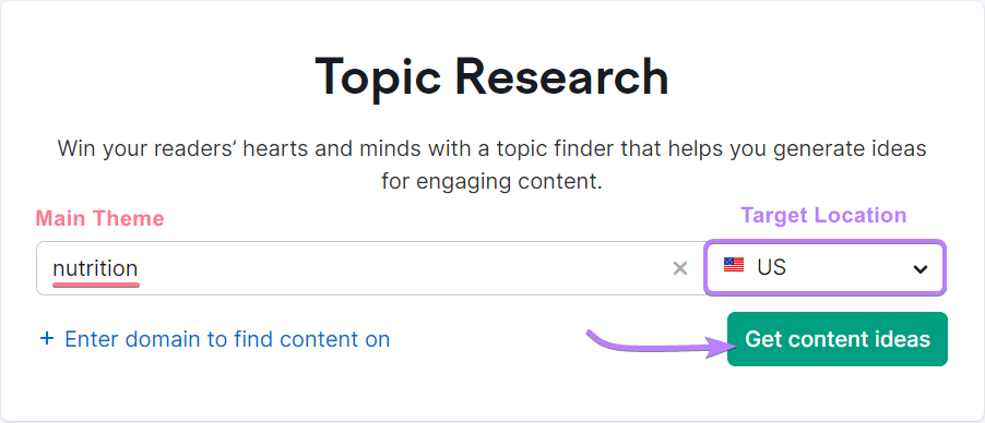
The tool will generate subtopics related to your main theme.
In our case, the main theme was “nutrition.” So, we see subtopics like “healthy food,” “nutritional facts,” etc.:
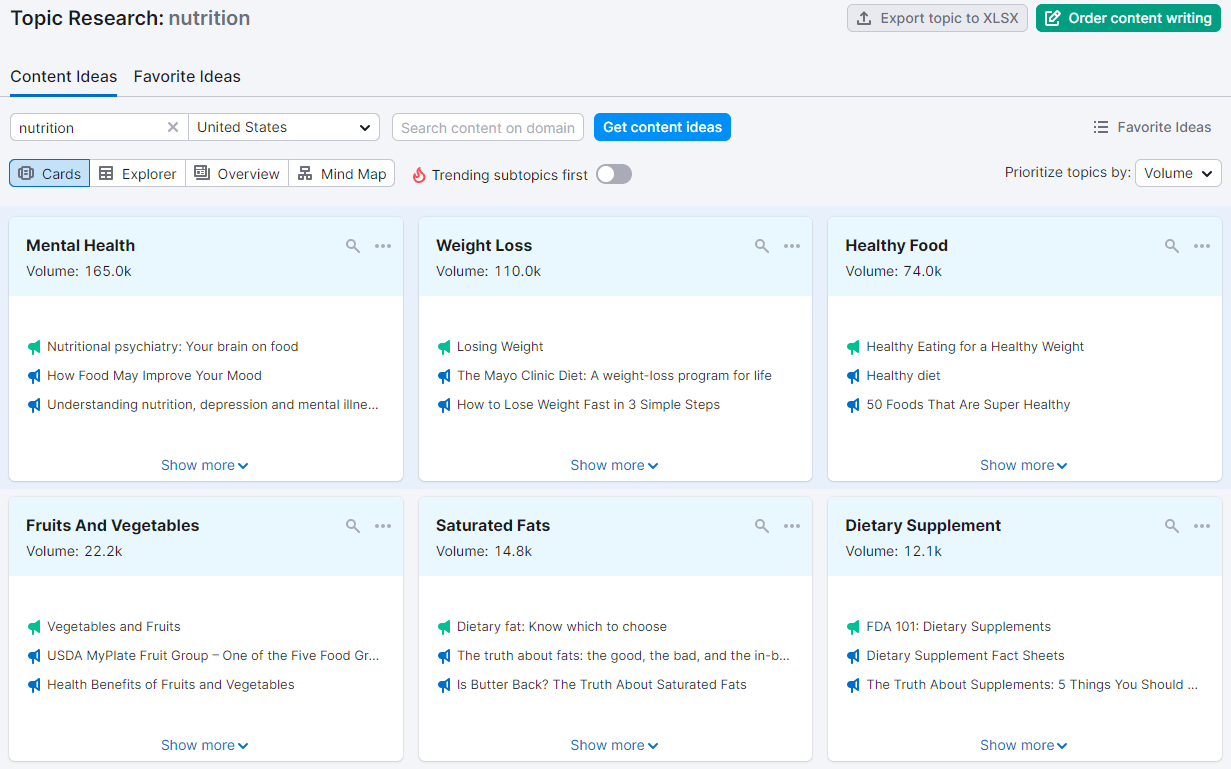
Click on each subtopic to see popular questions people ask about that specific topic:
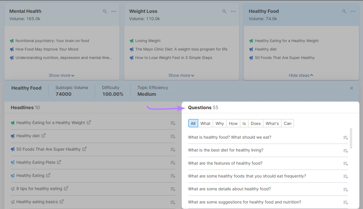
These questions can inspire infographic content that addresses your audience’s queries.
2. Conduct Comprehensive Research
Conduct comprehensive research to get a deeper understanding of your topic.
That’s a crucial step in crafting an effective infographic. Because it ensures that your content is accurate, relevant, and valuable to your target audience.
Here’s how you can use the Keyword Magic Tool for your research:
Let’s take our nutrition example.
First, type “nutrition” into the search bar and click “Search.”

The tool will generate a list of ideas you can explore in your infographic:
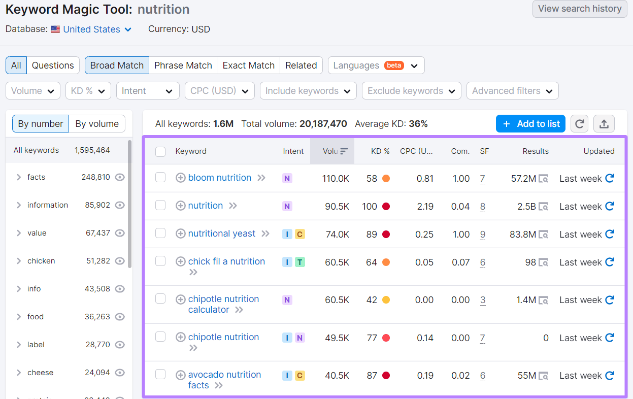
You can further use the filters to refine your search and generate even more focused keyword ideas. For example, if you click on “Questions”:
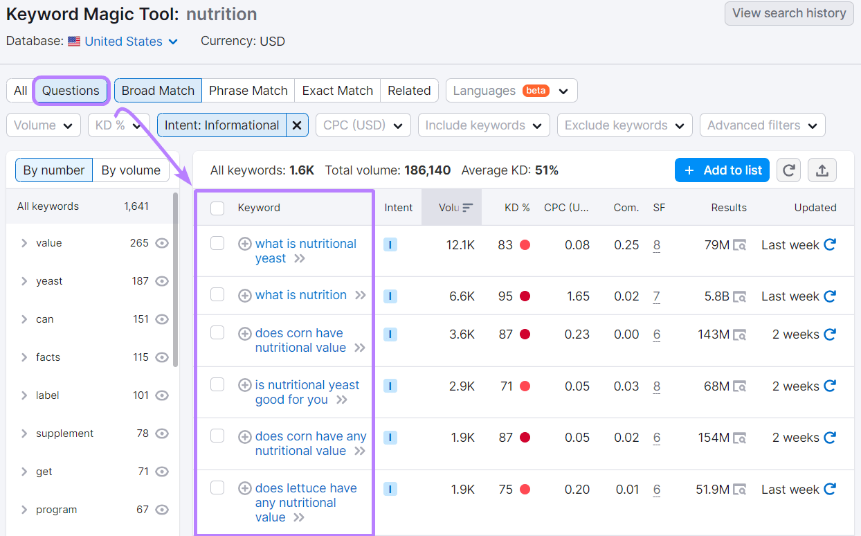
This will generate questions people ask about nutrition.
You demonstrate your expertise and understanding of the industry by directly addressing common queries or concerns.
This can position you as a go-to resource for valuable, accurate information. And also foster a sense of reliability and credibility with your audience.
Next, you can also use “Intent” to filter the results. So you can quickly find keywords related to your informational needs.
In our case, if we want to curate an infographic about nutritional facts, we’d click on “Informational” in the “Intent” section:
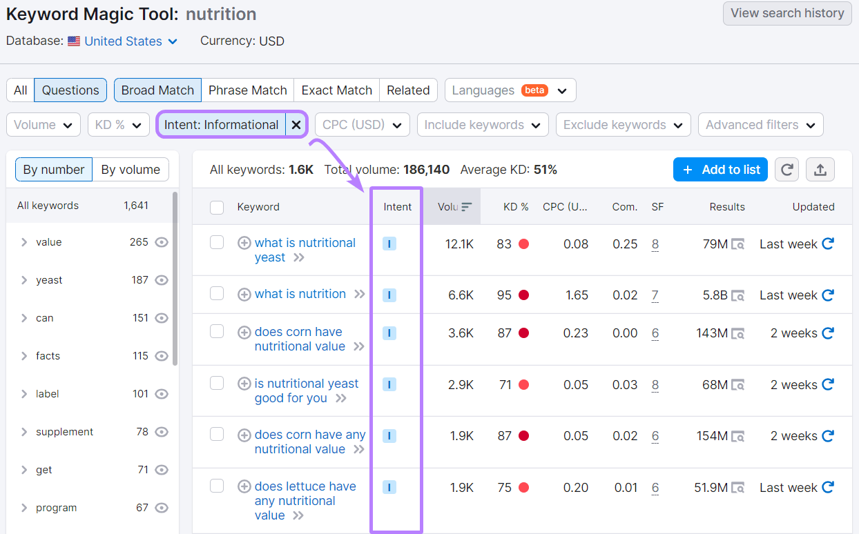
After analyzing related keywords, questions people ask, and the intent behind them, you’ll end up with phrases like: “What is nutrition,” “Why is nutrition important,” and “Watermelon nutrition facts.”
And your nutritional facts infographic could have the following information on it:
- What is nutrition
- Why is nutrition important
- Nutritional facts about watermelon, bananas, avocados, etc.
3. Pick the Right Type of Infographic Design
After you’ve gathered insights for your infographic, it’s time to choose the type of infographic you’ll use.
Base your decision on the nature of the information you’ll be sharing in your infographic.
For example:
If the information is primarily statistics, then consider using statistical infographics. If you’re trying to convey a particular process, use process infographics.
Once you’ve decided on the type of infographic, start organizing your information so it flows logically.
You can use many of the following elements to organize your information in an infographic:
- Lists
- Tables
- Charts
- Graphs
- Diagrams
- Timelines
- Pictograms
This is how an infographic looks after all the information is organized:
4. Understand Visual Hierarchy
Visual hierarchy is a design principle that helps you arrange elements in a way that draws the viewer’s attention to the most important information first.
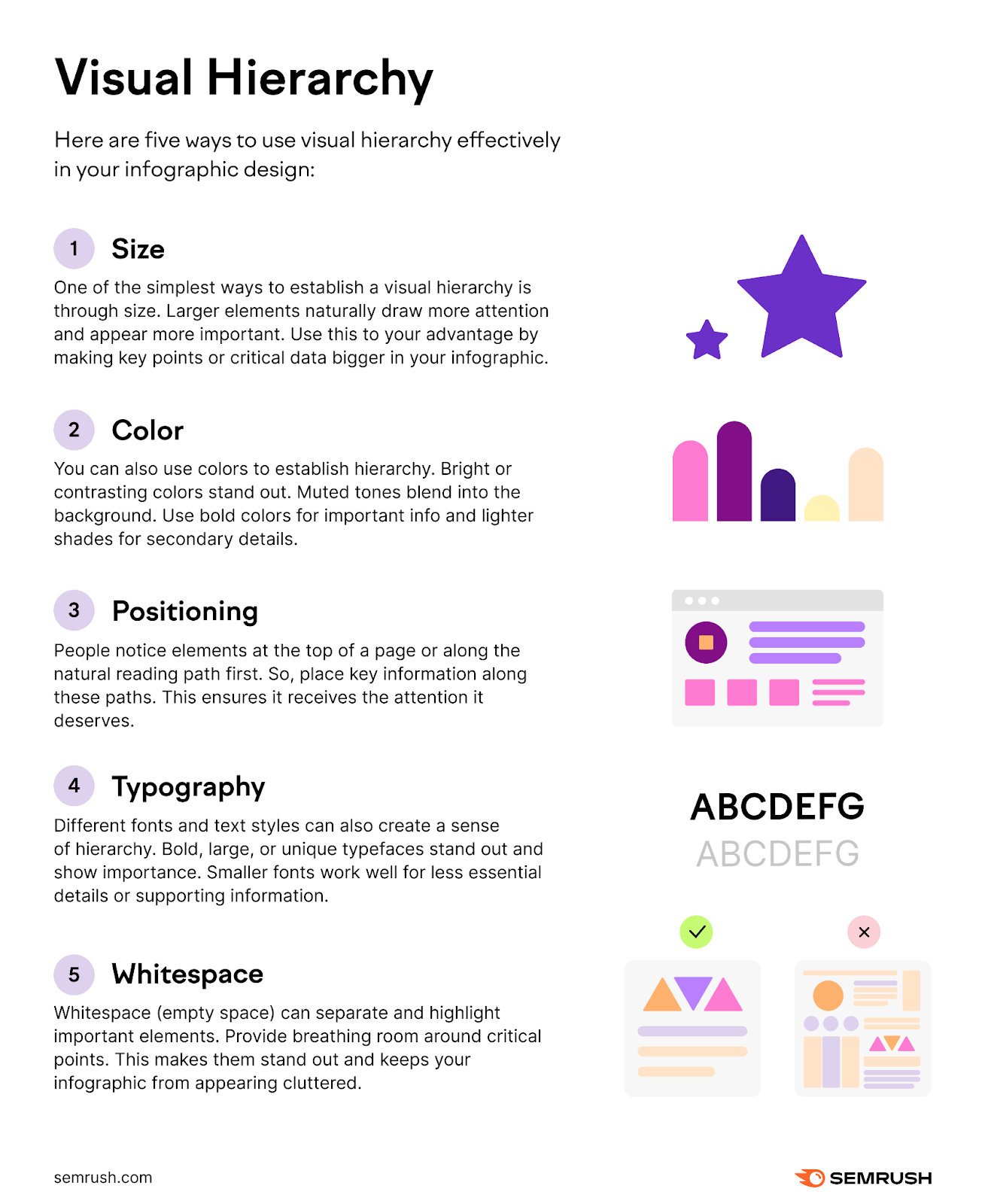
Here are five ways to use visual hierarchy effectively in your infographic design:
- Size: One of the simplest ways to establish a visual hierarchy is through size. Larger elements naturally draw more attention and appear more important. Use this to your advantage by making key points or critical data bigger in your infographic.
- Color: You can also use colors to establish hierarchy. Bright or contrasting colors stand out. Muted tones blend into the background. Use bold colors for important info and lighter shades for secondary details.
- Positioning: People notice elements at the top of a page or along the natural reading path first. So, place key information along these paths. This ensures it receives the attention it deserves.
- Typography: Different fonts and text styles can also create a sense of hierarchy. Bold, large, or unique typefaces stand out and show importance. Smaller fonts work well for less essential details or supporting information.
- Whitespace: Whitespace (empty space) can separate and highlight important elements. Provide breathing room around critical points. This makes them stand out and keeps your infographic from appearing cluttered.
5. Make Smart Color Choices
Colors evoke emotions and direct attention.
That’s why you should select a color scheme that aligns with your brand and message.
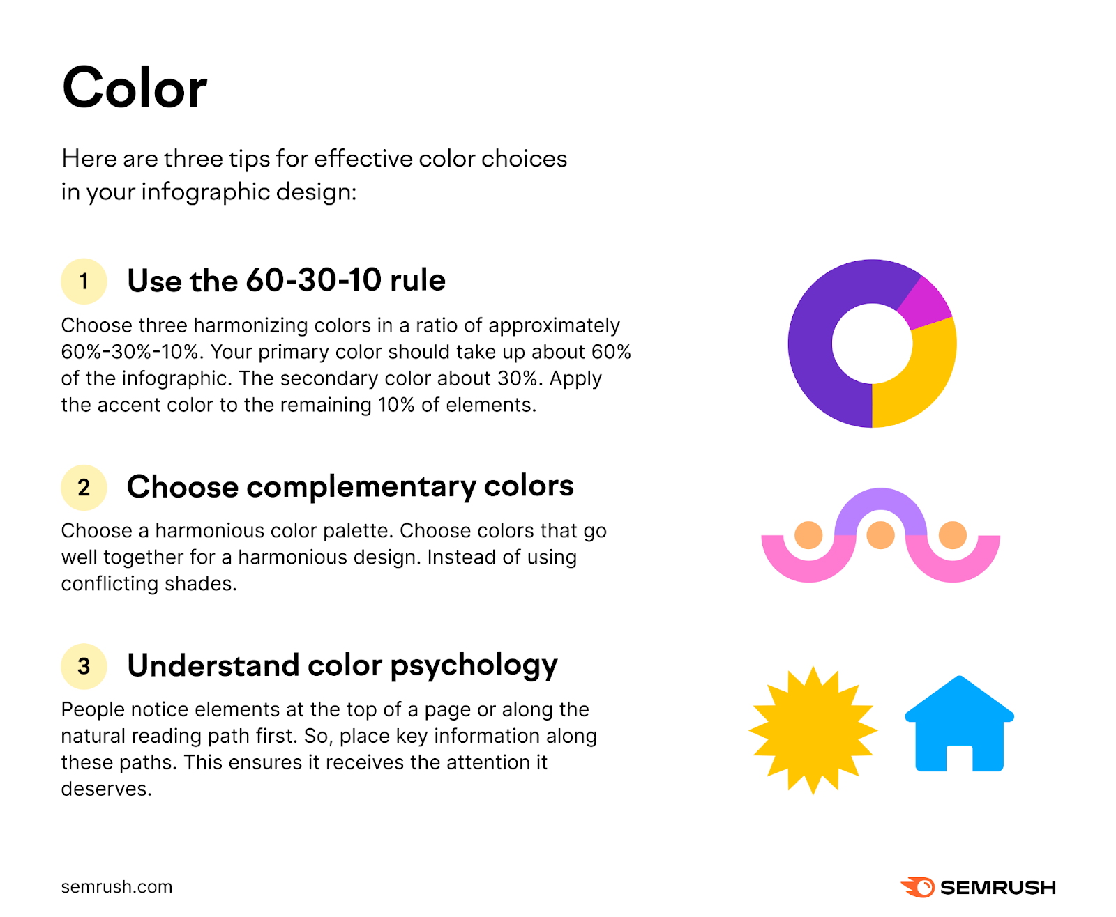
Here are three tips for effective color choices in your infographic design:
- Use the 60-30-10 rule. Choose three harmonizing colors in a ratio of approximately 60%-30%-10%. Your primary color should take up about 60% of the infographic. The secondary color about 30%. Apply the accent color to the remaining 10% of elements.
- Choose complementary colors. Choose a harmonious color palette. Choose colors that go well together for a harmonious design. Instead of using conflicting shades.
- Understand color psychology. Colors can stir emotions and ignite ideas. Blue symbolizes trustworthiness and stability. Yellow represents optimism and energy. Think about the message you want to convey when selecting infographic colors.
6. Pay Attention to Typography
Fonts play a crucial role in readability and mood.
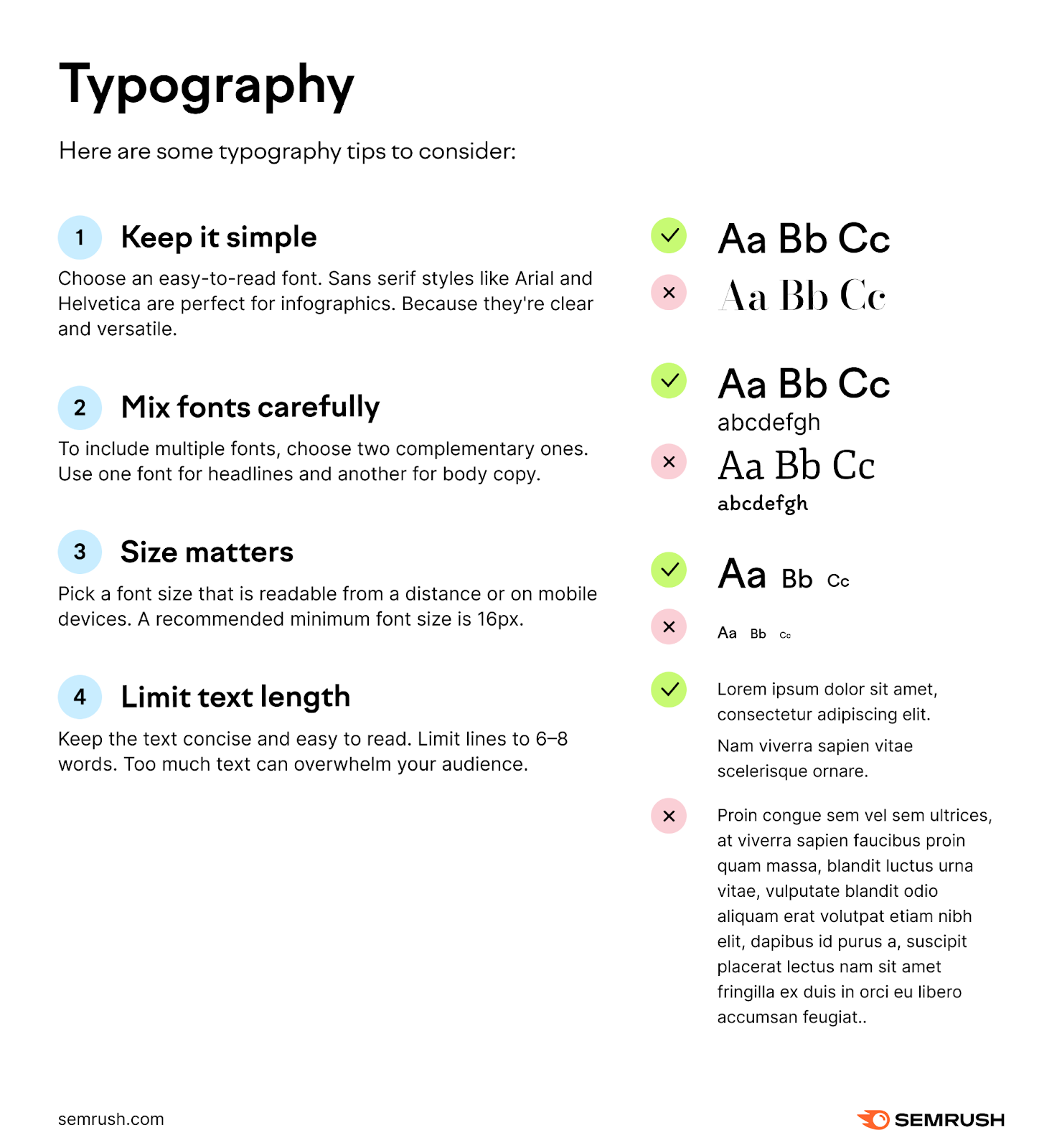
Here are some typography tips to consider:
- Keep it simple. Choose an easy-to-read font. Sans serif styles like Arial and Helvetica are perfect for infographics. Because they’re clear and versatile.
- Mix fonts carefully. To include multiple fonts, choose two complementary ones. Use one font for headlines and another for body copy.
- Size matters. Pick a font size that is readable from a distance or on mobile devices. A recommended minimum font size is 16px.
- Limit text length. Keep the text concise and easy to read. Limit lines to six to eight words. Too much text can overwhelm your audience.
7. Test and Refine
Finally, always test your infographic. Testing and refining your infographic ensures it effectively communicates the intended message and resonates with the target audience.
Here are three ways to do that:
- Invite a small group from your target audience to review the infographic. Consider their feedback and make any changes if needed.
- Test the design on various devices and browsers. Ensure everything functions as expected before publishing.
- After your infographic goes live, track its performance. Track page views, shares, and other key metrics to see how it resonates with your audience.
Further reading: 7 Common Infographic Designs & Why We Use Them
4 Ways Infographics Transform Content Marketing Campaigns
Enhancing Engagement
Infographics have the ability to draw the attention of readers, far more than plain text or even standard images.
With a combination of relevant imagery, concise text, and organized data, they offer a quick snapshot of a topic. Enticing readers to delve deeper.
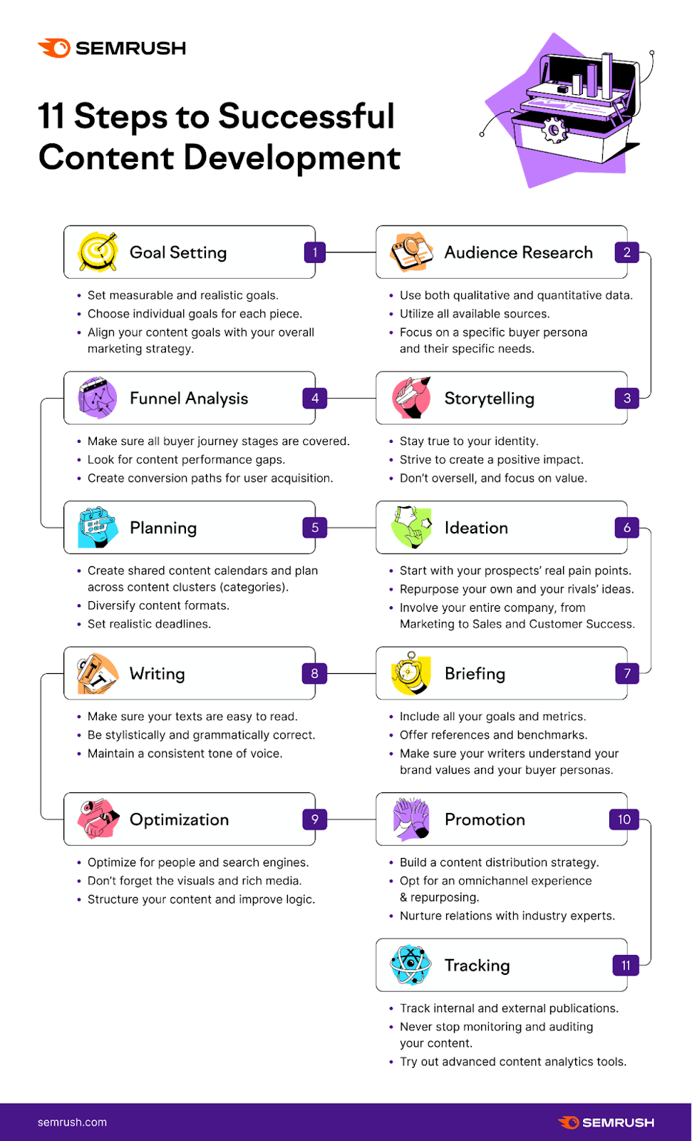
Let’s take a look at our infographic covering 11 steps in the content development process.
This infographic helps readers grasp the core ideas first. And follow along as they scroll through each step. Which makes this topic more approachable for the reader.
Additionally, when shared on social media platforms or embedded within blog posts, posts with infographics are likely to garner more shares and overall engagement.
The more visually appealing and informative an infographic is, the more likely viewers are to share it. Amplifying its reach.
Increasing Social Media Shares
Infographics have the potential to generate shares on social media platforms. When they’re shared on social media, they can also drive some traffic and generate leads for your business.
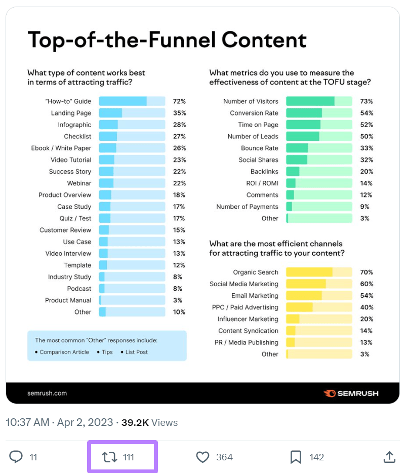
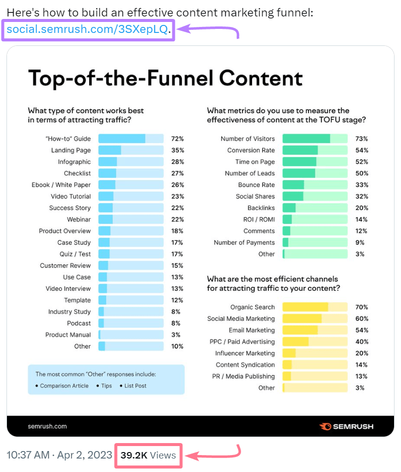
Take this infographic about top-of-the-funnel content as an example. We had shared it on X (formerly Twitter).
It has been reposted by others over 100 times.
And over 39,000 people have seen it. This post also has a link to our website. And assuming only a 1% conversion rate, around 390 people would have clicked through to the blog post.
Boosting Backlinks and SEO Efforts
When people share your infographics, more people discover them.
Some people who discover them might also use them in their content on their website. And link back to you as a source.
These links (called backlinks) can boost your website’s authority (ranking strength) and improve its rankings in search engines.
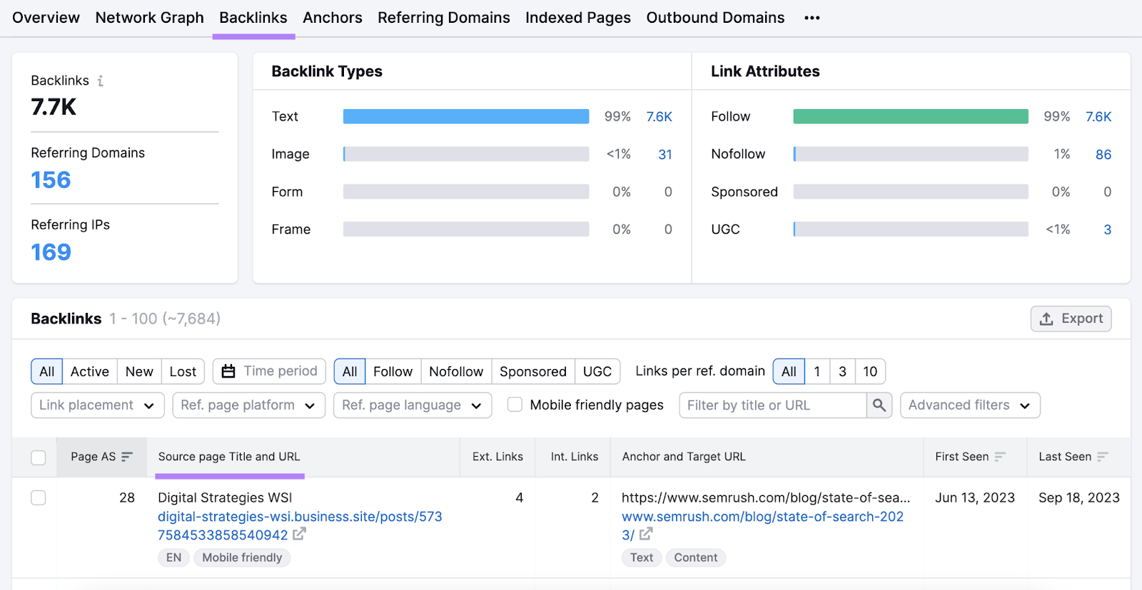
You can use Semrush’s Backlink Analytics tool to check whether your infographics or articles with infographics have garnered backlinks.
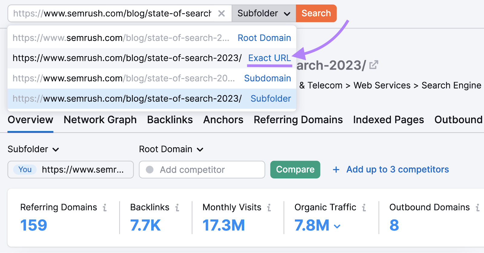
Open the tool and enter the exact URL of a webpage that has an infographic on it. Then, click “Analyze.”

Now, select "Exact URL" from the search bar at the top.
You can now navigate to the “Backlinks” report. And it will show all sources that link to the webpage containing the infographic.
Showcasing Expertise
Infographics can help you show your industry knowledge and position yourself as a thought leader in your space.
Here are some tips for how to do that:
- Include relevant data showcasing industry trends or changes over time
- Use original research to uncover and share unique insights that readers won’t find elsewhere
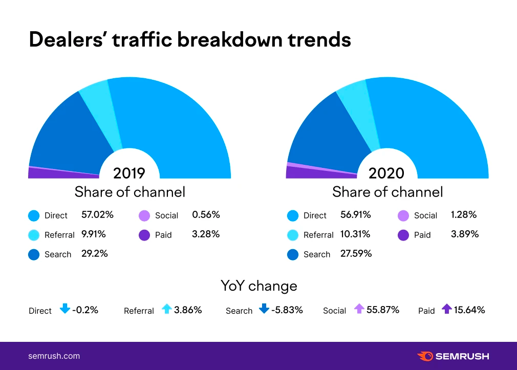
Let’s take a look at the infographic below. It depicts the share of search traffic in different industries.
The infographic uses statistics and original research to back up its claims:
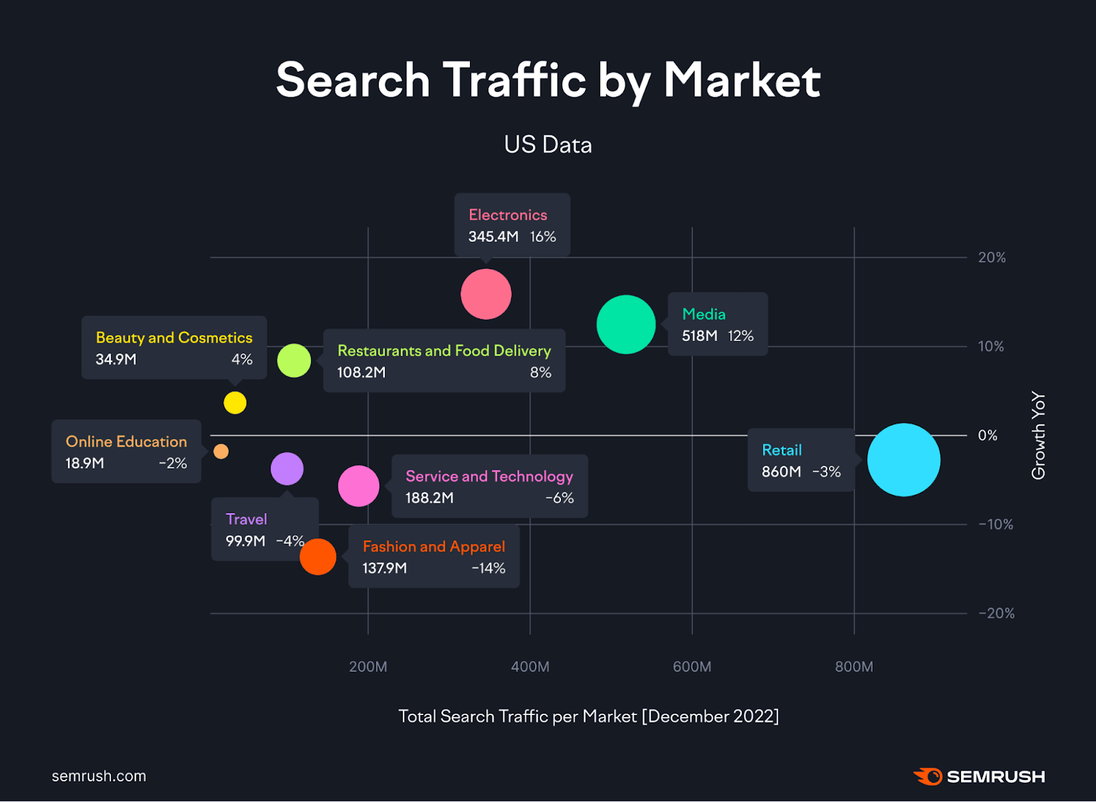
This builds credibility. And showcases expertise while providing people with valuable information.
Free Templates and Tools for Creating Stunning Infographics
Canva (Free & Paid)
Canva is a design platform that offers a plethora of templates, including many for infographics.
With its drag-and-drop interface, even those with limited design experience can create professional-looking infographics.
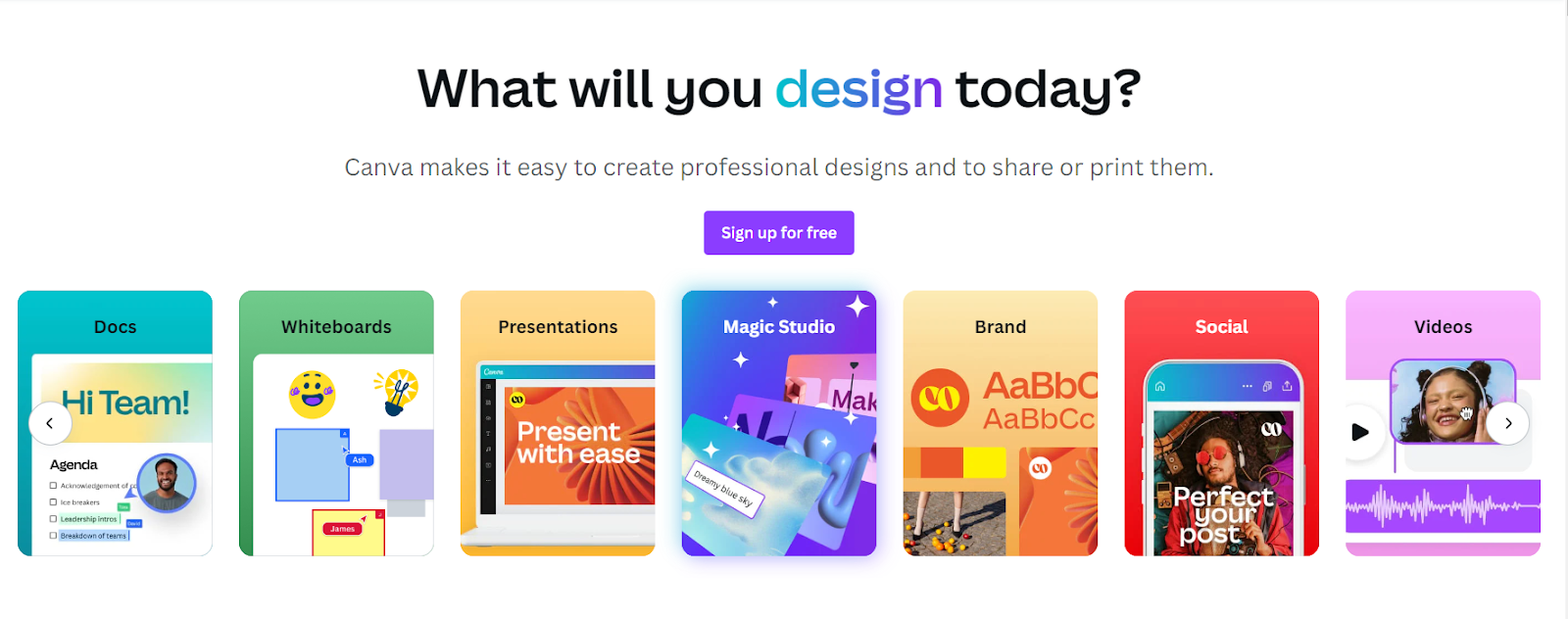
The platform offers both free and paid accounts. Free accounts have some limitations, while the paid accounts come with expanded capabilities, such as AI-powered design inputs.
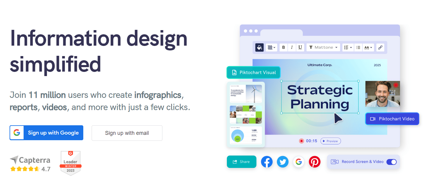
Piktochart (Free & Paid)
Piktochart offers an intuitive platform for creating infographics. And it has a huge library of customizable infographic templates.
It provides a range of design elements and interactive features to enhance engagement. The free version offers limited access. The paid version unlocks additional features, such as high-resolution downloads and more templates.
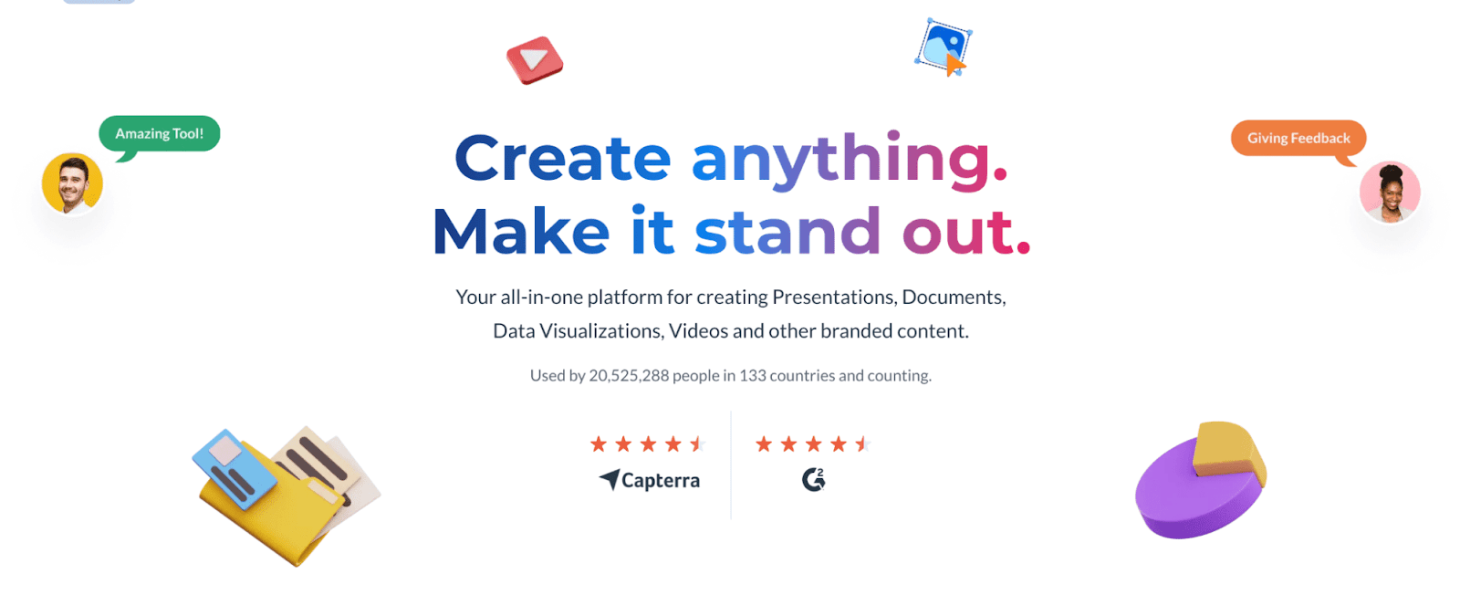
Visme (Free & Paid)
Visme is a versatile design tool. It allows you to create infographics, presentations, and other visual content.
It provides customizable infographic templates, a library of icons, charts, images, animations, and interactivity. The free version has limitations. The paid version offers advanced features, such as privacy controls and analytics.
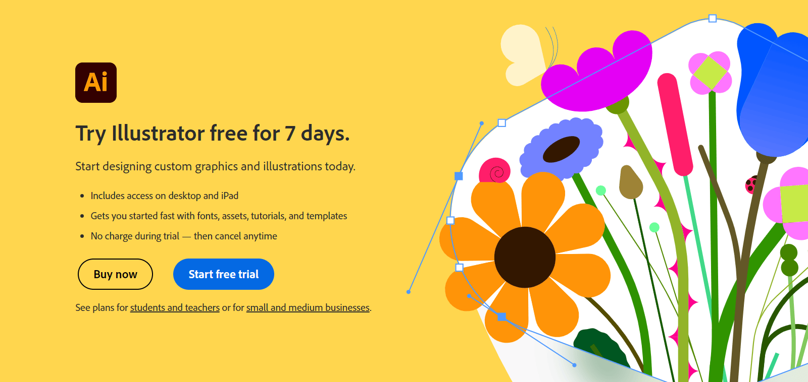
Adobe Illustrator (Paid)
Adobe Illustrator is a professional graphic design software.
It lets you customize every aspect of your infographic. From the fonts and colors to the shapes and icons. However, you need to pay for a subscription to use it.
But it’s worth the investment if you want to create stunning and professional-looking infographics that stand out from the crowd.
Unleash the Power of Visual Storytelling with Infographics
In content marketing, infographics are an invaluable asset for capturing and retaining audience attention. They’re powerful visual tools that effectively convey information in an appealing and easily digestible format.
Use Semrush’s Topic Research tool to find topics to create infographics around.
After you’ve created infographics and published them on your site, use Semrush’s Backlink Analytics tool to check if they’ve attracted any backlinks.
Sign up and get started.
